In this previous post I analyzed some data from the China Study that included counties where there were cases of schistosomiasis infection. Following one of Denise Minger’s suggestions, I removed all those counties from the data. I was left with 29 counties, a much smaller sample size. I then ran a multivariate analysis using WarpPLS (warppls.com), like in the previous post, but this time I used an algorithm that identifies nonlinear relationships between variables.
Below is the model with the results. (Click on it to enlarge. Use the "CRTL" and "+" keys to zoom in, and CRTL" and "-" to zoom out.) As in the previous post, the arrows explore associations between variables. The variables are shown within ovals. The meaning of each variable is the following: aprotein = animal protein consumption; pprotein = plant protein consumption; cholest = total cholesterol; crcancer = colorectal cancer.
What is total cholesterol doing at the right part of the graph? It is there because I am analyzing the associations between animal protein and plant protein consumption with colorectal cancer, controlling for the possible confounding effect of total cholesterol.
I am not hypothesizing anything regarding total cholesterol, even though this variable is shown as pointing at colorectal cancer. I am just controlling for it. This is the type of thing one can do in multivariate analyzes. This is how you “control for the effect of a variable” in an analysis like this.
ins
Since the sample is fairly small, we end up with nonsignificant beta coefficients that would normally be statistically significant with a larger sample. But it helps that we are using nonparametric statistics, because they are still robust in the presence of small samples, and deviations from normality. Also the nonlinear algorithm is more sensitive to relationships that do not fit a classic linear pattern. We can summarize the findings as follows:
- As animal protein consumption increases, plant protein consumption decreases significantly (beta=-0.36; P<0.01). This is to be expected and helpful in the analysis, as it differentiates somewhat animal from plant protein consumers. Those folks who got more of their protein from animal foods tended to get significantly less protein from plant foods.
- As animal protein consumption increases, colorectal cancer decreases, but not in a statistically significant way (beta=-0.31; P=0.10). The beta here is certainly high, and the likelihood that the relationship is real is 90 percent, even with such a small sample.
- As plant protein consumption increases, colorectal cancer increases significantly (beta=0.47; P<0.01). The small sample size was not enough to make this association nonsignificant. The reason is that the distribution pattern of the data here is very indicative of a real association, which is reflected in the low P value.
Remember, these results are not confounded by schistosomiasis infection, because we are only looking at counties where there were no cases of schistosomiasis infection. These results are not confounded by total cholesterol either, because we controlled for that possible confounding effect. Now, control variable or not, you would be correct to point out that the association between total cholesterol and colorectal cancer is high (beta=0.58; P=0.01). So let us take a look at the shape of that association:
Does this graph remind you of the one on this post; the one with several U curves? Yes. And why is that? Maybe it reflects a tendency among the folks who had low cholesterol to have more cancer because the body needs cholesterol to fight disease, and cancer is a disease. And maybe it reflects a tendency among the folks who have high total cholesterol to do so because total cholesterol (and particularly its main component, LDL cholesterol) is in part a marker of disease, and cancer is often a culmination of various metabolic disorders (e.g., the metabolic syndrome) that are nothing but one disease after another.
To believe that total cholesterol causes colorectal cancer is nonsensical because total cholesterol is generally increased by consumption of animal products, of which animal protein consumption is a proxy. (In this reduced dataset, the linear univariate correlation between animal protein consumption and total cholesterol is a significant and positive 0.36.) And animal protein consumption seems to be protective again colorectal cancer in this dataset (negative association on the model graph).
Now comes the part that I find the most ironic about this whole discussion in the blogosphere that has been going on recently about the China Study; and the answer to the question posed in the title of this post: Are raw plant foods giving people cancer? If you think that the answer is “yes”, think again. The variable that is strongly associated with colorectal cancer is plant protein consumption.
Do fruits, veggies, and other plant foods that can be consumed raw have a lot of protein?
With a few exceptions, like nuts, they do not. Most raw plant foods have trace amounts of protein, especially when compared with foods made from refined grains and seeds (e.g., wheat grains, soybean seeds). So the contribution of raw fruits and veggies in general could not have influenced much the variable plant protein consumption. To put this in perspective, the average plant protein consumption per day in this dataset was 63 g; even if they were eating 30 bananas a day, the study participants would not get half that much protein from bananas.
Refined foods made from grains and seeds are made from those plant parts that the plants absolutely do not “want” animals to eat. They are the plants’ “children” or “children’s nutritional reserves”, so to speak. This is why they are packed with nutrients, including protein and carbohydrates, but also often toxic and/or unpalatable to animals (including humans) when eaten raw.
But humans are so smart; they learned how to industrially refine grains and seeds for consumption. The resulting human-engineered products (usually engineered to sell as many units as possible, not to make you healthy) normally taste delicious, so you tend to eat a lot of them. They also tend to raise blood sugar to abnormally high levels, because industrial refining makes their high carbohydrate content easily digestible. Refined foods made from grains and seeds also tend to cause leaky gut problems, and autoimmune disorders like celiac disease. Yep, we humans are really smart.
Thanks again to Dr. Campbell and his colleagues for collecting and compiling the China Study data, and to Ms. Minger for making the data available in easily downloadable format and for doing some superb analyses herself.
Sunday, August 15, 2021
Tuesday, June 22, 2021
Blood glucose control before age 55 may increase your chances of living beyond 90
This post refers to an interesting study by Yashin and colleagues (2009) at Duke University’s Center for Population Health and Aging. (The full reference to the article, and a link, are at the end of this post.) This study is a gem with some rough edges, and some interesting implications.
The study uses data from the Framingham Heart Study (FHS). The FHS, which started in the late 1940s, recruited 5209 healthy participants (2336 males and 2873 females), aged 28 to 62, in the town of Framingham, Massachusetts. At the time of Yashin and colleagues’ article publication, there were 993 surviving participants.
I rearranged figure 2 from the Yashin and colleagues article so that the two graphs (for females and males) appeared one beside the other. The result is shown below (click on it to enlarge); the caption at the bottom-right corner refers to both graphs. The figure shows the age-related trajectory of blood glucose levels, grouped by lifespan (LS), starting at age 40.
As you can see from the figure above, blood glucose levels increase with age, even for long-lived individuals (LS > 90). The increases follow a U-curve (a.k.a. J-curve) pattern; the beginning of the right side of a U curve, to be more precise. The main difference in the trajectories of the blood glucose levels is that as lifespan increases, so does the width of the U curve. In other words, in long-lived people, blood glucose increases slowly with age; particularly up to 55 years of age, when it starts increasing more rapidly.
Now, here is one of the rough edges of this study. The authors do not provide standard deviations. You can ignore the error bars around the points on the graph; they are not standard deviations. They are standard errors, which are much lower than the corresponding standard deviations. Standard errors are calculated by dividing the standard deviations by the square root of the sample sizes for each trajectory point (which the authors do not provide either), so they go up with age since progressively smaller numbers of individuals reach advanced ages.
So, no need to worry if your blood glucose levels are higher than those shown on the vertical axes of the graphs. (I will comment more on those numbers below.) Not everybody who lived beyond 90 had a blood glucose of around 80 mg/dl at age 40. I wouldn't be surprised if about 2/3 of the long-lived participants had blood glucose levels in the range of 65 to 95 at that age.
Here is another rough edge. It is pretty clear that the authors’ main independent variable (i.e., health predictor) in this study is average blood glucose, which they refer to simply as “blood glucose”. However, the measure of blood glucose in the FHS is a very rough estimation of average blood glucose, because they measured blood glucose levels at random times during the day. These measurements, when averaged, are closer to fasting blood glucose levels than to average blood glucose levels.
A more reliable measure of average blood glucose levels is that of glycated hemoglobin (HbA1c). Blood glucose glycates (i.e., sticks to, like most sugary substances) hemoglobin, a protein found in red blood cells. Since red blood cells are relatively long-lived, with a turnover of about 3 months, HbA1c (given in percentages) is a good indicator of average blood glucose levels (if you don’t suffer from anemia or a few other blood abnormalities). Based on HbA1c, one can then estimate his or her average blood glucose level for the previous 3 months before the test, using one of the following equations, depending on whether the measurement is in mg/dl or mmol/l.
Average blood glucose (mg/dl) = 28.7 × HbA1c − 46.7
Average blood glucose (mmol/l) = 1.59 × HbA1c − 2.59
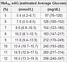
The table below, from Wikipedia, shows average blood glucose levels corresponding to various HbA1c values. As you can see, they are generally higher than the corresponding fasting blood glucose levels would normally be (the latter is what the values on the vertical axes of the graphs above from Yashin and colleagues’ study roughly measure). This is to be expected, because blood glucose levels vary a lot during the day, and are often transitorily high in response to food intake and fluctuations in various hormones. Growth hormone, cortisol and noradrenaline are examples of hormones that increase blood glucose. Only one hormone effectively decreases blood glucose levels, insulin, by stimulating glucose uptake and storage as glycogen and fat.
Nevertheless, one can reasonably expect fasting blood glucose levels to have been highly correlated with average blood glucose levels in the sample. So, in my opinion, the graphs above showing age-related blood glucose trajectories are still valid, in terms of their overall shape, but the values on the vertical axes should have been measured differently, perhaps using the formulas above.
Ironically, those who achieve low average blood glucose levels (measured based on HbA1c) by adopting a low carbohydrate diet (one of the most effective ways) frequently have somewhat high fasting blood glucose levels because of physiological (or benign) insulin resistance. Their body is primed to burn fat for energy, not glucose. Thus when growth hormone levels spike in the morning, so do blood glucose levels, as muscle cells are in glucose rejection mode. This is a benign version of the dawn effect (a.k.a. dawn phenomenon), which happens with quite a few low carbohydrate dieters, particularly with those who are deep in ketosis at dawn.
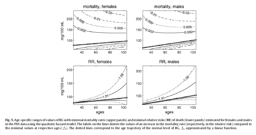
Yashin and colleagues also modeled relative risk of death based on blood glucose levels, using a fairly sophisticated mathematical model that takes into consideration U-curve relationships. What they found is intuitively appealing, and is illustrated by the two graphs at the bottom of the figure below. The graphs show how the relative risks (e.g., 1.05, on the topmost dashed line on the both graphs) associated with various ranges of blood glucose levels vary with age, for both females and males.
What the graphs above are telling us is that once you reach old age, controlling for blood sugar levels is not as effective as doing it earlier, because you are more likely to die from what the authors refer to as “other causes”. For example, at the age of 90, having a blood glucose of 150 mg/dl (corrected for the measurement problem noted earlier, this would be perhaps 165 mg/dl, from HbA1c values) is likely to increase your risk of death by only 5 percent. The graphs account for the facts that: (a) blood glucose levels naturally increase with age, and (b) fewer people survive as age progresses. So having that level of blood glucose at age 60 would significantly increase relative risk of death at that age; this is not shown on the graph, but can be inferred.
Here is a final rough edge of this study. From what I could gather from the underlying equations, the relative risks shown above do not account for the effect of high blood glucose levels earlier in life on relative risk of death later in life. This is a problem, even though it does not completely invalidate the conclusion above. As noted by several people (including Gary Taubes in his book Good Calories, Bad Calories), many of the diseases associated with high blood sugar levels (e.g., cancer) often take as much as 20 years of high blood sugar levels to develop. So the relative risks shown above underestimate the effect of high blood glucose levels earlier in life.
Do the long-lived participants have some natural protection against accelerated increases in blood sugar levels, or was it their diet and lifestyle that protected them? This question cannot be answered based on the study.
Assuming that their diet and lifestyle protected them, it is reasonable to argue that: (a) if you start controlling your average blood sugar levels well before you reach the age of 55, you may significantly increase your chances of living beyond the age of 90; (b) it is likely that your blood glucose levels will go up with age, but if you can manage to slow down that progression, you will increase your chances of living a longer and healthier life; (c) you should focus your control on reliable measures of average blood glucose levels, such as HbA1c, not fasting blood glucose levels (postprandial glucose levels are also a good option, because they contribute a lot to HbA1c increases); and (d) it is never too late to start controlling your blood glucose levels, but the more you wait, the bigger is the risk.
References:
Taubes, G. (2007). Good calories, bad calories: Challenging the conventional wisdom on diet, weight control, and disease. New York, NY: Alfred A. Knopf.
Yashin, A.I., Ukraintseva, S.V., Arbeev, K.G., Akushevich, I., Arbeeva, L.S., & Kulminski, A.M. (2009). Maintaining physiological state for exceptional survival: What is the normal level of blood glucose and does it change with age? Mechanisms of Ageing and Development, 130(9), 611-618.
The study uses data from the Framingham Heart Study (FHS). The FHS, which started in the late 1940s, recruited 5209 healthy participants (2336 males and 2873 females), aged 28 to 62, in the town of Framingham, Massachusetts. At the time of Yashin and colleagues’ article publication, there were 993 surviving participants.
I rearranged figure 2 from the Yashin and colleagues article so that the two graphs (for females and males) appeared one beside the other. The result is shown below (click on it to enlarge); the caption at the bottom-right corner refers to both graphs. The figure shows the age-related trajectory of blood glucose levels, grouped by lifespan (LS), starting at age 40.
As you can see from the figure above, blood glucose levels increase with age, even for long-lived individuals (LS > 90). The increases follow a U-curve (a.k.a. J-curve) pattern; the beginning of the right side of a U curve, to be more precise. The main difference in the trajectories of the blood glucose levels is that as lifespan increases, so does the width of the U curve. In other words, in long-lived people, blood glucose increases slowly with age; particularly up to 55 years of age, when it starts increasing more rapidly.
Now, here is one of the rough edges of this study. The authors do not provide standard deviations. You can ignore the error bars around the points on the graph; they are not standard deviations. They are standard errors, which are much lower than the corresponding standard deviations. Standard errors are calculated by dividing the standard deviations by the square root of the sample sizes for each trajectory point (which the authors do not provide either), so they go up with age since progressively smaller numbers of individuals reach advanced ages.
So, no need to worry if your blood glucose levels are higher than those shown on the vertical axes of the graphs. (I will comment more on those numbers below.) Not everybody who lived beyond 90 had a blood glucose of around 80 mg/dl at age 40. I wouldn't be surprised if about 2/3 of the long-lived participants had blood glucose levels in the range of 65 to 95 at that age.
Here is another rough edge. It is pretty clear that the authors’ main independent variable (i.e., health predictor) in this study is average blood glucose, which they refer to simply as “blood glucose”. However, the measure of blood glucose in the FHS is a very rough estimation of average blood glucose, because they measured blood glucose levels at random times during the day. These measurements, when averaged, are closer to fasting blood glucose levels than to average blood glucose levels.
A more reliable measure of average blood glucose levels is that of glycated hemoglobin (HbA1c). Blood glucose glycates (i.e., sticks to, like most sugary substances) hemoglobin, a protein found in red blood cells. Since red blood cells are relatively long-lived, with a turnover of about 3 months, HbA1c (given in percentages) is a good indicator of average blood glucose levels (if you don’t suffer from anemia or a few other blood abnormalities). Based on HbA1c, one can then estimate his or her average blood glucose level for the previous 3 months before the test, using one of the following equations, depending on whether the measurement is in mg/dl or mmol/l.
Average blood glucose (mg/dl) = 28.7 × HbA1c − 46.7
Average blood glucose (mmol/l) = 1.59 × HbA1c − 2.59
The table below, from Wikipedia, shows average blood glucose levels corresponding to various HbA1c values. As you can see, they are generally higher than the corresponding fasting blood glucose levels would normally be (the latter is what the values on the vertical axes of the graphs above from Yashin and colleagues’ study roughly measure). This is to be expected, because blood glucose levels vary a lot during the day, and are often transitorily high in response to food intake and fluctuations in various hormones. Growth hormone, cortisol and noradrenaline are examples of hormones that increase blood glucose. Only one hormone effectively decreases blood glucose levels, insulin, by stimulating glucose uptake and storage as glycogen and fat.
Nevertheless, one can reasonably expect fasting blood glucose levels to have been highly correlated with average blood glucose levels in the sample. So, in my opinion, the graphs above showing age-related blood glucose trajectories are still valid, in terms of their overall shape, but the values on the vertical axes should have been measured differently, perhaps using the formulas above.
Ironically, those who achieve low average blood glucose levels (measured based on HbA1c) by adopting a low carbohydrate diet (one of the most effective ways) frequently have somewhat high fasting blood glucose levels because of physiological (or benign) insulin resistance. Their body is primed to burn fat for energy, not glucose. Thus when growth hormone levels spike in the morning, so do blood glucose levels, as muscle cells are in glucose rejection mode. This is a benign version of the dawn effect (a.k.a. dawn phenomenon), which happens with quite a few low carbohydrate dieters, particularly with those who are deep in ketosis at dawn.
Yashin and colleagues also modeled relative risk of death based on blood glucose levels, using a fairly sophisticated mathematical model that takes into consideration U-curve relationships. What they found is intuitively appealing, and is illustrated by the two graphs at the bottom of the figure below. The graphs show how the relative risks (e.g., 1.05, on the topmost dashed line on the both graphs) associated with various ranges of blood glucose levels vary with age, for both females and males.
What the graphs above are telling us is that once you reach old age, controlling for blood sugar levels is not as effective as doing it earlier, because you are more likely to die from what the authors refer to as “other causes”. For example, at the age of 90, having a blood glucose of 150 mg/dl (corrected for the measurement problem noted earlier, this would be perhaps 165 mg/dl, from HbA1c values) is likely to increase your risk of death by only 5 percent. The graphs account for the facts that: (a) blood glucose levels naturally increase with age, and (b) fewer people survive as age progresses. So having that level of blood glucose at age 60 would significantly increase relative risk of death at that age; this is not shown on the graph, but can be inferred.
Here is a final rough edge of this study. From what I could gather from the underlying equations, the relative risks shown above do not account for the effect of high blood glucose levels earlier in life on relative risk of death later in life. This is a problem, even though it does not completely invalidate the conclusion above. As noted by several people (including Gary Taubes in his book Good Calories, Bad Calories), many of the diseases associated with high blood sugar levels (e.g., cancer) often take as much as 20 years of high blood sugar levels to develop. So the relative risks shown above underestimate the effect of high blood glucose levels earlier in life.
Do the long-lived participants have some natural protection against accelerated increases in blood sugar levels, or was it their diet and lifestyle that protected them? This question cannot be answered based on the study.
Assuming that their diet and lifestyle protected them, it is reasonable to argue that: (a) if you start controlling your average blood sugar levels well before you reach the age of 55, you may significantly increase your chances of living beyond the age of 90; (b) it is likely that your blood glucose levels will go up with age, but if you can manage to slow down that progression, you will increase your chances of living a longer and healthier life; (c) you should focus your control on reliable measures of average blood glucose levels, such as HbA1c, not fasting blood glucose levels (postprandial glucose levels are also a good option, because they contribute a lot to HbA1c increases); and (d) it is never too late to start controlling your blood glucose levels, but the more you wait, the bigger is the risk.
References:
Taubes, G. (2007). Good calories, bad calories: Challenging the conventional wisdom on diet, weight control, and disease. New York, NY: Alfred A. Knopf.
Yashin, A.I., Ukraintseva, S.V., Arbeev, K.G., Akushevich, I., Arbeeva, L.S., & Kulminski, A.M. (2009). Maintaining physiological state for exceptional survival: What is the normal level of blood glucose and does it change with age? Mechanisms of Ageing and Development, 130(9), 611-618.
Thursday, March 11, 2021
The steep obesity increase in the USA in the 1980s: In a sense, it reflects a major success story
Obesity rates have increased in the USA over the years, but the steep increase starting around the 1980s is unusual. Wang and Beydoun do a good job at discussing this puzzling phenomenon (), and a blog post by Discover Magazine provides a graph (see below) that clear illustrates it ().
What is the reason for this?
You may be tempted to point at increases in calorie intake and/or changes in macronutrient composition, but neither can explain this sharp increase in obesity in the 1980s. The differences in calorie intake and macronutrient composition are simply not large enough to fully account for such a steep increase. And the data is actually full of oddities.
For example, an article by Austin and colleagues (which ironically blames calorie consumption for the obesity epidemic) suggests that obese men in a NHANES (2005–2006) sample consumed only 2.2 percent more calories per day on average than normal weight men in a NHANES I (1971–1975) sample ().
So, what could be the main reason for the steep increase in obesity prevalence since the 1980s?
The first clue comes from an interesting observation. If you age-adjust obesity trends (by controlling for age), you end up with a much less steep increase. The steep increase in the graph above is based on raw, unadjusted numbers. There is a higher prevalence of obesity among older people (no surprise here). And older people are people that have survived longer than younger people. (Don’t be too quick to say “duh” just yet.)
This age-obesity connection also reflects an interesting difference between humans living “in the wild” and those who do not, which becomes more striking when we compare hunter-gatherers with modern urbanites. Adult hunter-gatherers, unlike modern urbanites, do not gain weight as they age; they actually lose weight (, ).
Modern urbanites gain a significant amount of weight, usually as body fat, particularly after age 40. The table below, from an article by Flegal and colleagues, illustrates this pattern quite clearly (). Obesity prevalence tends to be highest between ages 40-59 in men; and this has been happening since the 1960s, with the exception of the most recent period listed (1999-2000).
In the 1999-2000 period obesity prevalence in men peaked in the 60-74 age range. Why? With progress in medicine, it is likely that more obese people in that age range survived (however miserably) in the 1999-2000 period. Obesity prevalence overall tends to be highest between ages 40-74 in women, which is a wider range than in men. Keep in mind that women tend to also live longer than men.
Because age seems to be associated with obesity prevalence among urbanites, it would be reasonable to look for a factor that significantly increased survival rates as one of the main reasons for the steep increase in the prevalence of obesity in the USA in the 1980s. If significantly more people were surviving beyond age 40 in the 1980s and beyond, this would help explain the steep increase in obesity prevalence. People don’t die immediately after they become obese; obesity is a “disease” that first and foremost impairs quality of life for many years before it kills.
Now look at the graph below, from an article by Armstrong and colleagues (). It shows a significant decrease in mortality from infectious diseases in the USA since 1900, reaching a minimum point between 1950 and 1960 (possibly 1955), and remaining low afterwards. (The spike in 1918 is due to the influenza pandemic.) At the same time, mortality from non-infectious diseases remains relatively stable over the same period, leading to a similar decrease in overall mortality.
When proper treatment options are not available, infectious diseases kill disproportionately at ages 15 and under (). Someone who was 15 years old in the USA in 1955 would have been 40 years old in 1980, if he or she survived. Had this person been obese, this would have been just in time to contribute to the steep increase in obesity trends in the USA. This increase would be cumulative; if this person were to live to the age of 70, he or she would be contributing to the obesity statistics up to 2010.
Americans are clearly eating more, particularly highly palatable industrialized foods whose calorie-to-nutrient ratio is high. Americans are also less physically active. But one of the fundamental reasons for the sharp increase in obesity rates in the USA since the early 1980s is that Americans have been surviving beyond age 40 in significantly greater numbers.
This is due to the success of modern medicine and public health initiatives in dealing with infectious diseases.
PS: It is important to point out that this post is not about the increase in American obesity in general over the years, but rather about the sharp increase in obesity since the early 1980s. A few alternative hypotheses have been proposed in the comments section, of which one seems to have been favored by various readers: a significant increase in consumption of linoleic acid (not to be confused with linolenic acid) since the early 1980s.
What is the reason for this?
You may be tempted to point at increases in calorie intake and/or changes in macronutrient composition, but neither can explain this sharp increase in obesity in the 1980s. The differences in calorie intake and macronutrient composition are simply not large enough to fully account for such a steep increase. And the data is actually full of oddities.
For example, an article by Austin and colleagues (which ironically blames calorie consumption for the obesity epidemic) suggests that obese men in a NHANES (2005–2006) sample consumed only 2.2 percent more calories per day on average than normal weight men in a NHANES I (1971–1975) sample ().
So, what could be the main reason for the steep increase in obesity prevalence since the 1980s?
The first clue comes from an interesting observation. If you age-adjust obesity trends (by controlling for age), you end up with a much less steep increase. The steep increase in the graph above is based on raw, unadjusted numbers. There is a higher prevalence of obesity among older people (no surprise here). And older people are people that have survived longer than younger people. (Don’t be too quick to say “duh” just yet.)
This age-obesity connection also reflects an interesting difference between humans living “in the wild” and those who do not, which becomes more striking when we compare hunter-gatherers with modern urbanites. Adult hunter-gatherers, unlike modern urbanites, do not gain weight as they age; they actually lose weight (, ).
Modern urbanites gain a significant amount of weight, usually as body fat, particularly after age 40. The table below, from an article by Flegal and colleagues, illustrates this pattern quite clearly (). Obesity prevalence tends to be highest between ages 40-59 in men; and this has been happening since the 1960s, with the exception of the most recent period listed (1999-2000).
In the 1999-2000 period obesity prevalence in men peaked in the 60-74 age range. Why? With progress in medicine, it is likely that more obese people in that age range survived (however miserably) in the 1999-2000 period. Obesity prevalence overall tends to be highest between ages 40-74 in women, which is a wider range than in men. Keep in mind that women tend to also live longer than men.
Because age seems to be associated with obesity prevalence among urbanites, it would be reasonable to look for a factor that significantly increased survival rates as one of the main reasons for the steep increase in the prevalence of obesity in the USA in the 1980s. If significantly more people were surviving beyond age 40 in the 1980s and beyond, this would help explain the steep increase in obesity prevalence. People don’t die immediately after they become obese; obesity is a “disease” that first and foremost impairs quality of life for many years before it kills.
Now look at the graph below, from an article by Armstrong and colleagues (). It shows a significant decrease in mortality from infectious diseases in the USA since 1900, reaching a minimum point between 1950 and 1960 (possibly 1955), and remaining low afterwards. (The spike in 1918 is due to the influenza pandemic.) At the same time, mortality from non-infectious diseases remains relatively stable over the same period, leading to a similar decrease in overall mortality.
When proper treatment options are not available, infectious diseases kill disproportionately at ages 15 and under (). Someone who was 15 years old in the USA in 1955 would have been 40 years old in 1980, if he or she survived. Had this person been obese, this would have been just in time to contribute to the steep increase in obesity trends in the USA. This increase would be cumulative; if this person were to live to the age of 70, he or she would be contributing to the obesity statistics up to 2010.
Americans are clearly eating more, particularly highly palatable industrialized foods whose calorie-to-nutrient ratio is high. Americans are also less physically active. But one of the fundamental reasons for the sharp increase in obesity rates in the USA since the early 1980s is that Americans have been surviving beyond age 40 in significantly greater numbers.
This is due to the success of modern medicine and public health initiatives in dealing with infectious diseases.
PS: It is important to point out that this post is not about the increase in American obesity in general over the years, but rather about the sharp increase in obesity since the early 1980s. A few alternative hypotheses have been proposed in the comments section, of which one seems to have been favored by various readers: a significant increase in consumption of linoleic acid (not to be confused with linolenic acid) since the early 1980s.
Labels:
body fat,
calorie restriction,
energy expenditure,
obesity,
statistics
Sunday, January 17, 2021
Has COVID led to an increase in all-cause mortality? A look at US data from 2015 to 2020
Has COVID led to an increase in all-cause mortality? The figure below shows mortality data in the US for the 2015-2020 period. At the top chart are the absolute numbers of deaths per 1000 people. At the bottom are the annual change percentages, how much the absolute numbers have been changing from the previous years.
As you can see at the top chart the absolute numbers of deaths per 1000 people have been going up steadily, since 2015, at a rate of around 10 percent per year. This is due primarily to population ageing, which has been increasing in a very similar fashion. Since life expectancy has been generally stable in the US for the 2015-2020 period (), an increase in the number of deaths is to be expected due to population ageing.
What I mean by population ageing is an increase in the average age of the population due to an increase in the proportion of older individuals (e.g., aged 65 or more) in the population. In any population where there are no immortals, this population ageing phenomenon is normally expected to cause a higher number of deaths per 1000 people.
Now look at the bottom chart in the figure. It shows no increase in the rate of change from 2019 to 2020. This is not what you would expect if COVID had led to an increase in all-cause mortality in 2020. In fact, based on media reports, one would expect to see a visible spike in the rate of change for 2020. If these numbers are correct, we have to conclude that COVID has NOT led to an increase in all-cause mortality.
Thursday, December 24, 2020
Do COVID cases spike in cold weather? A look at effective reproduction rates from October to December 2020
Do COVID cases spike in cold weather? In a previous post () I argued that COVID cases may in fact go down in cold weather, due to compensatory adaptation (). The figure below shows the effective COVID reproduction numbers () in various states in the USA from the middle of October to the middle of December 2020. As you can see, as the weather patterns have become colder from October to December, COVID transmission rates have been generally improving.
While the risk of COVID transmission may go up with cold weather, which tends to lead to an increase in indoor activities and potentially higher transmission, people react in a compensatory way. This feedback loop may lead to results that are unexpected and surprising, as we can see here.
Sunday, October 11, 2020
Does protein leach calcium from the bones? Yes, but only if it is plant protein
The idea that protein leaches calcium from the bones has been around for a while. It is related to the notion that protein, especially from animal foods, increases blood acidity. The body then uses its main reservoir of calcium, the bones, to reduce blood acidity. This post generally supports the opposite view, and adds a twist to it, related to plant protein consumption.
The “eat-meat-lose-bone” idea has apparently become popular due to the position taken by Loren Cordain on the topic. Dr. Cordain has also made several important and invaluable contributions to our understanding of the diets of our Paleolithic ancestors. He has argued in his book, The Paleo Diet, and elsewhere that to counter the acid load of protein one should eat fruits and vegetables. The latter are believed to have an alkaline load.
If the idea that protein leaches calcium from the bones is correct, one would expect to see a negative association between protein consumption and bone mineral density (BMD). This negative association should be particularly strong in people aged 50 and older, who are more vulnerable to BMD losses.
As it turns out, this idea appears to be correct only for plant protein. Animal protein seems to be associated with an increase in BMD, at least according to a widely cited study by Promislow et al. (2002). The study shows that there is a positive multivariate association between animal protein consumption and BMD; an association that becomes negative when plant protein consumption is considered.
The study focused on 572 women and 388 men aged 55–92 years living in Rancho Bernardo, California. Food frequency questionnaires were administered in the 1988–1992 period, and BMD was measured 4 years later. The bar chart below shows the approximate increases in BMD (in g/cm^2) for each 15 g/d increment in protein intake.
The authors reported increments in BMD for different increments of protein (15 and 5 g/d), so the results above are adjusted somewhat from the original values reported in the article. Keeping that in mind, the increment in BMD for men due to animal protein was not statistically significant (P=0.20). That is the smallest bar on the left.
Does protein leach calcium from the bones? Based on this study, the reasonable answers to this question are yes for plant protein, and no for animal protein. For animal protein, it seems to be quite the opposite.
Even more interesting, calcium intake did not seem to be much of a factor. BMD gains due to animal protein seemed to converge to similar values whether calcium intake was high, medium or low. The convergence occurred as animal protein intake increased, and the point of convergence was between 85-90 g/d of animal protein intake.
And high calcium intakes did not seem to protect those whose plant protein consumption was high.
The authors do not discuss specific foods, but one can guess the main plant protein that those folks likely consumed. It was likely gluten from wheat products.
Are the associations above due to: (a) the folks eating animal protein consuming more fruits and vegetables than the folks eating plant protein; or (b) something inherent to animal foods that stimulates an increase in the absorption of dietary calcium, even in small amounts?
This question cannot be answered based on this study; it should have controlled for fruit and vegetable consumption for that.
But if I were to bet, I would bet on (b).
Reference
Promislow, J.H.E., Goodman-Gruen, D., Slymen, D.J., & Barrett-Connor, E. (2002). Protein consumption and bone mineral density in the elderly. American Journal of Epidemiology, 155(7), 636–644.
The “eat-meat-lose-bone” idea has apparently become popular due to the position taken by Loren Cordain on the topic. Dr. Cordain has also made several important and invaluable contributions to our understanding of the diets of our Paleolithic ancestors. He has argued in his book, The Paleo Diet, and elsewhere that to counter the acid load of protein one should eat fruits and vegetables. The latter are believed to have an alkaline load.
If the idea that protein leaches calcium from the bones is correct, one would expect to see a negative association between protein consumption and bone mineral density (BMD). This negative association should be particularly strong in people aged 50 and older, who are more vulnerable to BMD losses.
As it turns out, this idea appears to be correct only for plant protein. Animal protein seems to be associated with an increase in BMD, at least according to a widely cited study by Promislow et al. (2002). The study shows that there is a positive multivariate association between animal protein consumption and BMD; an association that becomes negative when plant protein consumption is considered.
The study focused on 572 women and 388 men aged 55–92 years living in Rancho Bernardo, California. Food frequency questionnaires were administered in the 1988–1992 period, and BMD was measured 4 years later. The bar chart below shows the approximate increases in BMD (in g/cm^2) for each 15 g/d increment in protein intake.
The authors reported increments in BMD for different increments of protein (15 and 5 g/d), so the results above are adjusted somewhat from the original values reported in the article. Keeping that in mind, the increment in BMD for men due to animal protein was not statistically significant (P=0.20). That is the smallest bar on the left.
Does protein leach calcium from the bones? Based on this study, the reasonable answers to this question are yes for plant protein, and no for animal protein. For animal protein, it seems to be quite the opposite.
Even more interesting, calcium intake did not seem to be much of a factor. BMD gains due to animal protein seemed to converge to similar values whether calcium intake was high, medium or low. The convergence occurred as animal protein intake increased, and the point of convergence was between 85-90 g/d of animal protein intake.
And high calcium intakes did not seem to protect those whose plant protein consumption was high.
The authors do not discuss specific foods, but one can guess the main plant protein that those folks likely consumed. It was likely gluten from wheat products.
Are the associations above due to: (a) the folks eating animal protein consuming more fruits and vegetables than the folks eating plant protein; or (b) something inherent to animal foods that stimulates an increase in the absorption of dietary calcium, even in small amounts?
This question cannot be answered based on this study; it should have controlled for fruit and vegetable consumption for that.
But if I were to bet, I would bet on (b).
Reference
Promislow, J.H.E., Goodman-Gruen, D., Slymen, D.J., & Barrett-Connor, E. (2002). Protein consumption and bone mineral density in the elderly. American Journal of Epidemiology, 155(7), 636–644.
Labels:
blood acidity,
bone density,
calcium,
protein,
research
Sunday, September 6, 2020
Do COVID cases spike in cold weather?
Do COVID cases spike in cold weather? To answer this question, it may be instructive to look at COVID figures for Brazil and the US, because these two countries have had similar responses to the pandemic (); and have opposite weather patterns – when it is hot in the US, it is cold in Brazil, and vice-versa. This applies particularly to the most populous areas of the two countries.
At the time of this writing, we had the following approximate numbers for Brazil and the US. Brazil – population: 209.5 million, COVID cases: 4.12 million, and COVID deaths: 126 thousand. US – population: 328.2 million, COVID cases: 6.26 million, and COVID deaths: 188 thousand. The two graphs below show the two following ratios: cases-to-population, and deaths-to-population.
In the last several months since the pandemic hit both countries, it has been generally cold in Brazil and hot in the US. Given this, these ratios are too close to support the assumption that COVID cases spike in cold weather. So, a reasonable answer to the question posed in the title of this post is: probably not.
This brings to mind another question: would indoor activities, such as restaurant dining and movie theater attendance, lead to spikes in COVID cases?
Well, the idea was that cold weather would lead to more indoor activities ...
While risk of infection may go up with cold weather and indoor activities, people react in a compensatory way. This feedback loop may lead to unexpected results.
Subscribe to:
Posts (Atom)