High-density lipoprotein (HDL) is one of the five main types of lipoproteins found in circulation, together with very low-density lipoprotein (VLDL), intermediate-density lipoprotein (IDL), low-density lipoprotein (LDL), and chylomicrons.
After a fatty meal, the blood is filled with chylomicrons, which carry triglycerides (TGAs). The TGAs are transferred to cells from chylomicrons via the activity of enzymes, in the form of free fatty acids (FFAs), which are used by those cells as sources of energy.
After delivering FFAs to the cells, the chylomicrons progressively lose their TGA content and “shrink”, eventually being absorbed and recycled by the liver. The liver exports part of the TGAs that it gets from chylomicrons back to cells for use as energy as well, now in the form of VLDL. As VLDL particles deliver TGAs to the cells they shrink in size, similarly to chylomicrons. As they shrink, VLDL particles first become IDL and then LDL particles.
The figure below (click on it to enlarge), from Elliott & Elliott (2009; reference at the end of this post), shows, on the same scale: (a) VLDL particles, (b) chylomicrons, (c) LDL particles, and (d) HDL particles. The dark bar at the bottom of each shot is 1000 A in length, or 100 nm (A = angstrom; nm = nanometer; 1 nm = 10 A).
As you can see from the figure, most of the LDL particles shown are about 1/4 of the length of the dark bar in diameter, often slightly more, or about 25-27 nm in size. They come in different sizes, with sizes in this range being the most common. The smaller and denser they are, the more likely they are to contribute to the formation of atherosclerotic plaque in the presence of other factors, such as chronic inflammation. The larger they become, which usually happens in diets high in saturated fat, the less likely they are to form plaque.
Note that the HDL particles are rather small compared to the LDL particles. Shouldn’t they cause plaque then? Not really. Apparently they have to be small, compared to LDL particles, to do their job effectively.
HDL is a completely different animal from VLDL, IDL and LDL. HDL particles are produced by the liver as dense disk-like particles, known as nascent HDL particles. These nascent HDL particles progressively pick up cholesterol from cells, as well as performing a number of other functions, and “fatten up” with cholesterol in the process.
This process also involves HDL particles picking up cholesterol from plaque in the artery walls, which is one of the reasons why HDL cholesterol is informally called “good” cholesterol. In fact, neither HDL nor LDL are really cholesterol; HDL and LDL are particles that carry cholesterol, protein and fat.
As far as particle size is concerned, LDL and HDL are opposites. Large LDL particles are the least likely to cause plaque formation, because LDL particles have to be approximately 25 nm in diameter or smaller to penetrate the artery walls. With HDL the opposite seems to be true, as HDL particles need to be small (compared with LDL particles) to easily penetrate the artery walls in order to pick up cholesterol, leave the artery walls with their cargo, and have it returned back to the liver.
Another interesting aspect of this cycle is that the return to the liver of cholesterol picked up by HDL appears to be done largely via IDL and LDL particles (Elliott & Elliott, 2009), which get the cholesterol directly from HDL particles! Life is not that simple.
Reference:
William H. Elliott & Daphne C. Elliott (2009). Biochemistry and Molecular Biology. 4th Edition. New York: NY: Oxford University Press.
Showing posts with label research. Show all posts
Friday, August 28, 2026
Wednesday, July 29, 2026
The China Study II: Wheat flour, rice, and cardiovascular disease
In another post () on the China Study II, I analyzed the effect of total and HDL cholesterol on mortality from all cardiovascular diseases. The main conclusion was that total and HDL cholesterol were protective. Total and HDL cholesterol usually increase with intake of animal foods, and particularly of animal fat. The lowest mortality from all cardiovascular diseases was in the highest total cholesterol range, 172.5 to 180; and the highest mortality in the lowest total cholesterol range, 120 to 127.5. The difference was quite large; the mortality in the lowest range was approximately 3.3 times higher than in the highest.
This post focuses on the intake of two main plant foods, namely wheat flour and rice intake, and their relationships with mortality from all cardiovascular diseases. After many exploratory multivariate analyses, wheat flour and rice emerged as the plant foods with the strongest associations with mortality from all cardiovascular diseases. Moreover, wheat flour and rice have a strong and inverse relationship with each other, which suggests a “consumption divide”. Since the data is from China in the late 1980s, it is likely that consumption of wheat flour is even higher now. As you’ll see, this picture is alarming.
The main model and results
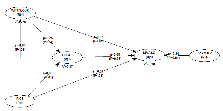
All of the results reported here are from analyses conducted using WarpPLS (). Below is the model with the main results of the analyses. (Click on it to enlarge. Use the "CRTL" and "+" keys to zoom in, and CRTL" and "-" to zoom out.) The arrows explore associations between variables, which are shown within ovals. The meaning of each variable is the following: SexM1F2 = sex, with 1 assigned to males and 2 to females; MVASC = mortality from all cardiovascular diseases (ages 35-69); TKCAL = total calorie intake per day; WHTFLOUR = wheat flour intake (g/day); and RICE = and rice intake (g/day).
The variables to the left of MVASC are the main predictors of interest in the model. The one to the right is a control variable – SexM1F2. The path coefficients (indicated as beta coefficients) reflect the strength of the relationships. A negative beta means that the relationship is negative; i.e., an increase in a variable is associated with a decrease in the variable that it points to. The P values indicate the statistical significance of the relationship; a P lower than 0.05 generally means a significant relationship (95 percent or higher likelihood that the relationship is “real”).
In summary, the model above seems to be telling us that:
- As rice intake increases, wheat flour intake decreases significantly (beta=-0.84; P<0.01). This relationship would be the same if the arrow pointed in the opposite direction. It suggests that there is a sharp divide between rice-consuming and wheat flour-consuming regions.
- As wheat flour intake increases, mortality from all cardiovascular diseases increases significantly (beta=0.32; P<0.01). This is after controlling for the effects of rice and total calorie intake. That is, wheat flour seems to have some inherent properties that make it bad for one’s health, even if one doesn’t consume that many calories.
- As rice intake increases, mortality from all cardiovascular diseases decreases significantly (beta=-0.24; P<0.01). This is after controlling for the effects of wheat flour and total calorie intake. That is, this effect is not entirely due to rice being consumed in place of wheat flour. Still, as you’ll see later in this post, this relationship is nonlinear. Excessive rice intake does not seem to be very good for one’s health either.
- Increases in wheat flour and rice intake are significantly associated with increases in total calorie intake (betas=0.25, 0.33; P<0.01). This may be due to wheat flour and rice intake: (a) being themselves, in terms of their own caloric content, main contributors to the total calorie intake; or (b) causing an increase in calorie intake from other sources. The former is more likely, given the effect below.
- The effect of total calorie intake on mortality from all cardiovascular diseases is insignificant when we control for the effects of rice and wheat flour intakes (beta=0.08; P=0.35). This suggests that neither wheat flour nor rice exerts an effect on mortality from all cardiovascular diseases by increasing total calorie intake from other food sources.
- Being female is significantly associated with a reduction in mortality from all cardiovascular diseases (beta=-0.24; P=0.01). This is to be expected. In other words, men are women with a few design flaws, so to speak. (This situation reverses itself a bit after menopause.)
Wheat flour displaces rice
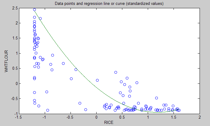
The graph below shows the shape of the association between wheat flour intake (WHTFLOUR) and rice intake (RICE). The values are provided in standardized format; e.g., 0 is the mean (a.k.a. average), 1 is one standard deviation above the mean, and so on. The curve is the best-fitting U curve obtained by the software. It actually has the shape of an exponential decay curve, which can be seen as a section of a U curve. This suggests that wheat flour consumption has strongly displaced rice consumption in several regions in China, and also that wherever rice consumption is high wheat flour consumption tends to be low.
As wheat flour intake goes up, so does cardiovascular disease mortality
The graphs below show the shapes of the association between wheat flour intake (WHTFLOUR) and mortality from all cardiovascular diseases (MVASC). In the first graph, the values are provided in standardized format; e.g., 0 is the mean (or average), 1 is one standard deviation above the mean, and so on. In the second graph, the values are provided in unstandardized format and organized in terciles (each of three equal intervals).
The curve in the first graph is the best-fitting U curve obtained by the software. It is a quasi-linear relationship. The higher the consumption of wheat flour in a county, the higher seems to be the mortality from all cardiovascular diseases. The second graph suggests that mortality in the third tercile, which represents a consumption of wheat flour of 501 to 751 g/day (a lot!), is 69 percent higher than mortality in the first tercile (0 to 251 g/day).
Rice seems to be protective, as long as intake is not too high
The graphs below show the shapes of the association between rice intake (RICE) and mortality from all cardiovascular diseases (MVASC). In the first graph, the values are provided in standardized format. In the second graph, the values are provided in unstandardized format and organized in terciles.
Here the relationship is more complex. The lowest mortality is clearly in the second tercile (206 to 412 g/day). There is a lot of variation in the first tercile, as suggested by the first graph with the U curve. (Remember, as rice intake goes down, wheat flour intake tends to go up.) The U curve here looks similar to the exponential decay curve shown earlier in the post, for the relationship between rice and wheat flour intake.
In fact, the shape of the association between rice intake and mortality from all cardiovascular diseases looks a bit like an “echo” of the shape of the relationship between rice and wheat flour intake. Here is what is creepy. This echo looks somewhat like the first curve (between rice and wheat flour intake), but with wheat flour intake replaced by “death” (i.e., mortality from all cardiovascular diseases).
What does this all mean?
- Wheat flour displacing rice does not look like a good thing. Wheat flour intake seems to have strongly displaced rice intake in the counties where it is heavily consumed. Generally speaking, that does not seem to have been a good thing. It looks like this is generally associated with increased mortality from all cardiovascular diseases.
- High glycemic index food consumption does not seem to be the problem here. Wheat flour and rice have very similar glycemic indices (but generally not glycemic loads; see below). Both lead to blood glucose and insulin spikes. Yet, rice consumption seems protective when it is not excessive. This is true in part (but not entirely) because it largely displaces wheat flour. Moreover, neither rice nor wheat flour consumption seems to be significantly associated with cardiovascular disease via an increase in total calorie consumption. This is a bit of a blow to the theory that high glycemic carbohydrates necessarily cause obesity, diabetes, and eventually cardiovascular disease.
- The problem with wheat flour is … hard to pinpoint, based on the results summarized here. Maybe it is the fact that it is an ultra-refined carbohydrate-rich food; less refined forms of wheat could be healthier. In fact, the glycemic loads of less refined carbohydrate-rich foods tend to be much lower than those of more refined ones (). (Also, boiled brown rice has a glycemic load that is about three times lower than that of whole wheat bread; whereas the glycemic indices are about the same.) Maybe the problem is wheat flour's gluten content. Maybe it is a combination of various factors (), including these.
Notes
- The path coefficients (indicated as beta coefficients) reflect the strength of the relationships; they are a bit like standard univariate (or Pearson) correlation coefficients, except that they take into consideration multivariate relationships (they control for competing effects on each variable). Whenever nonlinear relationships were modeled, the path coefficients were automatically corrected by the software to account for nonlinearity.
- The software used here identifies non-cyclical and mono-cyclical relationships such as logarithmic, exponential, and hyperbolic decay relationships. Once a relationship is identified, data values are corrected and coefficients calculated. This is not the same as log-transforming data prior to analysis, which is widely used but only works if the underlying relationship is logarithmic. Otherwise, log-transforming data may distort the relationship even more than assuming that it is linear, which is what is done by most statistical software tools.
- The R-squared values reflect the percentage of explained variance for certain variables; the higher they are, the better the model fit with the data. In complex and multi-factorial phenomena such as health-related phenomena, many would consider an R-squared of 0.20 as acceptable. Still, such an R-squared would mean that 80 percent of the variance for a particularly variable is unexplained by the data.
- The P values have been calculated using a nonparametric technique, a form of resampling called jackknifing, which does not require the assumption that the data is normally distributed to be met. This and other related techniques also tend to yield more reliable results for small samples, and samples with outliers (as long as the outliers are “good” data, and are not the result of measurement error).
- Only two data points per county were used (for males and females). This increased the sample size of the dataset without artificially reducing variance, which is desirable since the dataset is relatively small. This also allowed for the test of commonsense assumptions (e.g., the protective effects of being female), which is always a good idea in a complex analysis because violation of commonsense assumptions may suggest data collection or analysis error. On the other hand, it required the inclusion of a sex variable as a control variable in the analysis, which is no big deal.
- Since all the data was collected around the same time (late 1980s), this analysis assumes a somewhat static pattern of consumption of rice and wheat flour. In other words, let us assume that variations in consumption of a particular food do lead to variations in mortality. Still, that effect will typically take years to manifest itself. This is a major limitation of this dataset and any related analyses.
- Mortality from schistosomiasis infection (MSCHIST) does not confound the results presented here. Only counties where no deaths from schistosomiasis infection were reported have been included in this analysis. Mortality from all cardiovascular diseases (MVASC) was measured using the variable M059 ALLVASCc (ages 35-69).
This post focuses on the intake of two main plant foods, namely wheat flour and rice intake, and their relationships with mortality from all cardiovascular diseases. After many exploratory multivariate analyses, wheat flour and rice emerged as the plant foods with the strongest associations with mortality from all cardiovascular diseases. Moreover, wheat flour and rice have a strong and inverse relationship with each other, which suggests a “consumption divide”. Since the data is from China in the late 1980s, it is likely that consumption of wheat flour is even higher now. As you’ll see, this picture is alarming.
The main model and results
All of the results reported here are from analyses conducted using WarpPLS (). Below is the model with the main results of the analyses. (Click on it to enlarge. Use the "CRTL" and "+" keys to zoom in, and CRTL" and "-" to zoom out.) The arrows explore associations between variables, which are shown within ovals. The meaning of each variable is the following: SexM1F2 = sex, with 1 assigned to males and 2 to females; MVASC = mortality from all cardiovascular diseases (ages 35-69); TKCAL = total calorie intake per day; WHTFLOUR = wheat flour intake (g/day); and RICE = and rice intake (g/day).
The variables to the left of MVASC are the main predictors of interest in the model. The one to the right is a control variable – SexM1F2. The path coefficients (indicated as beta coefficients) reflect the strength of the relationships. A negative beta means that the relationship is negative; i.e., an increase in a variable is associated with a decrease in the variable that it points to. The P values indicate the statistical significance of the relationship; a P lower than 0.05 generally means a significant relationship (95 percent or higher likelihood that the relationship is “real”).
In summary, the model above seems to be telling us that:
- As rice intake increases, wheat flour intake decreases significantly (beta=-0.84; P<0.01). This relationship would be the same if the arrow pointed in the opposite direction. It suggests that there is a sharp divide between rice-consuming and wheat flour-consuming regions.
- As wheat flour intake increases, mortality from all cardiovascular diseases increases significantly (beta=0.32; P<0.01). This is after controlling for the effects of rice and total calorie intake. That is, wheat flour seems to have some inherent properties that make it bad for one’s health, even if one doesn’t consume that many calories.
- As rice intake increases, mortality from all cardiovascular diseases decreases significantly (beta=-0.24; P<0.01). This is after controlling for the effects of wheat flour and total calorie intake. That is, this effect is not entirely due to rice being consumed in place of wheat flour. Still, as you’ll see later in this post, this relationship is nonlinear. Excessive rice intake does not seem to be very good for one’s health either.
- Increases in wheat flour and rice intake are significantly associated with increases in total calorie intake (betas=0.25, 0.33; P<0.01). This may be due to wheat flour and rice intake: (a) being themselves, in terms of their own caloric content, main contributors to the total calorie intake; or (b) causing an increase in calorie intake from other sources. The former is more likely, given the effect below.
- The effect of total calorie intake on mortality from all cardiovascular diseases is insignificant when we control for the effects of rice and wheat flour intakes (beta=0.08; P=0.35). This suggests that neither wheat flour nor rice exerts an effect on mortality from all cardiovascular diseases by increasing total calorie intake from other food sources.
- Being female is significantly associated with a reduction in mortality from all cardiovascular diseases (beta=-0.24; P=0.01). This is to be expected. In other words, men are women with a few design flaws, so to speak. (This situation reverses itself a bit after menopause.)
Wheat flour displaces rice
The graph below shows the shape of the association between wheat flour intake (WHTFLOUR) and rice intake (RICE). The values are provided in standardized format; e.g., 0 is the mean (a.k.a. average), 1 is one standard deviation above the mean, and so on. The curve is the best-fitting U curve obtained by the software. It actually has the shape of an exponential decay curve, which can be seen as a section of a U curve. This suggests that wheat flour consumption has strongly displaced rice consumption in several regions in China, and also that wherever rice consumption is high wheat flour consumption tends to be low.
As wheat flour intake goes up, so does cardiovascular disease mortality
The graphs below show the shapes of the association between wheat flour intake (WHTFLOUR) and mortality from all cardiovascular diseases (MVASC). In the first graph, the values are provided in standardized format; e.g., 0 is the mean (or average), 1 is one standard deviation above the mean, and so on. In the second graph, the values are provided in unstandardized format and organized in terciles (each of three equal intervals).
The curve in the first graph is the best-fitting U curve obtained by the software. It is a quasi-linear relationship. The higher the consumption of wheat flour in a county, the higher seems to be the mortality from all cardiovascular diseases. The second graph suggests that mortality in the third tercile, which represents a consumption of wheat flour of 501 to 751 g/day (a lot!), is 69 percent higher than mortality in the first tercile (0 to 251 g/day).
Rice seems to be protective, as long as intake is not too high
The graphs below show the shapes of the association between rice intake (RICE) and mortality from all cardiovascular diseases (MVASC). In the first graph, the values are provided in standardized format. In the second graph, the values are provided in unstandardized format and organized in terciles.
Here the relationship is more complex. The lowest mortality is clearly in the second tercile (206 to 412 g/day). There is a lot of variation in the first tercile, as suggested by the first graph with the U curve. (Remember, as rice intake goes down, wheat flour intake tends to go up.) The U curve here looks similar to the exponential decay curve shown earlier in the post, for the relationship between rice and wheat flour intake.
In fact, the shape of the association between rice intake and mortality from all cardiovascular diseases looks a bit like an “echo” of the shape of the relationship between rice and wheat flour intake. Here is what is creepy. This echo looks somewhat like the first curve (between rice and wheat flour intake), but with wheat flour intake replaced by “death” (i.e., mortality from all cardiovascular diseases).
What does this all mean?
- Wheat flour displacing rice does not look like a good thing. Wheat flour intake seems to have strongly displaced rice intake in the counties where it is heavily consumed. Generally speaking, that does not seem to have been a good thing. It looks like this is generally associated with increased mortality from all cardiovascular diseases.
- High glycemic index food consumption does not seem to be the problem here. Wheat flour and rice have very similar glycemic indices (but generally not glycemic loads; see below). Both lead to blood glucose and insulin spikes. Yet, rice consumption seems protective when it is not excessive. This is true in part (but not entirely) because it largely displaces wheat flour. Moreover, neither rice nor wheat flour consumption seems to be significantly associated with cardiovascular disease via an increase in total calorie consumption. This is a bit of a blow to the theory that high glycemic carbohydrates necessarily cause obesity, diabetes, and eventually cardiovascular disease.
- The problem with wheat flour is … hard to pinpoint, based on the results summarized here. Maybe it is the fact that it is an ultra-refined carbohydrate-rich food; less refined forms of wheat could be healthier. In fact, the glycemic loads of less refined carbohydrate-rich foods tend to be much lower than those of more refined ones (). (Also, boiled brown rice has a glycemic load that is about three times lower than that of whole wheat bread; whereas the glycemic indices are about the same.) Maybe the problem is wheat flour's gluten content. Maybe it is a combination of various factors (), including these.
Notes
- The path coefficients (indicated as beta coefficients) reflect the strength of the relationships; they are a bit like standard univariate (or Pearson) correlation coefficients, except that they take into consideration multivariate relationships (they control for competing effects on each variable). Whenever nonlinear relationships were modeled, the path coefficients were automatically corrected by the software to account for nonlinearity.
- The software used here identifies non-cyclical and mono-cyclical relationships such as logarithmic, exponential, and hyperbolic decay relationships. Once a relationship is identified, data values are corrected and coefficients calculated. This is not the same as log-transforming data prior to analysis, which is widely used but only works if the underlying relationship is logarithmic. Otherwise, log-transforming data may distort the relationship even more than assuming that it is linear, which is what is done by most statistical software tools.
- The R-squared values reflect the percentage of explained variance for certain variables; the higher they are, the better the model fit with the data. In complex and multi-factorial phenomena such as health-related phenomena, many would consider an R-squared of 0.20 as acceptable. Still, such an R-squared would mean that 80 percent of the variance for a particularly variable is unexplained by the data.
- The P values have been calculated using a nonparametric technique, a form of resampling called jackknifing, which does not require the assumption that the data is normally distributed to be met. This and other related techniques also tend to yield more reliable results for small samples, and samples with outliers (as long as the outliers are “good” data, and are not the result of measurement error).
- Only two data points per county were used (for males and females). This increased the sample size of the dataset without artificially reducing variance, which is desirable since the dataset is relatively small. This also allowed for the test of commonsense assumptions (e.g., the protective effects of being female), which is always a good idea in a complex analysis because violation of commonsense assumptions may suggest data collection or analysis error. On the other hand, it required the inclusion of a sex variable as a control variable in the analysis, which is no big deal.
- Since all the data was collected around the same time (late 1980s), this analysis assumes a somewhat static pattern of consumption of rice and wheat flour. In other words, let us assume that variations in consumption of a particular food do lead to variations in mortality. Still, that effect will typically take years to manifest itself. This is a major limitation of this dataset and any related analyses.
- Mortality from schistosomiasis infection (MSCHIST) does not confound the results presented here. Only counties where no deaths from schistosomiasis infection were reported have been included in this analysis. Mortality from all cardiovascular diseases (MVASC) was measured using the variable M059 ALLVASCc (ages 35-69).
Labels:
cardiovascular disease,
China Study,
multivariate analysis,
research,
rice,
statistics,
warppls,
wheat
Sunday, June 28, 2026
The China Study II: Carbohydrates, fat, calories, insulin, and obesity
The “great blogosphere debate” rages on regarding the effects of carbohydrates and insulin on health. A lot of action has been happening over the years on Peter’s blog, with knowledgeable folks chiming in, such as Peter himself, Dr. Harris, Dr. B.G. (my sista from anotha mista), John, Nigel, CarbSane, Gunther G., Ed, and many others.
I like to see open debate among people who hold different views consistently, are willing to back them up with at least some evidence, and keep on challenging each other’s views. It is very unlikely that any one person holds the whole truth regarding health matters. Unfortunately this type of debate also confuses a lot of people, particularly those blog lurkers who want to get all of their health information from one single source.
Part of that “great blogosphere debate” debate hinges on the effect of low or high carbohydrate dieting on total calorie consumption. Well, let us see what the China Study II data can tell us about that, and about a few other things.
WarpPLS was used to do the analyses below. For other China Study analyses, many using WarpPLS as well as HealthCorrelator for Excel, click here. For the dataset used here, visit the HealthCorrelator for Excel site and check under the sample datasets area.
The two graphs below show the relationships between various foods, carbohydrates as a percentage of total calories, and total calorie consumption. A basic linear analysis was employed here. As carbohydrates as a percentage of total calories go up, the diet generally becomes a high carbohydrate diet. As it goes down, we see a move to the low carbohydrate end of the scale.
The left parts of the two graphs above are very similar. They tell us that wheat flour consumption is very strongly and negatively associated with rice consumption; i.e., wheat flour displaces rice. They tell us that fruit consumption is positively associated with rice consumption. They also tell us that high wheat flour consumption is strongly and positively associated with being on a high carbohydrate diet.
Neither rice nor fruit consumption has a statistically significant influence on whether the diet is high or low in carbohydrates, with rice having some effect and fruit practically none. But wheat flour consumption does. Increases in wheat flour consumption lead to a clear move toward the high carbohydrate diet end of the scale.
People may find the above results odd, but they should realize that white glutinous rice is only 20 percent carbohydrate, whereas wheat flour products are usually 50 percent carbohydrate or more. Someone consuming 400 g of white rice per day, and no other carbohydrates, will be consuming only 80 g of carbohydrates per day. Someone consuming 400 g of wheat flour products will be consuming 200 g of carbohydrates per day or more.
Fruits generally have much less carbohydrate than white rice, even very sweet fruits. For example, an apple is about 12 percent carbohydrate.
There is a measure that reflects the above differences somewhat. That measure is the glycemic load of a food; not to be confused with the glycemic index.
The right parts of the graphs above tell us something else. They tell us that the percentage of carbohydrates in one’s diet is strongly associated with total calorie consumption, and that this is not the case with percentage of fat in one’s diet.
Given the above, one may be interested in looking at the contribution of individual foods to total calorie consumption. The graph below focuses on that. The results take nonlinearity into consideration; they were generated using the Warp3 algorithm option of WarpPLS.
As you can see, wheat flour consumption is more strongly associated with total calories than rice; both associations being positive. Animal food consumption is negatively associated, somewhat weakly but statistically significantly, with total calories. Let me repeat for emphasis: negatively associated. This means that, as animal food consumption goes up, total calories consumed go down.
These results may seem paradoxical, but keep in mind that animal foods displace wheat flour in this dataset. Note that I am not saying that wheat flour consumption is a confounder; it is controlled for in the model above.
What does this all mean?
Increases in both wheat flour and rice consumption lead to increases in total caloric intake in this dataset. Wheat has a stronger effect. One plausible mechanism for this is abnormally high blood glucose elevations promoting abnormally high insulin responses. Refined carbohydrate-rich foods are particularly good at raising blood glucose fast and keeping it elevated, because they usually contain a lot of easily digestible carbohydrates. The amounts here are significantly higher than anything our body is “designed” to handle.
In normoglycemic folks, that could lead to a “lite” version of reactive hypoglycemia, leading to hunger again after a few hours following food consumption. Insulin drives calories, as fat, into adipocytes. It also keeps those calories there. If insulin is abnormally elevated for longer than it should be, one becomes hungry while storing fat; the fat that should have been released to meet the energy needs of the body. Over time, more calories are consumed; and they add up.
The above interpretation is consistent with the result that the percentage of fat in one’s diet has a statistically non-significant effect on total calorie consumption. That association, although non-significant, is negative. Again, this looks paradoxical, but in this sample animal fat displaces wheat flour.
Moreover, fat leads to no insulin response. If it comes from animals foods, fat is satiating not only because so much in our body is made of fat and/or requires fat to run properly; but also because animal fat contains micronutrients, and helps with the absorption of those micronutrients.
Fats from oils, even the healthy ones like coconut oil, just do not have the latter properties to the same extent as unprocessed fats from animal foods. Think slow-cooking meat with some water, making it release its fat, and then consuming all that fat as a sauce together with the meat.
In the absence of industrialized foods, typically we feel hungry for those foods that contain nutrients that our body needs at a particular point in time. This is a subconscious mechanism, which I believe relies in part on past experience; the reason why we have “acquired tastes”.
Incidentally, fructose leads to no insulin response either. Fructose is naturally found mostly in fruits, in relatively small amounts when compared with industrial foods rich in refined sugars.
And no, the pancreas does not get “tired” from secreting insulin.
The more refined a carbohydrate-rich food is, the more carbohydrates it tends to pack per unit of weight. Carbohydrates also contribute calories; about 4 calories per g. Thus more carbohydrates should translate into more calories.
If someone consumes 50 g of carbohydrates per day in excess of caloric needs, that will translate into about 22.2 g of body fat being stored. Over a month, that will be approximately 666.7 g. Over a year, that will be 8 kg, or 17.6 lbs. Over 5 years, that will be 40 kg, or 88 lbs. This is only from carbohydrates; it does not consider other macronutrients.
There is no need to resort to the “tired pancreas” theory of late-onset insulin resistance to explain obesity in this context. Insulin resistance is, more often than not, a direct result of obesity. Type 2 diabetes is by far the most common type of diabetes; and most type 2 diabetics become obese or overweight before they become diabetic. There is clearly a genetic effect here as well, which seems to moderate the relationship between body fat gain and liver as well as pancreas dysfunction.
It is not that hard to become obese consuming refined carbohydrate-rich foods. It seems to be much harder to become obese consuming animal foods, or fruits.
I like to see open debate among people who hold different views consistently, are willing to back them up with at least some evidence, and keep on challenging each other’s views. It is very unlikely that any one person holds the whole truth regarding health matters. Unfortunately this type of debate also confuses a lot of people, particularly those blog lurkers who want to get all of their health information from one single source.
Part of that “great blogosphere debate” debate hinges on the effect of low or high carbohydrate dieting on total calorie consumption. Well, let us see what the China Study II data can tell us about that, and about a few other things.
WarpPLS was used to do the analyses below. For other China Study analyses, many using WarpPLS as well as HealthCorrelator for Excel, click here. For the dataset used here, visit the HealthCorrelator for Excel site and check under the sample datasets area.
The two graphs below show the relationships between various foods, carbohydrates as a percentage of total calories, and total calorie consumption. A basic linear analysis was employed here. As carbohydrates as a percentage of total calories go up, the diet generally becomes a high carbohydrate diet. As it goes down, we see a move to the low carbohydrate end of the scale.
The left parts of the two graphs above are very similar. They tell us that wheat flour consumption is very strongly and negatively associated with rice consumption; i.e., wheat flour displaces rice. They tell us that fruit consumption is positively associated with rice consumption. They also tell us that high wheat flour consumption is strongly and positively associated with being on a high carbohydrate diet.
Neither rice nor fruit consumption has a statistically significant influence on whether the diet is high or low in carbohydrates, with rice having some effect and fruit practically none. But wheat flour consumption does. Increases in wheat flour consumption lead to a clear move toward the high carbohydrate diet end of the scale.
People may find the above results odd, but they should realize that white glutinous rice is only 20 percent carbohydrate, whereas wheat flour products are usually 50 percent carbohydrate or more. Someone consuming 400 g of white rice per day, and no other carbohydrates, will be consuming only 80 g of carbohydrates per day. Someone consuming 400 g of wheat flour products will be consuming 200 g of carbohydrates per day or more.
Fruits generally have much less carbohydrate than white rice, even very sweet fruits. For example, an apple is about 12 percent carbohydrate.
There is a measure that reflects the above differences somewhat. That measure is the glycemic load of a food; not to be confused with the glycemic index.
The right parts of the graphs above tell us something else. They tell us that the percentage of carbohydrates in one’s diet is strongly associated with total calorie consumption, and that this is not the case with percentage of fat in one’s diet.
Given the above, one may be interested in looking at the contribution of individual foods to total calorie consumption. The graph below focuses on that. The results take nonlinearity into consideration; they were generated using the Warp3 algorithm option of WarpPLS.
As you can see, wheat flour consumption is more strongly associated with total calories than rice; both associations being positive. Animal food consumption is negatively associated, somewhat weakly but statistically significantly, with total calories. Let me repeat for emphasis: negatively associated. This means that, as animal food consumption goes up, total calories consumed go down.
These results may seem paradoxical, but keep in mind that animal foods displace wheat flour in this dataset. Note that I am not saying that wheat flour consumption is a confounder; it is controlled for in the model above.
What does this all mean?
Increases in both wheat flour and rice consumption lead to increases in total caloric intake in this dataset. Wheat has a stronger effect. One plausible mechanism for this is abnormally high blood glucose elevations promoting abnormally high insulin responses. Refined carbohydrate-rich foods are particularly good at raising blood glucose fast and keeping it elevated, because they usually contain a lot of easily digestible carbohydrates. The amounts here are significantly higher than anything our body is “designed” to handle.
In normoglycemic folks, that could lead to a “lite” version of reactive hypoglycemia, leading to hunger again after a few hours following food consumption. Insulin drives calories, as fat, into adipocytes. It also keeps those calories there. If insulin is abnormally elevated for longer than it should be, one becomes hungry while storing fat; the fat that should have been released to meet the energy needs of the body. Over time, more calories are consumed; and they add up.
The above interpretation is consistent with the result that the percentage of fat in one’s diet has a statistically non-significant effect on total calorie consumption. That association, although non-significant, is negative. Again, this looks paradoxical, but in this sample animal fat displaces wheat flour.
Moreover, fat leads to no insulin response. If it comes from animals foods, fat is satiating not only because so much in our body is made of fat and/or requires fat to run properly; but also because animal fat contains micronutrients, and helps with the absorption of those micronutrients.
Fats from oils, even the healthy ones like coconut oil, just do not have the latter properties to the same extent as unprocessed fats from animal foods. Think slow-cooking meat with some water, making it release its fat, and then consuming all that fat as a sauce together with the meat.
In the absence of industrialized foods, typically we feel hungry for those foods that contain nutrients that our body needs at a particular point in time. This is a subconscious mechanism, which I believe relies in part on past experience; the reason why we have “acquired tastes”.
Incidentally, fructose leads to no insulin response either. Fructose is naturally found mostly in fruits, in relatively small amounts when compared with industrial foods rich in refined sugars.
And no, the pancreas does not get “tired” from secreting insulin.
The more refined a carbohydrate-rich food is, the more carbohydrates it tends to pack per unit of weight. Carbohydrates also contribute calories; about 4 calories per g. Thus more carbohydrates should translate into more calories.
If someone consumes 50 g of carbohydrates per day in excess of caloric needs, that will translate into about 22.2 g of body fat being stored. Over a month, that will be approximately 666.7 g. Over a year, that will be 8 kg, or 17.6 lbs. Over 5 years, that will be 40 kg, or 88 lbs. This is only from carbohydrates; it does not consider other macronutrients.
There is no need to resort to the “tired pancreas” theory of late-onset insulin resistance to explain obesity in this context. Insulin resistance is, more often than not, a direct result of obesity. Type 2 diabetes is by far the most common type of diabetes; and most type 2 diabetics become obese or overweight before they become diabetic. There is clearly a genetic effect here as well, which seems to moderate the relationship between body fat gain and liver as well as pancreas dysfunction.
It is not that hard to become obese consuming refined carbohydrate-rich foods. It seems to be much harder to become obese consuming animal foods, or fruits.
Labels:
carbohydrates,
China Study,
dietary fat,
fruit,
insulin,
obesity,
research,
statistics,
warppls
Tuesday, May 26, 2026
The China Study II: Cholesterol seems to protect against cardiovascular disease
First of all, many thanks are due to Dr. Campbell and his collaborators for collecting and compiling the data used in this analysis. The data has been compliled by those researchers to disseminate the data from a study often referred to as the “China Study II”. It has already been analyzed by other bloggers. Notable analyses have been conducted by Ricardo at Canibais e Reis, Stan at Heretic, and Denise at Raw Food SOS.
The analyses in this post differ from those other analyses in various aspects. One of them is that data for males and females were used separately for each county, instead of the totals per county. Only two data points per county were used (for males and females). This increased the sample size of the dataset without artificially reducing variance (for more details, see “Notes” at the end of the post), which is desirable since the dataset is relatively small. This also allowed for the test of commonsense assumptions (e.g., the protective effects of being female), which is always a good idea in a complex analysis because violation of commonsense assumption may suggest data collection or analysis error. On the other hand, it required the inclusion of a sex variable as a control variable in the analysis, which is no big deal.
The analysis was conducted using WarpPLS. Below is the model with the main results of the analysis. (Click on it to enlarge. Use the "CRTL" and "+" keys to zoom in, and CRTL" and "-" to zoom out.) The arrows explore associations between variables, which are shown within ovals. The meaning of each variable is the following: SexM1F2 = sex, with 1 assigned to males and 2 to females; HDLCHOL = HDL cholesterol; TOTCHOL = total cholesterol; MSCHIST = mortality from schistosomiasis infection; and MVASC = mortality from all cardiovascular diseases.
The variables to the left of MVASC are the main predictors of interest in the model – HDLCHOL and TOTCHOL. The ones to the right are control variables – SexM1F2 and MSCHIST. The path coefficients (indicated as beta coefficients) reflect the strength of the relationships. A negative beta means that the relationship is negative; i.e., an increase in a variable is associated with a decrease in the variable that it points to. The P values indicate the statistical significance of the relationship; a P lower than 0.05 generally means a significant relationship (95 percent or higher likelihood that the relationship is “real”).
In summary, this is what the model above is telling us:
- As HDL cholesterol increases, total cholesterol increases significantly (beta=0.48; P<0.01). This is to be expected, as HDL is a main component of total cholesterol, together with VLDL and LDL cholesterol.
- As total cholesterol increases, mortality from all cardiovascular diseases decreases significantly (beta=-0.25; P<0.01). This is to be expected if we assume that total cholesterol is in part an intervening variable between HDL cholesterol and mortality from all cardiovascular diseases. This assumption can be tested through a separate model (more below). Also, there is more to this story, as noted below.
- The effect of HDL cholesterol on mortality from all cardiovascular diseases is nonsignificant when we control for the effect of total cholesterol (beta=-0.08; P=0.26). This suggests that HDL’s protective role is subsumed by the variable total cholesterol, and also that it is possible that there is something else associated with total cholesterol that makes it protective. Otherwise the effect of total cholesterol might have been nonsignificant, and the effect of HDL cholesterol significant (the reverse of what we see here).
- Being female is significantly associated with a reduction in mortality from all cardiovascular diseases (beta=-0.16; P=0.01). This is to be expected. In other words, men are women with a few design flaws. (This situation reverses itself a bit after menopause.)
- Mortality from schistosomiasis infection is significantly and inversely associated with mortality from all cardiovascular diseases (beta=-0.28; P<0.01). This is probably due to those dying from schistosomiasis infection not being entered in the dataset as dying from cardiovascular diseases, and vice-versa.
Two other main components of total cholesterol, in addition to HDL cholesterol, are VLDL and LDL cholesterol. These are carried in particles, known as lipoproteins. VLDL cholesterol is usually represented as a fraction of triglycerides in cholesterol equations (e.g., the Friedewald and Iranian equations). It usually correlates inversely with HDL; that is, as HDL cholesterol increases, usually VLDL cholesterol decreases. Given this and the associations discussed above, it seems that LDL cholesterol is a good candidate for the possible “something else associated with total cholesterol that makes it protective”. But waidaminet! Is it possible that the demon particle, the LDL, serves any purpose other than giving us heart attacks?
The graph below shows the shape of the association between total cholesterol (TOTCHOL) and mortality from all cardiovascular diseases (MVASC). The values are provided in standardized format; e.g., 0 is the average, 1 is one standard deviation above the mean, and so on. The curve is the best-fitting S curve obtained by the software (an S curve is a slightly more complex curve than a U curve).
The graph below shows some of the data in unstandardized format, and organized differently. The data is grouped here in ranges of total cholesterol, which are shown on the horizontal axis. The lowest and highest ranges in the dataset are shown, to highlight the magnitude of the apparently protective effect. Here the two variables used to calculate mortality from all cardiovascular diseases (MVASC; see “Notes” at the end of this post) were added. Clearly the lowest mortality from all cardiovascular diseases is in the highest total cholesterol range, 172.5 to 180; and the highest mortality in the lowest total cholesterol range, 120 to 127.5. The difference is quite large; the mortality in the lowest range is approximately 3.3 times higher than in the highest.
The shape of the S-curve graph above suggests that there are other variables that are confounding the results a bit. Mortality from all cardiovascular diseases does seem to generally go down with increases in total cholesterol, but the smooth inflection point at the middle of the S-curve graph suggests a more complex variation pattern that may be influenced by other variables (e.g., smoking, dietary patterns, or even schistosomiasis infection; see “Notes” at the end of this post).
As mentioned before, total cholesterol is strongly influenced by HDL cholesterol, so below is the model with only HDL cholesterol (HDLCHOL) pointing at mortality from all cardiovascular diseases (MVASC), and the control variable sex (SexM1F2).
The graph above confirms the assumption that HDL’s protective role is subsumed by the variable total cholesterol. When the variable total cholesterol is removed from the model, as it was done above, the protective effect of HDL cholesterol becomes significant (beta=-0.27; P<0.01). The control variable sex (SexM1F2) was retained even in this targeted HDL effect model because of the expected confounding effect of sex; females generally tend to have higher HDL cholesterol and less cardiovascular disease than males.
Below, in the “Notes” section (after the “Reference”) are several notes, some of which are quite technical. Providing them separately hopefully has made the discussion above a bit easier to follow. The notes also point at some limitations of the analysis. This data needs to be analyzed from different angles, using multiple models, so that firmer conclusions can be reached. Still, the overall picture that seems to be emerging is at odds with previous beliefs based on the same dataset.
What could be increasing the apparently protective HDL and total cholesterol in this dataset? High consumption of animal foods, particularly foods rich in saturated fat and cholesterol, are strong candidates. Low consumption of vegetable oils rich in linoleic acid, and of foods rich in refined carbohydrates, are also good candidates. Maybe it is a combination of these.
We need more analyses!
Notes:
- The path coefficients (indicated as beta coefficients) reflect the strength of the relationships; they are a bit like standard univariate (or Pearson) correlation coefficients, except that they take into consideration multivariate relationships (they control for competing effects on each variable).
- The R-squared values reflect the percentage of explained variance for certain variables; the higher they are, the better the model fit with the data. In complex and multi-factorial phenomena such as health-related phenomena, many would consider an R-squared of 0.20 as acceptable. Still, such an R-squared would mean that 80 percent of the variance for a particularly variable is unexplained by the data.
- The P values have been calculated using a nonparametric technique, a form of resampling called jackknifing, which does not require the assumption that the data is normally distributed to be met. This and other related techniques also tend to yield more reliable results for small samples, and samples with outliers (as long as the outliers are “good” data, and are not the result of measurement error).
- Colinearity is an important consideration in models that analyze the effect of multiple predictors on one single variable. This is particularly true for multiple regression models, where there is a temptation of adding many predictors to the model to see which ones come out as the “winners”. This often backfires, as colinearity can severely distort the results. Some multiple regression techniques, such as automated stepwise regression with backward elimination, are particularly vulnerable to this problem. Colinearity is not the same as correlation, and thus is defined and measured differently. Two predictor variables may be significantly correlated and still have low colinearity. A reasonably reliable measure of colinearity is the variance inflation factor. Colinearity was tested in this model, and was found to be low.
- An effort was made here to avoid multiple data points per county (even though this was available for some variables), because this could artificially reduce the variance for each variable, and potentially bias the results. The reason for this is that multiple answers from a single county would normally be somewhat correlated; a higher degree of intra-county correlation than inter-county correlation. The resulting bias would be difficult to control for, via one or more control variables. With only two data points per county, one for males and the other for females, one can control for intra-country correlation by adding a “dummy” sex variable to the analysis, as a control variable. This was done here.
- Mortality from schistosomiasis infection (MSCHIST) is a variable that tends to affect the results in a way that makes it more difficult to make sense of them. Generally this is true for any infectious diseases that significantly affect a population under study. The problem with infection is that people with otherwise good health or habits may get the infection, and people with bad health and habits may not. Since cholesterol is used by the human body to fight disease, it may go up, giving the impression that it is going up for some other reason. Perhaps instead of controlling for its effect, as done here, it would have been better to remove from the analysis those counties with deaths from schistosomiasis infection. (See also this post, and this one.)
- Different parts of the data were collected at different times. It seems that the mortality data is for the period 1986-88, and the rest of the data is for 1989. This may have biased the results somewhat, even though the time lag is not that long, especially if there were changes in certain health trends from one period to the other. For example, major migrations from one county to another could have significantly affected the results.
- The following measures were used, from the China Study II dataset, like the other measures. P002 HDLCHOL, for HDLCHOL; P001 TOTCHOL, for TOTCHOL; and M021 SCHISTOc, for MSCHIST.
- SexM1F2 is a “dummy” variable that was coded with 1 assigned to males and 2 to females. As such, it essentially measures the “degree of femaleness” of the respondents. Being female is generally protective against cardiovascular disease, a situation that reverts itself a bit after menopause.
- MVASC is a composite measure of the two following variables, provided as component measures of mortality from all cardiovascular diseases: M058 ALLVASCb (ages 0-34), and M059 ALLVASCc (ages 35-69). A couple of obvious problems: (a) they does not include data on people older than 69; and (b) they seem to capture a lot of diseases, including some that do not seem like typical cardiovascular diseases. A factor analysis was conducted, and the loadings and cross-loadings suggested good validity. Composite reliability was also good. So essentially MVASC is measured here as a “latent variable” with two “indicators”. Why do this? The reason is that it reduces the biasing effects of incomplete data and measurement error (e.g., exclusion of folks older than 69). By the way, there is always some measurement error in any dataset.
- This note is related to measurement error in connection with the indicators for MVASC. There is something odd about the variables M058 ALLVASCb (ages 0-34), and M059 ALLVASCc (ages 35-69). According to the dataset, mortality from cardiovascular diseases for ages 0-34 is typically higher than for 35-69, for many counties. Given the good validity and reliability for MVASC as a latent variable, it is possible that the values for these two indicator variables were simply swapped by mistake.
The analyses in this post differ from those other analyses in various aspects. One of them is that data for males and females were used separately for each county, instead of the totals per county. Only two data points per county were used (for males and females). This increased the sample size of the dataset without artificially reducing variance (for more details, see “Notes” at the end of the post), which is desirable since the dataset is relatively small. This also allowed for the test of commonsense assumptions (e.g., the protective effects of being female), which is always a good idea in a complex analysis because violation of commonsense assumption may suggest data collection or analysis error. On the other hand, it required the inclusion of a sex variable as a control variable in the analysis, which is no big deal.
The analysis was conducted using WarpPLS. Below is the model with the main results of the analysis. (Click on it to enlarge. Use the "CRTL" and "+" keys to zoom in, and CRTL" and "-" to zoom out.) The arrows explore associations between variables, which are shown within ovals. The meaning of each variable is the following: SexM1F2 = sex, with 1 assigned to males and 2 to females; HDLCHOL = HDL cholesterol; TOTCHOL = total cholesterol; MSCHIST = mortality from schistosomiasis infection; and MVASC = mortality from all cardiovascular diseases.
The variables to the left of MVASC are the main predictors of interest in the model – HDLCHOL and TOTCHOL. The ones to the right are control variables – SexM1F2 and MSCHIST. The path coefficients (indicated as beta coefficients) reflect the strength of the relationships. A negative beta means that the relationship is negative; i.e., an increase in a variable is associated with a decrease in the variable that it points to. The P values indicate the statistical significance of the relationship; a P lower than 0.05 generally means a significant relationship (95 percent or higher likelihood that the relationship is “real”).
In summary, this is what the model above is telling us:
- As HDL cholesterol increases, total cholesterol increases significantly (beta=0.48; P<0.01). This is to be expected, as HDL is a main component of total cholesterol, together with VLDL and LDL cholesterol.
- As total cholesterol increases, mortality from all cardiovascular diseases decreases significantly (beta=-0.25; P<0.01). This is to be expected if we assume that total cholesterol is in part an intervening variable between HDL cholesterol and mortality from all cardiovascular diseases. This assumption can be tested through a separate model (more below). Also, there is more to this story, as noted below.
- The effect of HDL cholesterol on mortality from all cardiovascular diseases is nonsignificant when we control for the effect of total cholesterol (beta=-0.08; P=0.26). This suggests that HDL’s protective role is subsumed by the variable total cholesterol, and also that it is possible that there is something else associated with total cholesterol that makes it protective. Otherwise the effect of total cholesterol might have been nonsignificant, and the effect of HDL cholesterol significant (the reverse of what we see here).
- Being female is significantly associated with a reduction in mortality from all cardiovascular diseases (beta=-0.16; P=0.01). This is to be expected. In other words, men are women with a few design flaws. (This situation reverses itself a bit after menopause.)
- Mortality from schistosomiasis infection is significantly and inversely associated with mortality from all cardiovascular diseases (beta=-0.28; P<0.01). This is probably due to those dying from schistosomiasis infection not being entered in the dataset as dying from cardiovascular diseases, and vice-versa.
Two other main components of total cholesterol, in addition to HDL cholesterol, are VLDL and LDL cholesterol. These are carried in particles, known as lipoproteins. VLDL cholesterol is usually represented as a fraction of triglycerides in cholesterol equations (e.g., the Friedewald and Iranian equations). It usually correlates inversely with HDL; that is, as HDL cholesterol increases, usually VLDL cholesterol decreases. Given this and the associations discussed above, it seems that LDL cholesterol is a good candidate for the possible “something else associated with total cholesterol that makes it protective”. But waidaminet! Is it possible that the demon particle, the LDL, serves any purpose other than giving us heart attacks?
The graph below shows the shape of the association between total cholesterol (TOTCHOL) and mortality from all cardiovascular diseases (MVASC). The values are provided in standardized format; e.g., 0 is the average, 1 is one standard deviation above the mean, and so on. The curve is the best-fitting S curve obtained by the software (an S curve is a slightly more complex curve than a U curve).
The graph below shows some of the data in unstandardized format, and organized differently. The data is grouped here in ranges of total cholesterol, which are shown on the horizontal axis. The lowest and highest ranges in the dataset are shown, to highlight the magnitude of the apparently protective effect. Here the two variables used to calculate mortality from all cardiovascular diseases (MVASC; see “Notes” at the end of this post) were added. Clearly the lowest mortality from all cardiovascular diseases is in the highest total cholesterol range, 172.5 to 180; and the highest mortality in the lowest total cholesterol range, 120 to 127.5. The difference is quite large; the mortality in the lowest range is approximately 3.3 times higher than in the highest.
The shape of the S-curve graph above suggests that there are other variables that are confounding the results a bit. Mortality from all cardiovascular diseases does seem to generally go down with increases in total cholesterol, but the smooth inflection point at the middle of the S-curve graph suggests a more complex variation pattern that may be influenced by other variables (e.g., smoking, dietary patterns, or even schistosomiasis infection; see “Notes” at the end of this post).
As mentioned before, total cholesterol is strongly influenced by HDL cholesterol, so below is the model with only HDL cholesterol (HDLCHOL) pointing at mortality from all cardiovascular diseases (MVASC), and the control variable sex (SexM1F2).
The graph above confirms the assumption that HDL’s protective role is subsumed by the variable total cholesterol. When the variable total cholesterol is removed from the model, as it was done above, the protective effect of HDL cholesterol becomes significant (beta=-0.27; P<0.01). The control variable sex (SexM1F2) was retained even in this targeted HDL effect model because of the expected confounding effect of sex; females generally tend to have higher HDL cholesterol and less cardiovascular disease than males.
Below, in the “Notes” section (after the “Reference”) are several notes, some of which are quite technical. Providing them separately hopefully has made the discussion above a bit easier to follow. The notes also point at some limitations of the analysis. This data needs to be analyzed from different angles, using multiple models, so that firmer conclusions can be reached. Still, the overall picture that seems to be emerging is at odds with previous beliefs based on the same dataset.
What could be increasing the apparently protective HDL and total cholesterol in this dataset? High consumption of animal foods, particularly foods rich in saturated fat and cholesterol, are strong candidates. Low consumption of vegetable oils rich in linoleic acid, and of foods rich in refined carbohydrates, are also good candidates. Maybe it is a combination of these.
We need more analyses!
Notes:
- The path coefficients (indicated as beta coefficients) reflect the strength of the relationships; they are a bit like standard univariate (or Pearson) correlation coefficients, except that they take into consideration multivariate relationships (they control for competing effects on each variable).
- The R-squared values reflect the percentage of explained variance for certain variables; the higher they are, the better the model fit with the data. In complex and multi-factorial phenomena such as health-related phenomena, many would consider an R-squared of 0.20 as acceptable. Still, such an R-squared would mean that 80 percent of the variance for a particularly variable is unexplained by the data.
- The P values have been calculated using a nonparametric technique, a form of resampling called jackknifing, which does not require the assumption that the data is normally distributed to be met. This and other related techniques also tend to yield more reliable results for small samples, and samples with outliers (as long as the outliers are “good” data, and are not the result of measurement error).
- Colinearity is an important consideration in models that analyze the effect of multiple predictors on one single variable. This is particularly true for multiple regression models, where there is a temptation of adding many predictors to the model to see which ones come out as the “winners”. This often backfires, as colinearity can severely distort the results. Some multiple regression techniques, such as automated stepwise regression with backward elimination, are particularly vulnerable to this problem. Colinearity is not the same as correlation, and thus is defined and measured differently. Two predictor variables may be significantly correlated and still have low colinearity. A reasonably reliable measure of colinearity is the variance inflation factor. Colinearity was tested in this model, and was found to be low.
- An effort was made here to avoid multiple data points per county (even though this was available for some variables), because this could artificially reduce the variance for each variable, and potentially bias the results. The reason for this is that multiple answers from a single county would normally be somewhat correlated; a higher degree of intra-county correlation than inter-county correlation. The resulting bias would be difficult to control for, via one or more control variables. With only two data points per county, one for males and the other for females, one can control for intra-country correlation by adding a “dummy” sex variable to the analysis, as a control variable. This was done here.
- Mortality from schistosomiasis infection (MSCHIST) is a variable that tends to affect the results in a way that makes it more difficult to make sense of them. Generally this is true for any infectious diseases that significantly affect a population under study. The problem with infection is that people with otherwise good health or habits may get the infection, and people with bad health and habits may not. Since cholesterol is used by the human body to fight disease, it may go up, giving the impression that it is going up for some other reason. Perhaps instead of controlling for its effect, as done here, it would have been better to remove from the analysis those counties with deaths from schistosomiasis infection. (See also this post, and this one.)
- Different parts of the data were collected at different times. It seems that the mortality data is for the period 1986-88, and the rest of the data is for 1989. This may have biased the results somewhat, even though the time lag is not that long, especially if there were changes in certain health trends from one period to the other. For example, major migrations from one county to another could have significantly affected the results.
- The following measures were used, from the China Study II dataset, like the other measures. P002 HDLCHOL, for HDLCHOL; P001 TOTCHOL, for TOTCHOL; and M021 SCHISTOc, for MSCHIST.
- SexM1F2 is a “dummy” variable that was coded with 1 assigned to males and 2 to females. As such, it essentially measures the “degree of femaleness” of the respondents. Being female is generally protective against cardiovascular disease, a situation that reverts itself a bit after menopause.
- MVASC is a composite measure of the two following variables, provided as component measures of mortality from all cardiovascular diseases: M058 ALLVASCb (ages 0-34), and M059 ALLVASCc (ages 35-69). A couple of obvious problems: (a) they does not include data on people older than 69; and (b) they seem to capture a lot of diseases, including some that do not seem like typical cardiovascular diseases. A factor analysis was conducted, and the loadings and cross-loadings suggested good validity. Composite reliability was also good. So essentially MVASC is measured here as a “latent variable” with two “indicators”. Why do this? The reason is that it reduces the biasing effects of incomplete data and measurement error (e.g., exclusion of folks older than 69). By the way, there is always some measurement error in any dataset.
- This note is related to measurement error in connection with the indicators for MVASC. There is something odd about the variables M058 ALLVASCb (ages 0-34), and M059 ALLVASCc (ages 35-69). According to the dataset, mortality from cardiovascular diseases for ages 0-34 is typically higher than for 35-69, for many counties. Given the good validity and reliability for MVASC as a latent variable, it is possible that the values for these two indicator variables were simply swapped by mistake.
Labels:
cardiovascular disease,
China Study,
cholesterol,
HDL,
LDL,
multivariate analysis,
research,
statistics,
VLDL,
warppls
Tuesday, April 21, 2026
Heavy physical activity may significantly reduce heart disease deaths, especially after age 45
The idea that heavy physical activity is a main trigger of heart attacks is widespread. Often endurance running and cardio-type activities are singled out. Some people refer to this as “death by running”. Others think that strength training has a higher lethal potential. We know based on the Oregon Sudden Unexpected Death Study that this is a myth ().
Here is some evidence that heavy physical activity in fact has a significant protective effect. The graph below shows the number of deaths from coronary heart disease, organized by age group, in longshoremen (dock workers). The shaded bars represent those whose level of activity at work was considered heavy. The unshaded bars represent those whose level of activity at work was considered moderate or light (essentially below the “heavy” level).
The data is based on an old and classic study of 6351 men, aged 35 to 74 years, who were followed either for 22 years, or to death, or to the age of 75. It shows a significant protective effect of heavy activity, especially after age 45 () . The numbers atop the unshaded bars reflect the relative risk of death from coronary heart disease in each age group. For example, in the age group 65-74, the risk among those not in the heavy activity group is 110 percent higher (2.1 times higher) than in the heavy activity group.
It should be noted that this is a cumulative effect, of years of heavy activity. Based on the description of the types of activities performed, and the calories spent, I estimate that the heavy activity group performed the equivalent of a few hours of strength training per week, plus a lot of walking and other light physical activities. The authors of the study concluded that “… repeated bursts of high energy output established a plateau of protection against coronary mortality.”
Heavy physical activity may not make you lose much weight, but has the potential to make you live longer.
Wednesday, March 25, 2026
Want to make coffee less acidic? Add cream to it
The table below is from a 2008 article by Ehlen and colleagues (), showing the amount of erosion caused by various types of beverages, when teeth were exposed to them for 25 h in vitro. Erosion depth is measured in microns. The third row shows the chance probabilities (i.e., P values) associated with the differences in erosion of enamel and root.
As you can see, even diet drinks may cause tooth erosion. That is not to say that if you drink a diet soda occasionally you will destroy your teeth, but regular drinking may be a problem. I discussed this study in a previous post (). After that post was published here some folks asked me about coffee, so I decided to do some research.
Unfortunately coffee by itself can also cause some erosion, primarily because of its acidity. Generally speaking, you want a liquid substance that you are interested in drinking to have a pH as close to 7 as possible, as this pH is neutral (). Tap and mineral water have a pH that is very close to 7. Black coffee seems to have a pH of about 4.8.
Also problematic are drinks containing fermentable carbohydrates, such as sucrose, fructose, glucose, and lactose. These are fermented by acid-producing bacteria. Interestingly, when fermentable carbohydrates are consumed as part of foods that require chewing, such as fruits, acidity is either neutralized or significantly reduced by large amounts of saliva being secreted as a result of the chewing process.
So what to do about coffee?
One possible solution is to add heavy cream to it. A small amount, such as a teaspoon, appears to bring the pH in a cup of coffee to a little over 6. Another advantage of heavy cream is that it has no fermentable carbohydrates; it has no carbohydrates, period. You will have to get over the habit of drinking sweet beverages, including sweet coffee, if you were unfortunate enough to develop that habit (like so many people living in cities today).
It is not easy to find reliable pH values for various foods. I guess dentistry researchers are more interested in ways of repairing damage already done, and there doesn't seem to be much funding available for preventive dentistry research. Some pH testing results from a University of Cincinnati college biology page were available at the time of this writing; they appeared to be reasonably reliable the last time I checked them ().
As you can see, even diet drinks may cause tooth erosion. That is not to say that if you drink a diet soda occasionally you will destroy your teeth, but regular drinking may be a problem. I discussed this study in a previous post (). After that post was published here some folks asked me about coffee, so I decided to do some research.
Unfortunately coffee by itself can also cause some erosion, primarily because of its acidity. Generally speaking, you want a liquid substance that you are interested in drinking to have a pH as close to 7 as possible, as this pH is neutral (). Tap and mineral water have a pH that is very close to 7. Black coffee seems to have a pH of about 4.8.
Also problematic are drinks containing fermentable carbohydrates, such as sucrose, fructose, glucose, and lactose. These are fermented by acid-producing bacteria. Interestingly, when fermentable carbohydrates are consumed as part of foods that require chewing, such as fruits, acidity is either neutralized or significantly reduced by large amounts of saliva being secreted as a result of the chewing process.
So what to do about coffee?
One possible solution is to add heavy cream to it. A small amount, such as a teaspoon, appears to bring the pH in a cup of coffee to a little over 6. Another advantage of heavy cream is that it has no fermentable carbohydrates; it has no carbohydrates, period. You will have to get over the habit of drinking sweet beverages, including sweet coffee, if you were unfortunate enough to develop that habit (like so many people living in cities today).
It is not easy to find reliable pH values for various foods. I guess dentistry researchers are more interested in ways of repairing damage already done, and there doesn't seem to be much funding available for preventive dentistry research. Some pH testing results from a University of Cincinnati college biology page were available at the time of this writing; they appeared to be reasonably reliable the last time I checked them ().
Labels:
coffee,
dental caries,
fruit,
industrial beverages,
research,
tooth decay
Tuesday, January 27, 2026
Subcutaneous versus visceral fat: How to tell the difference?
The photos below, from Wikipedia, show two patterns of abdominal fat deposition. The one on the left is predominantly of subcutaneous abdominal fat deposition. The one on the right is an example of visceral abdominal fat deposition, around internal organs, together with a significant amount of subcutaneous fat deposition as well.
Body fat is not an inert mass used only to store energy. Body fat can be seen as a “distributed organ”, as it secretes a number of hormones into the bloodstream. For example, it secretes leptin, which regulates hunger. It secretes adiponectin, which has many health-promoting properties. It also secretes tumor necrosis factor-alpha (more recently referred to as simply “tumor necrosis factor” in the medical literature), which promotes inflammation. Inflammation is necessary to repair damaged tissue and deal with pathogens, but too much of it does more harm than good.
How does one differentiate subcutaneous from visceral abdominal fat?
Subcutaneous abdominal fat shifts position more easily as one’s body moves. When one is standing, subcutaneous fat often tends to fold around the navel, creating a “mouth” shape. Subcutaneous fat is easier to hold in one’s hand, as shown on the left photo above. Because subcutaneous fat tends to “shift” more easily as one changes the position of the body, if you measure your waist circumference lying down and standing up, and the difference is large (a one-inch difference can be considered large), you probably have a significant amount of subcutaneous fat.
Waist circumference is a variable that reflects individual changes in body fat percentage fairly well. This is especially true as one becomes lean (e.g., around 14-17 percent or less of body fat for men, and 21-24 for women), because as that happens abdominal fat contributes to an increasingly higher proportion of total body fat. For people who are lean, a 1-inch reduction in waist circumference will frequently translate into a 2-3 percent reduction in body fat percentage. Having said that, waist circumference comparisons between individuals are often misleading. Waist-to-fat ratios tend to vary a lot among different individuals (like almost any trait). This means that someone with a 34-inch waist (measured at the navel) may have a lower body fat percentage than someone with a 33-inch waist.
Subcutaneous abdominal fat is hard to mobilize; that is, it is hard to burn through diet and exercise. This is why it is often called the “stubborn” abdominal fat. One reason for the difficulty in mobilizing subcutaneous abdominal fat is that the network of blood vessels is not as dense in the area where this type of fat occurs, as it is with visceral fat. Another reason, which is related to degree of vascularization, is that subcutaneous fat is farther away from the portal vein than visceral fat. As such, it has to travel a longer distance to reach the main “highway” that will take it to other tissues (e.g., muscle) for use as energy.
In terms of health, excess subcutaneous fat is not nearly as detrimental as excess visceral fat. Excess visceral fat typically happens together with excess subcutaneous fat; but not necessarily the other way around. For instance, sumo wrestlers frequently have excess subcutaneous fat, but little or no visceral fat. The more health-detrimental effect of excess visceral fat is probably related to its proximity to the portal vein, which amplifies the negative health effects of excessive pro-inflammatory hormone secretion. Those hormones reach a major transport “highway” rather quickly.
Even though excess subcutaneous body fat is more benign than excess visceral fat, excess body fat of any kind is unlikely to be health-promoting. From an evolutionary perspective, excess body fat impaired agile movement and decreased circulating adiponectin levels; the latter leading to a host of negative health effects. In modern humans, negative health effects may be much less pronounced with subcutaneous than visceral fat, but they will still occur.
Based on studies of isolated hunger-gatherers, it is reasonable to estimate “natural” body fat levels among our Stone Age ancestors, and thus optimal body fat levels in modern humans, to be around 6-13 percent in men and 14–20 percent in women.
If you think that being overweight probably protected some of our Stone Age ancestors during times of famine, here is one interesting factoid to consider. It will take over a month for a man weighing 150 lbs and with 10 percent body fat to die from starvation, and death will not be typically caused by too little body fat being left for use as a source of energy. In starvation, normally death will be caused by heart failure, as the body slowly breaks down muscle tissue (including heart muscle) to maintain blood glucose levels.
References:
Arner, P. (2005). Site differences in human subcutaneous adipose tissue metabolism in obesity. Aesthetic Plastic Surgery, 8(1), 13-17.
Brooks, G.A., Fahey, T.D., & Baldwin, K.M. (2005). Exercise physiology: Human bioenergetics and its applications. Boston, MA: McGraw-Hill.
Fleck, S.J., & Kraemer, W.J. (2004). Designing resistance training programs. Champaign, IL: Human Kinetics.
Taubes, G. (2007). Good calories, bad calories: Challenging the conventional wisdom on diet, weight control, and disease. New York, NY: Alfred A. Knopf.
Body fat is not an inert mass used only to store energy. Body fat can be seen as a “distributed organ”, as it secretes a number of hormones into the bloodstream. For example, it secretes leptin, which regulates hunger. It secretes adiponectin, which has many health-promoting properties. It also secretes tumor necrosis factor-alpha (more recently referred to as simply “tumor necrosis factor” in the medical literature), which promotes inflammation. Inflammation is necessary to repair damaged tissue and deal with pathogens, but too much of it does more harm than good.
How does one differentiate subcutaneous from visceral abdominal fat?
Subcutaneous abdominal fat shifts position more easily as one’s body moves. When one is standing, subcutaneous fat often tends to fold around the navel, creating a “mouth” shape. Subcutaneous fat is easier to hold in one’s hand, as shown on the left photo above. Because subcutaneous fat tends to “shift” more easily as one changes the position of the body, if you measure your waist circumference lying down and standing up, and the difference is large (a one-inch difference can be considered large), you probably have a significant amount of subcutaneous fat.
Waist circumference is a variable that reflects individual changes in body fat percentage fairly well. This is especially true as one becomes lean (e.g., around 14-17 percent or less of body fat for men, and 21-24 for women), because as that happens abdominal fat contributes to an increasingly higher proportion of total body fat. For people who are lean, a 1-inch reduction in waist circumference will frequently translate into a 2-3 percent reduction in body fat percentage. Having said that, waist circumference comparisons between individuals are often misleading. Waist-to-fat ratios tend to vary a lot among different individuals (like almost any trait). This means that someone with a 34-inch waist (measured at the navel) may have a lower body fat percentage than someone with a 33-inch waist.
Subcutaneous abdominal fat is hard to mobilize; that is, it is hard to burn through diet and exercise. This is why it is often called the “stubborn” abdominal fat. One reason for the difficulty in mobilizing subcutaneous abdominal fat is that the network of blood vessels is not as dense in the area where this type of fat occurs, as it is with visceral fat. Another reason, which is related to degree of vascularization, is that subcutaneous fat is farther away from the portal vein than visceral fat. As such, it has to travel a longer distance to reach the main “highway” that will take it to other tissues (e.g., muscle) for use as energy.
In terms of health, excess subcutaneous fat is not nearly as detrimental as excess visceral fat. Excess visceral fat typically happens together with excess subcutaneous fat; but not necessarily the other way around. For instance, sumo wrestlers frequently have excess subcutaneous fat, but little or no visceral fat. The more health-detrimental effect of excess visceral fat is probably related to its proximity to the portal vein, which amplifies the negative health effects of excessive pro-inflammatory hormone secretion. Those hormones reach a major transport “highway” rather quickly.
Even though excess subcutaneous body fat is more benign than excess visceral fat, excess body fat of any kind is unlikely to be health-promoting. From an evolutionary perspective, excess body fat impaired agile movement and decreased circulating adiponectin levels; the latter leading to a host of negative health effects. In modern humans, negative health effects may be much less pronounced with subcutaneous than visceral fat, but they will still occur.
Based on studies of isolated hunger-gatherers, it is reasonable to estimate “natural” body fat levels among our Stone Age ancestors, and thus optimal body fat levels in modern humans, to be around 6-13 percent in men and 14–20 percent in women.
If you think that being overweight probably protected some of our Stone Age ancestors during times of famine, here is one interesting factoid to consider. It will take over a month for a man weighing 150 lbs and with 10 percent body fat to die from starvation, and death will not be typically caused by too little body fat being left for use as a source of energy. In starvation, normally death will be caused by heart failure, as the body slowly breaks down muscle tissue (including heart muscle) to maintain blood glucose levels.
References:
Arner, P. (2005). Site differences in human subcutaneous adipose tissue metabolism in obesity. Aesthetic Plastic Surgery, 8(1), 13-17.
Brooks, G.A., Fahey, T.D., & Baldwin, K.M. (2005). Exercise physiology: Human bioenergetics and its applications. Boston, MA: McGraw-Hill.
Fleck, S.J., & Kraemer, W.J. (2004). Designing resistance training programs. Champaign, IL: Human Kinetics.
Taubes, G. (2007). Good calories, bad calories: Challenging the conventional wisdom on diet, weight control, and disease. New York, NY: Alfred A. Knopf.
Labels:
adiponectin,
body fat,
leptin,
research,
tumor necrosis factor-alpha
Friday, September 26, 2025
The China Study II: Does calorie restriction increase longevity?
The idea that calorie restriction extends human life comes largely from studies of other species. The most relevant of those studies have been conducted with primates, where it has been shown that primates that eat a restricted calorie diet live longer and healthier lives than those that are allowed to eat as much as they want.
There are two main problems with many of the animal studies of calorie restriction. One is that, as natural lifespan decreases, it becomes progressively easier to experimentally obtain major relative lifespan extensions. (That is, it seems much easier to double the lifespan of an organism whose natural lifespan is one day than an organism whose natural lifespan is 80 years.) The second, and main problem in my mind, is that the studies often compare obese with lean animals.
Obesity clearly reduces lifespan in humans, but that is a different claim than the one that calorie restriction increases lifespan. It has often been claimed that Asian countries and regions where calorie intake is reduced display increased lifespan. And this may well be true, but the question remains as to whether this is due to calorie restriction increasing lifespan, or because the rates of obesity are much lower in countries and regions where calorie intake is reduced.
So, what can the China Study II data tell us about the hypothesis that calorie restriction increases longevity?
As it turns out, we can conduct a preliminary test of this hypothesis based on a key assumption. Let us say we compared two populations (e.g., counties in China), based on the following ratio: number of deaths at or after age 70 divided by number deaths before age 70. Let us call this the “ratio of longevity” of a population, or RLONGEV. The assumption is that the population with the highest RLONGEV would be the population with the highest longevity of the two. The reason is that, as longevity goes up, one would expect to see a shift in death patterns, with progressively more people dying old and fewer people dying young.
The 1989 China Study II dataset has two variables that we can use to estimate RLONGEV. They are coded as M005 and M006, and refer to the mortality rates from 35 to 69 and 70 to 79 years of age, respectively. Unfortunately there is no variable for mortality after 79 years of age, which limits the scope of our results somewhat. (This does not totally invalidate the results because we are using a ratio as our measure of longevity, not the absolute number of deaths from 70 to 79 years of age.) Take a look at these two previous China Study II posts (here, and here) for other notes, most of which apply here as well. The notes are at the end of the posts.
All of the results reported here are from analyses conducted using WarpPLS. Below is a model with coefficients of association; it is a simple model, since the hypothesis that we are testing is also simple. (Click on it to enlarge. Use the "CRTL" and "+" keys to zoom in, and CRTL" and "-" to zoom out.) The arrows explore associations between variables, which are shown within ovals. The meaning of each variable is the following: TKCAL = total calorie intake per day; RLONGEV = ratio of longevity; SexM1F2 = sex, with 1 assigned to males and 2 to females.
As one would expect, being female is associated with increased longevity, but the association is just shy of being statistically significant in this dataset (beta=0.14; P=0.07). The association between total calorie intake and longevity is trivial, and statistically indistinguishable from zero (beta=-0.04; P=0.39). Moreover, even though this very weak association is overall negative (or inverse), the sign of the association here does not fully reflect the shape of the association. The shape is that of an inverted J-curve; a.k.a. U-curve. When we split the data into total calorie intake terciles we get a better picture:
The second tercile, which refers to a total daily calorie intake of 2193 to 2844 calories, is the one associated with the highest longevity. The first tercile (with the lowest range of calories) is associated with a higher longevity than the third tercile (with the highest range of calories). These results need to be viewed in context. The average weight in this dataset was about 116 lbs. A conservative estimate of the number of calories needed to maintain this weight without any physical activity would be about 1740. Add about 700 calories to that, for a reasonable and healthy level of physical activity, and you get 2440 calories needed daily for weight maintenance. That is right in the middle of the second tercile.
In simple terms, the China Study II data seems to suggest that those who eat well, but not too much, live the longest. Those who eat little have slightly lower longevity. Those who eat too much seem to have the lowest longevity, perhaps because of the negative effects of excessive body fat.
Because these trends are all very weak from a statistical standpoint, we have to take them with caution. What we can say with more confidence is that the China Study II data does not seem to support the hypothesis that calorie restriction increases longevity.
Reference
Kock, N. (2019). WarpPLS User Manual: Version 6.0. Laredo, Texas: ScriptWarp Systems.
Notes
- The path coefficients (indicated as beta coefficients) reflect the strength of the relationships; they are a bit like standard univariate (or Pearson) correlation coefficients, except that they take into consideration multivariate relationships (they control for competing effects on each variable). Whenever nonlinear relationships were modeled, the path coefficients were automatically corrected by the software to account for nonlinearity.
- Only two data points per county were used (for males and females). This increased the sample size of the dataset without artificially reducing variance, which is desirable since the dataset is relatively small (each county, not individual, is a separate data point is this dataset). This also allowed for the test of commonsense assumptions (e.g., the protective effects of being female), which is always a good idea in a multivariate analyses because violation of commonsense assumptions may suggest data collection or analysis error. On the other hand, it required the inclusion of a sex variable as a control variable in the analysis, which is no big deal.
- Mortality from schistosomiasis infection (MSCHIST) does not confound the results presented here. Only counties where no deaths from schistosomiasis infection were reported have been included in this analysis. The reason for this is that mortality from schistosomiasis infection can severely distort the results in the age ranges considered here. On the other hand, removal of counties with deaths from schistosomiasis infection reduced the sample size, and thus decreased the statistical power of the analysis.
There are two main problems with many of the animal studies of calorie restriction. One is that, as natural lifespan decreases, it becomes progressively easier to experimentally obtain major relative lifespan extensions. (That is, it seems much easier to double the lifespan of an organism whose natural lifespan is one day than an organism whose natural lifespan is 80 years.) The second, and main problem in my mind, is that the studies often compare obese with lean animals.
Obesity clearly reduces lifespan in humans, but that is a different claim than the one that calorie restriction increases lifespan. It has often been claimed that Asian countries and regions where calorie intake is reduced display increased lifespan. And this may well be true, but the question remains as to whether this is due to calorie restriction increasing lifespan, or because the rates of obesity are much lower in countries and regions where calorie intake is reduced.
So, what can the China Study II data tell us about the hypothesis that calorie restriction increases longevity?
As it turns out, we can conduct a preliminary test of this hypothesis based on a key assumption. Let us say we compared two populations (e.g., counties in China), based on the following ratio: number of deaths at or after age 70 divided by number deaths before age 70. Let us call this the “ratio of longevity” of a population, or RLONGEV. The assumption is that the population with the highest RLONGEV would be the population with the highest longevity of the two. The reason is that, as longevity goes up, one would expect to see a shift in death patterns, with progressively more people dying old and fewer people dying young.
The 1989 China Study II dataset has two variables that we can use to estimate RLONGEV. They are coded as M005 and M006, and refer to the mortality rates from 35 to 69 and 70 to 79 years of age, respectively. Unfortunately there is no variable for mortality after 79 years of age, which limits the scope of our results somewhat. (This does not totally invalidate the results because we are using a ratio as our measure of longevity, not the absolute number of deaths from 70 to 79 years of age.) Take a look at these two previous China Study II posts (here, and here) for other notes, most of which apply here as well. The notes are at the end of the posts.
All of the results reported here are from analyses conducted using WarpPLS. Below is a model with coefficients of association; it is a simple model, since the hypothesis that we are testing is also simple. (Click on it to enlarge. Use the "CRTL" and "+" keys to zoom in, and CRTL" and "-" to zoom out.) The arrows explore associations between variables, which are shown within ovals. The meaning of each variable is the following: TKCAL = total calorie intake per day; RLONGEV = ratio of longevity; SexM1F2 = sex, with 1 assigned to males and 2 to females.
As one would expect, being female is associated with increased longevity, but the association is just shy of being statistically significant in this dataset (beta=0.14; P=0.07). The association between total calorie intake and longevity is trivial, and statistically indistinguishable from zero (beta=-0.04; P=0.39). Moreover, even though this very weak association is overall negative (or inverse), the sign of the association here does not fully reflect the shape of the association. The shape is that of an inverted J-curve; a.k.a. U-curve. When we split the data into total calorie intake terciles we get a better picture:
The second tercile, which refers to a total daily calorie intake of 2193 to 2844 calories, is the one associated with the highest longevity. The first tercile (with the lowest range of calories) is associated with a higher longevity than the third tercile (with the highest range of calories). These results need to be viewed in context. The average weight in this dataset was about 116 lbs. A conservative estimate of the number of calories needed to maintain this weight without any physical activity would be about 1740. Add about 700 calories to that, for a reasonable and healthy level of physical activity, and you get 2440 calories needed daily for weight maintenance. That is right in the middle of the second tercile.
In simple terms, the China Study II data seems to suggest that those who eat well, but not too much, live the longest. Those who eat little have slightly lower longevity. Those who eat too much seem to have the lowest longevity, perhaps because of the negative effects of excessive body fat.
Because these trends are all very weak from a statistical standpoint, we have to take them with caution. What we can say with more confidence is that the China Study II data does not seem to support the hypothesis that calorie restriction increases longevity.
Reference
Kock, N. (2019). WarpPLS User Manual: Version 6.0. Laredo, Texas: ScriptWarp Systems.
Notes
- The path coefficients (indicated as beta coefficients) reflect the strength of the relationships; they are a bit like standard univariate (or Pearson) correlation coefficients, except that they take into consideration multivariate relationships (they control for competing effects on each variable). Whenever nonlinear relationships were modeled, the path coefficients were automatically corrected by the software to account for nonlinearity.
- Only two data points per county were used (for males and females). This increased the sample size of the dataset without artificially reducing variance, which is desirable since the dataset is relatively small (each county, not individual, is a separate data point is this dataset). This also allowed for the test of commonsense assumptions (e.g., the protective effects of being female), which is always a good idea in a multivariate analyses because violation of commonsense assumptions may suggest data collection or analysis error. On the other hand, it required the inclusion of a sex variable as a control variable in the analysis, which is no big deal.
- Mortality from schistosomiasis infection (MSCHIST) does not confound the results presented here. Only counties where no deaths from schistosomiasis infection were reported have been included in this analysis. The reason for this is that mortality from schistosomiasis infection can severely distort the results in the age ranges considered here. On the other hand, removal of counties with deaths from schistosomiasis infection reduced the sample size, and thus decreased the statistical power of the analysis.
Monday, June 16, 2025
Compensatory adaptation as a unifying concept: Understanding how we respond to diet and lifestyle changes
Trying to understand each body response to each diet and lifestyle change, individually, is certainly a losing battle. It is a bit like the various attempts to classify organisms that occurred prior to solid knowledge about common descent. Darwin’s theory of evolution is a theory of common descent that makes classification of organisms a much easier and logical task.
Compensatory adaptation (CA) is a broad theoretical framework that hopefully can help us better understand responses to diet and lifestyle changes. CA is a very broad idea, and it has applications at many levels. I have discussed CA in the context of human behavior in general (Kock, 2002), and human behavior toward communication technologies (Kock, 2001; 2005; 2007). Full references and links are at the end of this post.
CA is all about time-dependent adaptation in response to stimuli facing an organism. The stimuli may be in the form of obstacles. From a general human behavior perspective, CA seems to be at the source of many success stories. A few are discussed in the Kock (2002) book; the cases of Helen Keller and Stephen Hawking are among them.
People who have to face serious obstacles sometimes develop remarkable adaptations that make them rather unique individuals. Hawking developed remarkable mental visualization abilities, which seem to be related to some of his most important cosmological discoveries. Keller could recognize an approaching person based on floor vibrations, even though she was blind and deaf. Both achieved remarkable professional success, perhaps not as much in spite but because of their disabilities.
From a diet and lifestyle perspective, CA allows us to make one key prediction. The prediction is that compensatory body responses to diet and lifestyle changes will occur, and they will be aimed at maximizing reproductive success, but with a twist – it’s reproductive success in our evolutionary past! We are stuck with those adaptations, even though we live in modern environments that differ in many respects from the environments where our ancestors lived.
Note that what CA generally tries to maximize is reproductive success, not survival success. From an evolutionary perspective, if an organism generates 30 offspring in a lifetime of 2 years, that organism is more successful in terms of spreading its genes than another that generates 5 offspring in a lifetime of 200 years. This is true as long as the offspring survive to reproductive maturity, which is why extended survival is selected for in some species.
We live longer than chimpanzees in part because our ancestors were “good fathers and mothers”, taking care of their children, who were vulnerable. If our ancestors were not as caring or their children not as vulnerable, maybe this blog would have posts on how to control blood glucose levels to live beyond the ripe old age of 50!
The CA prediction related to responses aimed at maximizing reproductive success is a straightforward enough prediction. The difficult part is to understand how CA works in specific contexts (e.g., Paleolithic dieting, low carbohydrate dieting, calorie restriction), and what we can do to take advantage (or work around) CA mechanisms. For that we need a good understanding of evolution, some common sense, and also good empirical research.
One thing we can say with some degree of certainty is that CA leads to short-term and long-term responses, and that those are likely to be different from one another. The reason is that a particular diet and lifestyle change affected the reproductive success of our Paleolithic ancestors in different ways, depending on whether it was a short-term or long-term change. The same is true for CA responses at different stages of one’s life, such as adolescence and middle age; they are also different.
This is the main reason why many diets that work very well in the beginning (e.g., first months) frequently cease to work as well after a while (e.g., a year).
Also, CA leads to psychological responses, which is one of the key reasons why most diets fail. Without a change in mindset, more often than not one tends to return to old habits. Hunger is not only a physiological response; it is also a psychological response, and the psychological part can be a lot stronger than the physiological one.
It is because of CA that a one-month moderately severe calorie restriction period (e.g., 30% below basal metabolic rate) will lead to significant body fat loss, as the body produces hormonal responses to several stimuli (e.g., glycogen depletion) in a compensatory way, but still “assuming” that liberal amounts of food will soon be available. Do that for one year and the body will respond differently, “assuming” that food scarcity is no longer short-term and thus that it requires different, and possibly more drastic, responses.
Among other things, prolonged severe calorie restriction will lead to a significant decrease in metabolism, loss of libido, loss of morale, and physical as well as mental fatigue. It will make the body hold on to its fat reserves a lot more greedily, and induce a number of psychological responses to force us to devour anything in sight. In several people it will induce psychosis. The results of prolonged starvation experiments, such as the Biosphere 2 experiments, are very instructive in this respect.
It is because of CA that resistance exercise leads to muscle gain. Muscle gain is actually a body’s response to reasonable levels of anaerobic exercise. The exercise itself leads to muscle damage, and short-term muscle loss. The gain comes after the exercise, in the following hours and days (and with proper nutrition), as the body tries to repair the muscle damage. Here the body “assumes” that the level of exertion that caused it will continue in the near future.
If you increase the effort (by increasing resistance or repetitions, within a certain range) at each workout session, the body will be constantly adapting, up to a limit. If there is no increase, adaptation will stop; it will even regress if exercise ceases altogether. Do too much resistance training (e.g., multiple workout sessions everyday), and the body will react differently. Among other things, it will create deterrents in the form of pain (through inflammation), physical and mental fatigue, and even psychological aversion to resistance exercise.
CA processes have a powerful effect on one’s body, and even on one’s mind!
References:
Kock, N. (2001). Compensatory Adaptation to a Lean Medium: An Action Research Investigation of Electronic Communication in Process Improvement Groups. IEEE Transactions on Professional Communication, 44(4), 267-285.
Kock, N. (2002). Compensatory Adaptation: Understanding How Obstacles Can Lead to Success. Infinity Publishing, Haverford, PA. (Additional link.)
Kock, N. (2005). Compensatory adaptation to media obstacles: An experimental study of process redesign dyads. Information Resources Management Journal, 18(2), 41-67.
Kock, N. (2007). Media Naturalness and Compensatory Encoding: The Burden of Electronic Media Obstacles is on Senders. Decision Support Systems, 44(1), 175-187.
Compensatory adaptation (CA) is a broad theoretical framework that hopefully can help us better understand responses to diet and lifestyle changes. CA is a very broad idea, and it has applications at many levels. I have discussed CA in the context of human behavior in general (Kock, 2002), and human behavior toward communication technologies (Kock, 2001; 2005; 2007). Full references and links are at the end of this post.
CA is all about time-dependent adaptation in response to stimuli facing an organism. The stimuli may be in the form of obstacles. From a general human behavior perspective, CA seems to be at the source of many success stories. A few are discussed in the Kock (2002) book; the cases of Helen Keller and Stephen Hawking are among them.
People who have to face serious obstacles sometimes develop remarkable adaptations that make them rather unique individuals. Hawking developed remarkable mental visualization abilities, which seem to be related to some of his most important cosmological discoveries. Keller could recognize an approaching person based on floor vibrations, even though she was blind and deaf. Both achieved remarkable professional success, perhaps not as much in spite but because of their disabilities.
From a diet and lifestyle perspective, CA allows us to make one key prediction. The prediction is that compensatory body responses to diet and lifestyle changes will occur, and they will be aimed at maximizing reproductive success, but with a twist – it’s reproductive success in our evolutionary past! We are stuck with those adaptations, even though we live in modern environments that differ in many respects from the environments where our ancestors lived.
Note that what CA generally tries to maximize is reproductive success, not survival success. From an evolutionary perspective, if an organism generates 30 offspring in a lifetime of 2 years, that organism is more successful in terms of spreading its genes than another that generates 5 offspring in a lifetime of 200 years. This is true as long as the offspring survive to reproductive maturity, which is why extended survival is selected for in some species.
We live longer than chimpanzees in part because our ancestors were “good fathers and mothers”, taking care of their children, who were vulnerable. If our ancestors were not as caring or their children not as vulnerable, maybe this blog would have posts on how to control blood glucose levels to live beyond the ripe old age of 50!
The CA prediction related to responses aimed at maximizing reproductive success is a straightforward enough prediction. The difficult part is to understand how CA works in specific contexts (e.g., Paleolithic dieting, low carbohydrate dieting, calorie restriction), and what we can do to take advantage (or work around) CA mechanisms. For that we need a good understanding of evolution, some common sense, and also good empirical research.
One thing we can say with some degree of certainty is that CA leads to short-term and long-term responses, and that those are likely to be different from one another. The reason is that a particular diet and lifestyle change affected the reproductive success of our Paleolithic ancestors in different ways, depending on whether it was a short-term or long-term change. The same is true for CA responses at different stages of one’s life, such as adolescence and middle age; they are also different.
This is the main reason why many diets that work very well in the beginning (e.g., first months) frequently cease to work as well after a while (e.g., a year).
Also, CA leads to psychological responses, which is one of the key reasons why most diets fail. Without a change in mindset, more often than not one tends to return to old habits. Hunger is not only a physiological response; it is also a psychological response, and the psychological part can be a lot stronger than the physiological one.
It is because of CA that a one-month moderately severe calorie restriction period (e.g., 30% below basal metabolic rate) will lead to significant body fat loss, as the body produces hormonal responses to several stimuli (e.g., glycogen depletion) in a compensatory way, but still “assuming” that liberal amounts of food will soon be available. Do that for one year and the body will respond differently, “assuming” that food scarcity is no longer short-term and thus that it requires different, and possibly more drastic, responses.
Among other things, prolonged severe calorie restriction will lead to a significant decrease in metabolism, loss of libido, loss of morale, and physical as well as mental fatigue. It will make the body hold on to its fat reserves a lot more greedily, and induce a number of psychological responses to force us to devour anything in sight. In several people it will induce psychosis. The results of prolonged starvation experiments, such as the Biosphere 2 experiments, are very instructive in this respect.
It is because of CA that resistance exercise leads to muscle gain. Muscle gain is actually a body’s response to reasonable levels of anaerobic exercise. The exercise itself leads to muscle damage, and short-term muscle loss. The gain comes after the exercise, in the following hours and days (and with proper nutrition), as the body tries to repair the muscle damage. Here the body “assumes” that the level of exertion that caused it will continue in the near future.
If you increase the effort (by increasing resistance or repetitions, within a certain range) at each workout session, the body will be constantly adapting, up to a limit. If there is no increase, adaptation will stop; it will even regress if exercise ceases altogether. Do too much resistance training (e.g., multiple workout sessions everyday), and the body will react differently. Among other things, it will create deterrents in the form of pain (through inflammation), physical and mental fatigue, and even psychological aversion to resistance exercise.
CA processes have a powerful effect on one’s body, and even on one’s mind!
References:
Kock, N. (2001). Compensatory Adaptation to a Lean Medium: An Action Research Investigation of Electronic Communication in Process Improvement Groups. IEEE Transactions on Professional Communication, 44(4), 267-285.
Kock, N. (2002). Compensatory Adaptation: Understanding How Obstacles Can Lead to Success. Infinity Publishing, Haverford, PA. (Additional link.)
Kock, N. (2005). Compensatory adaptation to media obstacles: An experimental study of process redesign dyads. Information Resources Management Journal, 18(2), 41-67.
Kock, N. (2007). Media Naturalness and Compensatory Encoding: The Burden of Electronic Media Obstacles is on Senders. Decision Support Systems, 44(1), 175-187.
Labels:
body fat,
compensatory adaptation,
evolution,
muscle gain,
research
Saturday, April 26, 2025
The amounts of water, carbohydrates, fat, and protein lost during a 30-day fast
When it comes to losing fat and maintaining muscle, at the same time, there are no shortcuts. The process generally has to be slow to be healthy. When one loses a lot of weight in a few days, most of what is being lost is water, followed by carbohydrates. (Carbohydrates are stored as liver and muscle glycogen.) Smaller amounts of fat and protein are also lost. The figure below (see reference at the end of post) shows the weights in grams of stored water, carbohydrates (glycogen), fat, and protein lost during a 30-day water fast.
On the first few days of the fast a massive amount of water is lost, even though drinking water is allowed in this type of fast. A significant amount of glycogen is lost as well. This is no surprise. About 2.6 g of water are lost for each 1 g of glycogen lost. That is, water is stored by the body proportionally to the amount of glycogen stored. People who do strength training on a regular basis tend to store more glycogen, particular in muscle tissue; this is a compensatory adaptation. Those folks also tend to store more water.
Not many people will try a 30-day fast. Still, the figure above has implications for almost everybody.
One implication is that if you use a bioimpedance scale to measure your body fat, you can bet that it will give you fairly misleading results if your glycogen stores are depleted. Your body fat percentage will be overestimated, because water and glycogen are lean body mass. This will happen with low carbohydrate dieters who regularly engage in intense physical exercise, aerobic or anaerobic. The physical exercise will deplete glycogen stores, which will typically not be fully replenished due to the low intake of carbohydrates.
Light endurance exercise (e.g., walking) is normally easier to maintain with a depleted “glycogen tank” than strength training, because light endurance exercise relies heavily on fat oxidation. It uses glycogen, but more slowly. Strength training, on the other hand, relies much more heavily on glycogen while it is being conducted (significant fat oxidation occurs after the exercise session), and is difficult to do effectively with a depleted “glycogen tank”.
Strength training practitioners often will feel fatigued, and will probably be unable to generate supercompensation, if their “glycogen tank” is constantly depleted. Still, compensatory adaptation can work its “magic” if one persists, and lead to long term adaptations that make athletes rely much more heavily on fat than the average person as a fuel for strength training and other types of anaerobic exercise. Some people seem to be naturally more likely to achieve this type of compensatory adaptation; others may never do so, no matter how hard they try.
Another implication is that you should not worry about short-term weight variations if your focus is on losing body fat. Losing stored water and glycogen may give you an illusion of body fat loss, but it will be only that – an illusion. You may recall this post, where body fat loss coupled with muscle gain led to some weight gain and yet to a much improved body composition. That is, the participants ended up leaner, even though they also weighed more.
The figure above also gives us some hints as to what happens with very low carbohydrate dieting (i.e., daily consumption of less than 20 grams of carbohydrates); at least at the beginning, before long term compensatory adaptation. This type of dieting mimics fasting as far as glycogen depletion is concerned, especially if protein intake is low, and has many positive short term health benefits. The depletion is not as quick as in a fast because a high fat and/or protein diet promotes higher rates of fat/protein oxidation and ketosis than fasting, which spare glycogen. (Yes, dietary fat spares glycogen. It also spares muscle tissue.) Still, the related loss of stored water is analogous to that of fasting, over a slightly longer period. The result is a marked weight loss at the beginning of the diet. This is an illusion as far as body fat loss is concerned.
Dietary protein cannot be used directly for glycogenesis; i.e., for replenishing glycogen stores. Dietary protein must first be used to generate glucose, through a process called gluconeogenesis. The glucose is then used for liver and muscle glycogenesis, among other things. This process is less efficient than glycogenesis based on carbohydrate sources (particularly carbohydrate sources that combine fructose and glucose), which is why for quite a few people (but not all) it is difficult to replenish glycogen stores and stimulate muscle growth on very low carbohydrate diets.
Glycogen depletion appears to be very healthy, but most of the empirical evidence seems to suggest that it is the depletion that creates a hormonal mix that is particularly health-promoting, not being permanently in the depleted state. In this sense, the extent of the glycogen depletion that is happening should be positively associated with the health benefits. And significant glycogen depletion can only happen if glycogen stores are at least half full to start with.
Reference
Wilmore, J.H., Costill, D.L., & Kenney, W.L. (2007). Physiology of sport and exercise. Champaign, IL: Human Kinetics. [Note: the figure may be found in a different edition.]
On the first few days of the fast a massive amount of water is lost, even though drinking water is allowed in this type of fast. A significant amount of glycogen is lost as well. This is no surprise. About 2.6 g of water are lost for each 1 g of glycogen lost. That is, water is stored by the body proportionally to the amount of glycogen stored. People who do strength training on a regular basis tend to store more glycogen, particular in muscle tissue; this is a compensatory adaptation. Those folks also tend to store more water.
Not many people will try a 30-day fast. Still, the figure above has implications for almost everybody.
One implication is that if you use a bioimpedance scale to measure your body fat, you can bet that it will give you fairly misleading results if your glycogen stores are depleted. Your body fat percentage will be overestimated, because water and glycogen are lean body mass. This will happen with low carbohydrate dieters who regularly engage in intense physical exercise, aerobic or anaerobic. The physical exercise will deplete glycogen stores, which will typically not be fully replenished due to the low intake of carbohydrates.
Light endurance exercise (e.g., walking) is normally easier to maintain with a depleted “glycogen tank” than strength training, because light endurance exercise relies heavily on fat oxidation. It uses glycogen, but more slowly. Strength training, on the other hand, relies much more heavily on glycogen while it is being conducted (significant fat oxidation occurs after the exercise session), and is difficult to do effectively with a depleted “glycogen tank”.
Strength training practitioners often will feel fatigued, and will probably be unable to generate supercompensation, if their “glycogen tank” is constantly depleted. Still, compensatory adaptation can work its “magic” if one persists, and lead to long term adaptations that make athletes rely much more heavily on fat than the average person as a fuel for strength training and other types of anaerobic exercise. Some people seem to be naturally more likely to achieve this type of compensatory adaptation; others may never do so, no matter how hard they try.
Another implication is that you should not worry about short-term weight variations if your focus is on losing body fat. Losing stored water and glycogen may give you an illusion of body fat loss, but it will be only that – an illusion. You may recall this post, where body fat loss coupled with muscle gain led to some weight gain and yet to a much improved body composition. That is, the participants ended up leaner, even though they also weighed more.
The figure above also gives us some hints as to what happens with very low carbohydrate dieting (i.e., daily consumption of less than 20 grams of carbohydrates); at least at the beginning, before long term compensatory adaptation. This type of dieting mimics fasting as far as glycogen depletion is concerned, especially if protein intake is low, and has many positive short term health benefits. The depletion is not as quick as in a fast because a high fat and/or protein diet promotes higher rates of fat/protein oxidation and ketosis than fasting, which spare glycogen. (Yes, dietary fat spares glycogen. It also spares muscle tissue.) Still, the related loss of stored water is analogous to that of fasting, over a slightly longer period. The result is a marked weight loss at the beginning of the diet. This is an illusion as far as body fat loss is concerned.
Dietary protein cannot be used directly for glycogenesis; i.e., for replenishing glycogen stores. Dietary protein must first be used to generate glucose, through a process called gluconeogenesis. The glucose is then used for liver and muscle glycogenesis, among other things. This process is less efficient than glycogenesis based on carbohydrate sources (particularly carbohydrate sources that combine fructose and glucose), which is why for quite a few people (but not all) it is difficult to replenish glycogen stores and stimulate muscle growth on very low carbohydrate diets.
Glycogen depletion appears to be very healthy, but most of the empirical evidence seems to suggest that it is the depletion that creates a hormonal mix that is particularly health-promoting, not being permanently in the depleted state. In this sense, the extent of the glycogen depletion that is happening should be positively associated with the health benefits. And significant glycogen depletion can only happen if glycogen stores are at least half full to start with.
Reference
Wilmore, J.H., Costill, D.L., & Kenney, W.L. (2007). Physiology of sport and exercise. Champaign, IL: Human Kinetics. [Note: the figure may be found in a different edition.]
Labels:
body fat,
fasting,
glycogen depletion,
muscle gain,
research
Wednesday, January 29, 2025
Growth hormone: The fountain of youth
Growth hormone, also known as human growth hormone, seems to be implicated in a number of metabolic conditions associated with aging, and, more generally, poor health.
In adults, growth hormone deficiency is associated with: decreased calcium retention and osteoporosis, loss of muscle mass, increased fat deposition, decreased protein synthesis, and immunodeficiency. In children, growth hormone deficiency is associated with stunted growth.
Levels of growth hormones decline with age, and their decrease is believed to contribute to the aging process. Abdominal obesity is associated with low levels of growth hormone, and is also associated with the onset of the metabolic syndrome, a precursor of diabetes and cardiovascular disease.
While there are many treatments in the market that include exogenous administration of growth hormones (e.g., through injection), there are several natural ways in which growth hormone levels can be increased. These natural ways can often lead to more effective and sustainable results than prescription drugs.
For example, fasting stimulates the natural production of growth hormone. So does vigorous exercise, particularly resistance exercise with a strong anaerobic component (not cardio though). And, to the surprise of many people, deep sleep stimulates the natural production of growth hormone, perhaps more than anything else. (Although only once every 24 hours; sleeping all day does not seem to work.)
In fact, during a 24-hour period, growth hormone typically varies in pulses, or cycles. The pulses are somewhat uniformly distributed during the day, with a peak occurring at night. The graph below (source: Fleck & Kraemer, 2004) plots the typical variation of growth hormone during a 12-hour period, including the deep sleep period.
As you can see, growth hormone peaks during deep sleep; which is achieved a few hours after one goes to bed, and not too long before one wakes up.
By the way, if you want to know more about human physiology and metabolism, forget about popular diet and exercise books. Next to peer-reviewed academic articles (which are often hard to read), the best sources are college textbooks used in courses on physical education, nutrition, endocrinology, and related topics. The book from which the graph above was taken (Fleck & Kraemer, 2004), is a superb example of that.
Reference:
Fleck, S.J., & Kraemer, W.J. (2004). Designing resistance training programs. Champaign, IL: Human Kinetics.
In adults, growth hormone deficiency is associated with: decreased calcium retention and osteoporosis, loss of muscle mass, increased fat deposition, decreased protein synthesis, and immunodeficiency. In children, growth hormone deficiency is associated with stunted growth.
Levels of growth hormones decline with age, and their decrease is believed to contribute to the aging process. Abdominal obesity is associated with low levels of growth hormone, and is also associated with the onset of the metabolic syndrome, a precursor of diabetes and cardiovascular disease.
While there are many treatments in the market that include exogenous administration of growth hormones (e.g., through injection), there are several natural ways in which growth hormone levels can be increased. These natural ways can often lead to more effective and sustainable results than prescription drugs.
For example, fasting stimulates the natural production of growth hormone. So does vigorous exercise, particularly resistance exercise with a strong anaerobic component (not cardio though). And, to the surprise of many people, deep sleep stimulates the natural production of growth hormone, perhaps more than anything else. (Although only once every 24 hours; sleeping all day does not seem to work.)
In fact, during a 24-hour period, growth hormone typically varies in pulses, or cycles. The pulses are somewhat uniformly distributed during the day, with a peak occurring at night. The graph below (source: Fleck & Kraemer, 2004) plots the typical variation of growth hormone during a 12-hour period, including the deep sleep period.
As you can see, growth hormone peaks during deep sleep; which is achieved a few hours after one goes to bed, and not too long before one wakes up.
By the way, if you want to know more about human physiology and metabolism, forget about popular diet and exercise books. Next to peer-reviewed academic articles (which are often hard to read), the best sources are college textbooks used in courses on physical education, nutrition, endocrinology, and related topics. The book from which the graph above was taken (Fleck & Kraemer, 2004), is a superb example of that.
Reference:
Fleck, S.J., & Kraemer, W.J. (2004). Designing resistance training programs. Champaign, IL: Human Kinetics.
Sunday, September 29, 2024
Body fat and disease: How much body fat can I lose in one day?
Body fat is not an inert deposit of energy. It can be seen as a distributed endocrine organ. Body fat cells, or adipocytes, secrete a number of different hormones into the bloodstream. Major hormones secreted by adipose tissue are adiponectin and leptin.
Estrogen is also secreted by body fat, which is one of the reasons why obesity is associated with infertility. (Yes, abnormally high levels of estrogen can reduce fertility in both men and women.) Moreover, body fat secretes tumor necrosis factor, a hormone that is associated with generalized inflammation and a number of diseases, including cancer, when in excess.
The reduction in circulating tumor necrosis factor and other pro-inflammatory hormones as one loses weight is one reason why non-obese people usually experience fewer illness symptoms than those who are obese in any given year, other things being equal. For example, the non-obese will have fewer illness episodes that require full rest during the flu season. In those who are obese, the inflammatory response accompanying an illness (which is necessary for recovery) will often be exaggerated.
The exaggerated inflammatory response to illness often seen in the obese is one indication that obesity in an unnatural state for humans. It is reasonable to assume that it was non-adaptive for our Paleolithic ancestors to be unable to perform daily activities because of an illness. The adaptive response would be physical discomfort, but not to the extent that one would require full rest for a few days to fully recover.
Inflammation markers such as C-reactive protein are positively correlated with body fat. As body fat increases, so does inflammation throughout the body. Lipid metabolism is negatively affected by excessive body fat, and so is glucose metabolism. Obesity is associated with leptin and insulin resistance, which are precursors of diabetes type 2.
Some body fat is necessary for survival; that is normally called essential body fat. The table below (from Wikipedia) shows various levels of body fat, including essential levels. Also shown are body fat levels found in athletes, as well as fit, “not so fit” (indicated as "Acceptable"), and obese individuals. Women normally have higher healthy levels of body fat than men.
If one is obese, losing body fat becomes a very high priority for health reasons.
There are many ways in which body fat can be measured.
When one loses body fat through fasting, the number of adipocytes is not actually reduced. It is the amount of fat stored in adipocytes that is reduced.
How much body fat can a person lose in one day?
Let us consider a man, John, whose weight is 170 lbs (77 kg), and whose body fat percentage is 30 percent. John carries around 51 lbs (23 kg) of body fat. Standing up is, for John, a form of resistance exercise. So is climbing stairs.
During a 24-hour fast, John’s basal metabolic rate is estimated at about 2,550 kcal/day. This is the number of calories John would spend doing nothing the whole day. It can vary a lot for different individuals; here it is calculated as 15 times John’s weight in lbs.
The 2,550 kcal/day is likely an overestimation for John, because the body adjusts its metabolic rate downwards during a fast, leading to fewer calories being burned.
Typically women have lower basal metabolic rates than men of equal weight.
For the sake of discussion, we expect each gram of John’s body fat to contribute about 8 kcals of energy, assuming a rate of conversion of body fat to calories of about 90 percent.
Thus during a 24-hour fast John burns about 318 g of fat, or about 0.7 lbs. In reality, the actual amount may be lower (e.g., 0.35 lbs), because of the body's own down-regulation of its basal metabolic rate during a fast. This down-regulation varies widely across different individuals, and is generally small.
Many people think that this is not much for the effort. The reality is that body fat loss is a long term game, and cannot be achieved through fasting alone; this is a discussion for another post.
It is worth noting that intermittent fasting (e.g., one 24-hour fast per week) has many other health benefits, even if no overall calorie restriction occurs. That is, intermittent fasting is associated with health benefits even if one fasts every other day, and eats twice one's normal intake on the non-fasting days.
Some of the calories being burned during John's 24-hour fast will be from glucose, mostly from John’s glycogen reserves in the liver if he is at rest. Muscle glycogen stores, which store more glucose substrate (i.e., material for production of glucose) than liver glycogen, are mobilized primarily through anaerobic exercise.
Very few muscle-derived calories end up being used through the protein and glycogen breakdown pathways in a 24-hour fast. John’s liver glycogen reserves, plus the body’s own self-regulation, will largely spare muscle tissue.
The idea that one has to eat every few hours to avoid losing muscle tissue is complete nonsense. Muscle buildup and loss happen all the time through amino acid turnover.
Net muscle gain occurs when the balance is tipped in favor of buildup, to which resistance exercise and the right hormonal balance (including elevated levels of insulin) contribute.
One of the best ways to lose muscle tissue is lack of use. If John's arm were immobilized in a cast, he would lose muscle tissue in that arm even if he ate every 30 minutes.
Longer fasts (e.g., lasting multiple days, with only water being consumed) will invariably lead to some (possibly significant) muscle breakdown, as muscle is the main store of glucose-generating substrate in the human body.
In a 24-hour fast (a relatively short fast), the body will adjust its metabolism so that most of its energy needs are met by fat and related byproducts. This includes ketones, which are produced by the liver based on dietary and body fat.
How come some people can easily lose 2 or 3 pounds of weight in one day?
Well, it is not body fat that is being lost, or muscle. It is water, which may account for as much as 75 percent of one’s body weight.
References:
Elliott, W.H., & Elliott, D.C. (2009). Biochemistry and molecular biology. New York: NY: Oxford University Press.
Fleck, S.J., & Kraemer, W.J. (2004). Designing resistance training programs. Champaign, IL: Human Kinetics.
Large, V., Peroni, O., Letexier, D., Ray, H., & Beylot, M. (2004). Metabolism of lipids in human white adipocyte. Diabetes & Metabolism, 30(4), 294-309.
Estrogen is also secreted by body fat, which is one of the reasons why obesity is associated with infertility. (Yes, abnormally high levels of estrogen can reduce fertility in both men and women.) Moreover, body fat secretes tumor necrosis factor, a hormone that is associated with generalized inflammation and a number of diseases, including cancer, when in excess.
The reduction in circulating tumor necrosis factor and other pro-inflammatory hormones as one loses weight is one reason why non-obese people usually experience fewer illness symptoms than those who are obese in any given year, other things being equal. For example, the non-obese will have fewer illness episodes that require full rest during the flu season. In those who are obese, the inflammatory response accompanying an illness (which is necessary for recovery) will often be exaggerated.
The exaggerated inflammatory response to illness often seen in the obese is one indication that obesity in an unnatural state for humans. It is reasonable to assume that it was non-adaptive for our Paleolithic ancestors to be unable to perform daily activities because of an illness. The adaptive response would be physical discomfort, but not to the extent that one would require full rest for a few days to fully recover.
Inflammation markers such as C-reactive protein are positively correlated with body fat. As body fat increases, so does inflammation throughout the body. Lipid metabolism is negatively affected by excessive body fat, and so is glucose metabolism. Obesity is associated with leptin and insulin resistance, which are precursors of diabetes type 2.
Some body fat is necessary for survival; that is normally called essential body fat. The table below (from Wikipedia) shows various levels of body fat, including essential levels. Also shown are body fat levels found in athletes, as well as fit, “not so fit” (indicated as "Acceptable"), and obese individuals. Women normally have higher healthy levels of body fat than men.
If one is obese, losing body fat becomes a very high priority for health reasons.
There are many ways in which body fat can be measured.
When one loses body fat through fasting, the number of adipocytes is not actually reduced. It is the amount of fat stored in adipocytes that is reduced.
How much body fat can a person lose in one day?
Let us consider a man, John, whose weight is 170 lbs (77 kg), and whose body fat percentage is 30 percent. John carries around 51 lbs (23 kg) of body fat. Standing up is, for John, a form of resistance exercise. So is climbing stairs.
During a 24-hour fast, John’s basal metabolic rate is estimated at about 2,550 kcal/day. This is the number of calories John would spend doing nothing the whole day. It can vary a lot for different individuals; here it is calculated as 15 times John’s weight in lbs.
The 2,550 kcal/day is likely an overestimation for John, because the body adjusts its metabolic rate downwards during a fast, leading to fewer calories being burned.
Typically women have lower basal metabolic rates than men of equal weight.
For the sake of discussion, we expect each gram of John’s body fat to contribute about 8 kcals of energy, assuming a rate of conversion of body fat to calories of about 90 percent.
Thus during a 24-hour fast John burns about 318 g of fat, or about 0.7 lbs. In reality, the actual amount may be lower (e.g., 0.35 lbs), because of the body's own down-regulation of its basal metabolic rate during a fast. This down-regulation varies widely across different individuals, and is generally small.
Many people think that this is not much for the effort. The reality is that body fat loss is a long term game, and cannot be achieved through fasting alone; this is a discussion for another post.
It is worth noting that intermittent fasting (e.g., one 24-hour fast per week) has many other health benefits, even if no overall calorie restriction occurs. That is, intermittent fasting is associated with health benefits even if one fasts every other day, and eats twice one's normal intake on the non-fasting days.
Some of the calories being burned during John's 24-hour fast will be from glucose, mostly from John’s glycogen reserves in the liver if he is at rest. Muscle glycogen stores, which store more glucose substrate (i.e., material for production of glucose) than liver glycogen, are mobilized primarily through anaerobic exercise.
Very few muscle-derived calories end up being used through the protein and glycogen breakdown pathways in a 24-hour fast. John’s liver glycogen reserves, plus the body’s own self-regulation, will largely spare muscle tissue.
The idea that one has to eat every few hours to avoid losing muscle tissue is complete nonsense. Muscle buildup and loss happen all the time through amino acid turnover.
Net muscle gain occurs when the balance is tipped in favor of buildup, to which resistance exercise and the right hormonal balance (including elevated levels of insulin) contribute.
One of the best ways to lose muscle tissue is lack of use. If John's arm were immobilized in a cast, he would lose muscle tissue in that arm even if he ate every 30 minutes.
Longer fasts (e.g., lasting multiple days, with only water being consumed) will invariably lead to some (possibly significant) muscle breakdown, as muscle is the main store of glucose-generating substrate in the human body.
In a 24-hour fast (a relatively short fast), the body will adjust its metabolism so that most of its energy needs are met by fat and related byproducts. This includes ketones, which are produced by the liver based on dietary and body fat.
How come some people can easily lose 2 or 3 pounds of weight in one day?
Well, it is not body fat that is being lost, or muscle. It is water, which may account for as much as 75 percent of one’s body weight.
References:
Elliott, W.H., & Elliott, D.C. (2009). Biochemistry and molecular biology. New York: NY: Oxford University Press.
Fleck, S.J., & Kraemer, W.J. (2004). Designing resistance training programs. Champaign, IL: Human Kinetics.
Large, V., Peroni, O., Letexier, D., Ray, H., & Beylot, M. (2004). Metabolism of lipids in human white adipocyte. Diabetes & Metabolism, 30(4), 294-309.
Wednesday, May 29, 2024
The China Study again: A multivariate analysis suggesting that schistosomiasis rules!
In the comments section of Denise Minger’s post on July 16, 2010, which discusses some of the data from the China Study (as a follow up to a previous post on the same topic), Denise herself posted the data she used in her analysis. This data is from the China Study. So I decided to take a look at that data and do a couple of multivariate analyzes with it using WarpPLS (warppls.com).
First I built a model that explores relationships with the goal of testing the assumption that the consumption of animal protein causes colorectal cancer, via an intermediate effect on total cholesterol. I built the model with various hypothesized associations to explore several relationships simultaneously, including some commonsense ones. Including commonsense relationships is usually a good idea in exploratory multivariate analyses.
The model is shown on the graph below, with the results. (Click on it to enlarge. Use the "CRTL" and "+" keys to zoom in, and CRTL" and "-" to zoom out.) The arrows explore causative associations between variables. The variables are shown within ovals. The meaning of each variable is the following: aprotein = animal protein consumption; pprotein = plant protein consumption; cholest = total cholesterol; crcancer = colorectal cancer.
The path coefficients (indicated as beta coefficients) reflect the strength of the relationships; they are a bit like standard univariate (or Pearson) correlation coefficients, except that they take into consideration multivariate relationships (they control for competing effects on each variable). A negative beta means that the relationship is negative; i.e., an increase in a variable is associated with a decrease in the variable that it points to.
The P values indicate the statistical significance of the relationship; a P lower than 0.05 means a significant relationship (95 percent or higher likelihood that the relationship is real). The R-squared values reflect the percentage of explained variance for certain variables; the higher they are, the better the model fit with the data. Ignore the “(R)1i” below the variable names; it simply means that each of the variables is measured through a single indicator (or a single measure; that is, the variables are not latent variables).
I should note that the P values have been calculated using a nonparametric technique, a form of resampling called jackknifing, which does not require the assumption that the data is normally distributed to be met. This is good, because I checked the data, and it does not look like it is normally distributed. So what does the model above tell us? It tells us that:
- As animal protein consumption increases, colorectal cancer decreases, but not in a statistically significant way (beta=-0.13; P=0.11).
- As animal protein consumption increases, plant protein consumption decreases significantly (beta=-0.19; P<0.01). This is to be expected.
- As plant protein consumption increases, colorectal cancer increases significantly (beta=0.30; P=0.03). This is statistically significant because the P is lower than 0.05.
- As animal protein consumption increases, total cholesterol increases significantly (beta=0.20; P<0.01). No surprise here. And, by the way, the total cholesterol levels in this study are quite low; an overall increase in them would probably be healthy.
- As plant protein consumption increases, total cholesterol decreases significantly (beta=-0.23; P=0.02). No surprise here either, because plant protein consumption is negatively associated with animal protein consumption; and the latter tends to increase total cholesterol.
- As total cholesterol increases, colorectal cancer increases significantly (beta=0.45; P<0.01). Big surprise here!
Why the big surprise with the apparently strong relationship between total cholesterol and colorectal cancer? The reason is that it does not make sense, because animal protein consumption seems to increase total cholesterol (which we know it usually does), and yet animal protein consumption seems to decrease colorectal cancer.
When something like this happens in a multivariate analysis, it usually is due to the model not incorporating a variable that has important relationships with the other variables. In other words, the model is incomplete, hence the nonsensical results. As I said before in a previous post, relationships among variables that are implied by coefficients of association must also make sense.
Now, Denise pointed out that the missing variable here possibly is schistosomiasis infection. The dataset that she provided included that variable, even though there were some missing values (about 28 percent of the data for that variable was missing), so I added it to the model in a way that seems to make sense. The new model is shown on the graph below. In the model, schisto = schistosomiasis infection.
So what does this new, and more complete, model tell us? It tells us some of the things that the previous model told us, but a few new things, which make a lot more sense. Note that this model fits the data much better than the previous one, particularly regarding the overall effect on colorectal cancer, which is indicated by the high R-squared value for that variable (R-squared=0.73). Most notably, this new model tells us that:
- As schistosomiasis infection increases, colorectal cancer increases significantly (beta=0.83; P<0.01). This is a MUCH STRONGER relationship than the previous one between total cholesterol and colorectal cancer; even though some data on schistosomiasis infection for a few counties is missing (the relationship might have been even stronger with a complete dataset). And this strong relationship makes sense, because schistosomiasis infection is indeed associated with increased cancer rates. More information on schistosomiasis infections can be found here.
- Schistosomiasis infection has no significant relationship with these variables: animal protein consumption, plant protein consumption, or total cholesterol. This makes sense, as the infection is caused by a worm that is not normally present in plant or animal food, and the infection itself is not specifically associated with abnormalities that would lead one to expect major increases in total cholesterol.
- Animal protein consumption has no significant relationship with colorectal cancer. The beta here is very low, and negative (beta=-0.03).
- Plant protein consumption has no significant relationship with colorectal cancer. The beta for this association is positive and nontrivial (beta=0.15), but the P value is too high (P=0.20) for us to discard chance within the context of this dataset. A more targeted dataset, with data on specific plant foods (e.g., wheat-based foods), could yield different results – maybe more significant associations, maybe less significant.
Below is the plot showing the relationship between schistosomiasis infection and colorectal cancer. The values are standardized, which means that the zero on the horizontal axis is the mean of the schistosomiasis infection numbers in the dataset. The shape of the plot is the same as the one with the unstandardized data. As you can see, the data points are very close to a line, which suggests a very strong linear association.
So, in summary, this multivariate analysis vindicates pretty much everything that Denise said in her July 16, 2010 post. It even supports Denise’s warning about jumping to conclusions too early regarding the possible relationship between wheat consumption and colorectal cancer (previously highlighted by a univariate analysis). Not that those conclusions are wrong; they may well be correct.
This multivariate analysis also supports Dr. Campbell’s assertion about the quality of the China Study data. The data that I analyzed was already grouped by county, so the sample size (65 cases) was not so high as to cast doubt on P values. (Having said that, small samples create problems of their own, such as low statistical power and an increase in the likelihood of error-induced bias.) The results summarized in this post also make sense in light of past empirical research.
It is very good data; data that needs to be properly analyzed!
First I built a model that explores relationships with the goal of testing the assumption that the consumption of animal protein causes colorectal cancer, via an intermediate effect on total cholesterol. I built the model with various hypothesized associations to explore several relationships simultaneously, including some commonsense ones. Including commonsense relationships is usually a good idea in exploratory multivariate analyses.
The model is shown on the graph below, with the results. (Click on it to enlarge. Use the "CRTL" and "+" keys to zoom in, and CRTL" and "-" to zoom out.) The arrows explore causative associations between variables. The variables are shown within ovals. The meaning of each variable is the following: aprotein = animal protein consumption; pprotein = plant protein consumption; cholest = total cholesterol; crcancer = colorectal cancer.
The path coefficients (indicated as beta coefficients) reflect the strength of the relationships; they are a bit like standard univariate (or Pearson) correlation coefficients, except that they take into consideration multivariate relationships (they control for competing effects on each variable). A negative beta means that the relationship is negative; i.e., an increase in a variable is associated with a decrease in the variable that it points to.
The P values indicate the statistical significance of the relationship; a P lower than 0.05 means a significant relationship (95 percent or higher likelihood that the relationship is real). The R-squared values reflect the percentage of explained variance for certain variables; the higher they are, the better the model fit with the data. Ignore the “(R)1i” below the variable names; it simply means that each of the variables is measured through a single indicator (or a single measure; that is, the variables are not latent variables).
I should note that the P values have been calculated using a nonparametric technique, a form of resampling called jackknifing, which does not require the assumption that the data is normally distributed to be met. This is good, because I checked the data, and it does not look like it is normally distributed. So what does the model above tell us? It tells us that:
- As animal protein consumption increases, colorectal cancer decreases, but not in a statistically significant way (beta=-0.13; P=0.11).
- As animal protein consumption increases, plant protein consumption decreases significantly (beta=-0.19; P<0.01). This is to be expected.
- As plant protein consumption increases, colorectal cancer increases significantly (beta=0.30; P=0.03). This is statistically significant because the P is lower than 0.05.
- As animal protein consumption increases, total cholesterol increases significantly (beta=0.20; P<0.01). No surprise here. And, by the way, the total cholesterol levels in this study are quite low; an overall increase in them would probably be healthy.
- As plant protein consumption increases, total cholesterol decreases significantly (beta=-0.23; P=0.02). No surprise here either, because plant protein consumption is negatively associated with animal protein consumption; and the latter tends to increase total cholesterol.
- As total cholesterol increases, colorectal cancer increases significantly (beta=0.45; P<0.01). Big surprise here!
Why the big surprise with the apparently strong relationship between total cholesterol and colorectal cancer? The reason is that it does not make sense, because animal protein consumption seems to increase total cholesterol (which we know it usually does), and yet animal protein consumption seems to decrease colorectal cancer.
When something like this happens in a multivariate analysis, it usually is due to the model not incorporating a variable that has important relationships with the other variables. In other words, the model is incomplete, hence the nonsensical results. As I said before in a previous post, relationships among variables that are implied by coefficients of association must also make sense.
Now, Denise pointed out that the missing variable here possibly is schistosomiasis infection. The dataset that she provided included that variable, even though there were some missing values (about 28 percent of the data for that variable was missing), so I added it to the model in a way that seems to make sense. The new model is shown on the graph below. In the model, schisto = schistosomiasis infection.
So what does this new, and more complete, model tell us? It tells us some of the things that the previous model told us, but a few new things, which make a lot more sense. Note that this model fits the data much better than the previous one, particularly regarding the overall effect on colorectal cancer, which is indicated by the high R-squared value for that variable (R-squared=0.73). Most notably, this new model tells us that:
- As schistosomiasis infection increases, colorectal cancer increases significantly (beta=0.83; P<0.01). This is a MUCH STRONGER relationship than the previous one between total cholesterol and colorectal cancer; even though some data on schistosomiasis infection for a few counties is missing (the relationship might have been even stronger with a complete dataset). And this strong relationship makes sense, because schistosomiasis infection is indeed associated with increased cancer rates. More information on schistosomiasis infections can be found here.
- Schistosomiasis infection has no significant relationship with these variables: animal protein consumption, plant protein consumption, or total cholesterol. This makes sense, as the infection is caused by a worm that is not normally present in plant or animal food, and the infection itself is not specifically associated with abnormalities that would lead one to expect major increases in total cholesterol.
- Animal protein consumption has no significant relationship with colorectal cancer. The beta here is very low, and negative (beta=-0.03).
- Plant protein consumption has no significant relationship with colorectal cancer. The beta for this association is positive and nontrivial (beta=0.15), but the P value is too high (P=0.20) for us to discard chance within the context of this dataset. A more targeted dataset, with data on specific plant foods (e.g., wheat-based foods), could yield different results – maybe more significant associations, maybe less significant.
Below is the plot showing the relationship between schistosomiasis infection and colorectal cancer. The values are standardized, which means that the zero on the horizontal axis is the mean of the schistosomiasis infection numbers in the dataset. The shape of the plot is the same as the one with the unstandardized data. As you can see, the data points are very close to a line, which suggests a very strong linear association.
So, in summary, this multivariate analysis vindicates pretty much everything that Denise said in her July 16, 2010 post. It even supports Denise’s warning about jumping to conclusions too early regarding the possible relationship between wheat consumption and colorectal cancer (previously highlighted by a univariate analysis). Not that those conclusions are wrong; they may well be correct.
This multivariate analysis also supports Dr. Campbell’s assertion about the quality of the China Study data. The data that I analyzed was already grouped by county, so the sample size (65 cases) was not so high as to cast doubt on P values. (Having said that, small samples create problems of their own, such as low statistical power and an increase in the likelihood of error-induced bias.) The results summarized in this post also make sense in light of past empirical research.
It is very good data; data that needs to be properly analyzed!
Labels:
cancer,
China Study,
multivariate analysis,
research,
statistics,
warppls
Subscribe to:
Posts (Atom)