Showing posts with label China Study. Show all posts

Wednesday, July 29, 2026

The China Study II: Wheat flour, rice, and cardiovascular disease

In another post () on the China Study II, I analyzed the effect of total and HDL cholesterol on mortality from all cardiovascular diseases. The main conclusion was that total and HDL cholesterol were protective. Total and HDL cholesterol usually increase with intake of animal foods, and particularly of animal fat. The lowest mortality from all cardiovascular diseases was in the highest total cholesterol range, 172.5 to 180; and the highest mortality in the lowest total cholesterol range, 120 to 127.5. The difference was quite large; the mortality in the lowest range was approximately 3.3 times higher than in the highest.

This post focuses on the intake of two main plant foods, namely wheat flour and rice intake, and their relationships with mortality from all cardiovascular diseases. After many exploratory multivariate analyses, wheat flour and rice emerged as the plant foods with the strongest associations with mortality from all cardiovascular diseases. Moreover, wheat flour and rice have a strong and inverse relationship with each other, which suggests a “consumption divide”. Since the data is from China in the late 1980s, it is likely that consumption of wheat flour is even higher now. As you’ll see, this picture is alarming.

The main model and results

All of the results reported here are from analyses conducted using WarpPLS (). Below is the model with the main results of the analyses. (Click on it to enlarge. Use the "CRTL" and "+" keys to zoom in, and CRTL" and "-" to zoom out.) The arrows explore associations between variables, which are shown within ovals. The meaning of each variable is the following: SexM1F2 = sex, with 1 assigned to males and 2 to females; MVASC = mortality from all cardiovascular diseases (ages 35-69); TKCAL = total calorie intake per day; WHTFLOUR = wheat flour intake (g/day); and RICE = and rice intake (g/day).
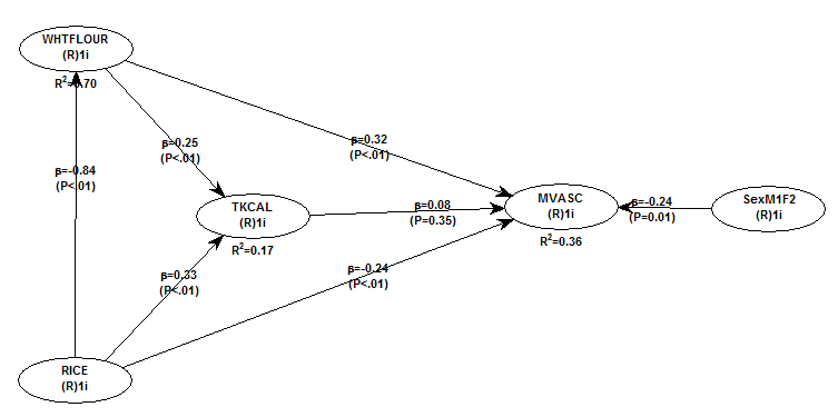

The variables to the left of MVASC are the main predictors of interest in the model. The one to the right is a control variable – SexM1F2. The path coefficients (indicated as beta coefficients) reflect the strength of the relationships. A negative beta means that the relationship is negative; i.e., an increase in a variable is associated with a decrease in the variable that it points to. The P values indicate the statistical significance of the relationship; a P lower than 0.05 generally means a significant relationship (95 percent or higher likelihood that the relationship is “real”).

In summary, the model above seems to be telling us that:

- As rice intake increases, wheat flour intake decreases significantly (beta=-0.84; P<0.01). This relationship would be the same if the arrow pointed in the opposite direction. It suggests that there is a sharp divide between rice-consuming and wheat flour-consuming regions.

- As wheat flour intake increases, mortality from all cardiovascular diseases increases significantly (beta=0.32; P<0.01). This is after controlling for the effects of rice and total calorie intake. That is, wheat flour seems to have some inherent properties that make it bad for one’s health, even if one doesn’t consume that many calories.

- As rice intake increases, mortality from all cardiovascular diseases decreases significantly (beta=-0.24; P<0.01). This is after controlling for the effects of wheat flour and total calorie intake. That is, this effect is not entirely due to rice being consumed in place of wheat flour. Still, as you’ll see later in this post, this relationship is nonlinear. Excessive rice intake does not seem to be very good for one’s health either.

- Increases in wheat flour and rice intake are significantly associated with increases in total calorie intake (betas=0.25, 0.33; P<0.01). This may be due to wheat flour and rice intake: (a) being themselves, in terms of their own caloric content, main contributors to the total calorie intake; or (b) causing an increase in calorie intake from other sources. The former is more likely, given the effect below.

- The effect of total calorie intake on mortality from all cardiovascular diseases is insignificant when we control for the effects of rice and wheat flour intakes (beta=0.08; P=0.35). This suggests that neither wheat flour nor rice exerts an effect on mortality from all cardiovascular diseases by increasing total calorie intake from other food sources.

- Being female is significantly associated with a reduction in mortality from all cardiovascular diseases (beta=-0.24; P=0.01). This is to be expected. In other words, men are women with a few design flaws, so to speak. (This situation reverses itself a bit after menopause.)

Wheat flour displaces rice

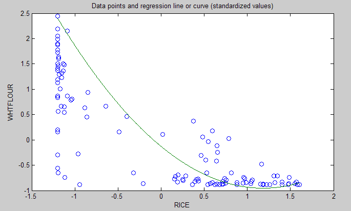
The graph below shows the shape of the association between wheat flour intake (WHTFLOUR) and rice intake (RICE). The values are provided in standardized format; e.g., 0 is the mean (a.k.a. average), 1 is one standard deviation above the mean, and so on. The curve is the best-fitting U curve obtained by the software. It actually has the shape of an exponential decay curve, which can be seen as a section of a U curve. This suggests that wheat flour consumption has strongly displaced rice consumption in several regions in China, and also that wherever rice consumption is high wheat flour consumption tends to be low.

As wheat flour intake goes up, so does cardiovascular disease mortality

The graphs below show the shapes of the association between wheat flour intake (WHTFLOUR) and mortality from all cardiovascular diseases (MVASC). In the first graph, the values are provided in standardized format; e.g., 0 is the mean (or average), 1 is one standard deviation above the mean, and so on. In the second graph, the values are provided in unstandardized format and organized in terciles (each of three equal intervals).


The curve in the first graph is the best-fitting U curve obtained by the software. It is a quasi-linear relationship. The higher the consumption of wheat flour in a county, the higher seems to be the mortality from all cardiovascular diseases. The second graph suggests that mortality in the third tercile, which represents a consumption of wheat flour of 501 to 751 g/day (a lot!), is 69 percent higher than mortality in the first tercile (0 to 251 g/day).

Rice seems to be protective, as long as intake is not too high

The graphs below show the shapes of the association between rice intake (RICE) and mortality from all cardiovascular diseases (MVASC). In the first graph, the values are provided in standardized format. In the second graph, the values are provided in unstandardized format and organized in terciles.


Here the relationship is more complex. The lowest mortality is clearly in the second tercile (206 to 412 g/day). There is a lot of variation in the first tercile, as suggested by the first graph with the U curve. (Remember, as rice intake goes down, wheat flour intake tends to go up.) The U curve here looks similar to the exponential decay curve shown earlier in the post, for the relationship between rice and wheat flour intake.

In fact, the shape of the association between rice intake and mortality from all cardiovascular diseases looks a bit like an “echo” of the shape of the relationship between rice and wheat flour intake. Here is what is creepy. This echo looks somewhat like the first curve (between rice and wheat flour intake), but with wheat flour intake replaced by “death” (i.e., mortality from all cardiovascular diseases).

What does this all mean?

- Wheat flour displacing rice does not look like a good thing. Wheat flour intake seems to have strongly displaced rice intake in the counties where it is heavily consumed. Generally speaking, that does not seem to have been a good thing. It looks like this is generally associated with increased mortality from all cardiovascular diseases.

- High glycemic index food consumption does not seem to be the problem here. Wheat flour and rice have very similar glycemic indices (but generally not glycemic loads; see below). Both lead to blood glucose and insulin spikes. Yet, rice consumption seems protective when it is not excessive. This is true in part (but not entirely) because it largely displaces wheat flour. Moreover, neither rice nor wheat flour consumption seems to be significantly associated with cardiovascular disease via an increase in total calorie consumption. This is a bit of a blow to the theory that high glycemic carbohydrates necessarily cause obesity, diabetes, and eventually cardiovascular disease.

- The problem with wheat flour is … hard to pinpoint, based on the results summarized here. Maybe it is the fact that it is an ultra-refined carbohydrate-rich food; less refined forms of wheat could be healthier. In fact, the glycemic loads of less refined carbohydrate-rich foods tend to be much lower than those of more refined ones (). (Also, boiled brown rice has a glycemic load that is about three times lower than that of whole wheat bread; whereas the glycemic indices are about the same.) Maybe the problem is wheat flour's  gluten content. Maybe it is a combination of various factors (), including these.

Notes

- The path coefficients (indicated as beta coefficients) reflect the strength of the relationships; they are a bit like standard univariate (or Pearson) correlation coefficients, except that they take into consideration multivariate relationships (they control for competing effects on each variable). Whenever nonlinear relationships were modeled, the path coefficients were automatically corrected by the software to account for nonlinearity.

- The software used here identifies non-cyclical and mono-cyclical relationships such as logarithmic, exponential, and hyperbolic decay relationships. Once a relationship is identified, data values are corrected and coefficients calculated. This is not the same as log-transforming data prior to analysis, which is widely used but only works if the underlying relationship is logarithmic. Otherwise, log-transforming data may distort the relationship even more than assuming that it is linear, which is what is done by most statistical software tools.

- The R-squared values reflect the percentage of explained variance for certain variables; the higher they are, the better the model fit with the data. In complex and multi-factorial phenomena such as health-related phenomena, many would consider an R-squared of 0.20 as acceptable. Still, such an R-squared would mean that 80 percent of the variance for a particularly variable is unexplained by the data.

- The P values have been calculated using a nonparametric technique, a form of resampling called jackknifing, which does not require the assumption that the data is normally distributed to be met. This and other related techniques also tend to yield more reliable results for small samples, and samples with outliers (as long as the outliers are “good” data, and are not the result of measurement error).

- Only two data points per county were used (for males and females). This increased the sample size of the dataset without artificially reducing variance, which is desirable since the dataset is relatively small. This also allowed for the test of commonsense assumptions (e.g., the protective effects of being female), which is always a good idea in a complex analysis because violation of commonsense assumptions may suggest data collection or analysis error. On the other hand, it required the inclusion of a sex variable as a control variable in the analysis, which is no big deal.

- Since all the data was collected around the same time (late 1980s), this analysis assumes a somewhat static pattern of consumption of rice and wheat flour. In other words, let us assume that variations in consumption of a particular food do lead to variations in mortality. Still, that effect will typically take years to manifest itself. This is a major limitation of this dataset and any related analyses.

- Mortality from schistosomiasis infection (MSCHIST) does not confound the results presented here. Only counties where no deaths from schistosomiasis infection were reported have been included in this analysis. Mortality from all cardiovascular diseases (MVASC) was measured using the variable M059 ALLVASCc (ages 35-69).

Sunday, June 28, 2026

The China Study II: Carbohydrates, fat, calories, insulin, and obesity

The “great blogosphere debate” rages on regarding the effects of carbohydrates and insulin on health. A lot of action has been happening over the years on Peter’s blog, with knowledgeable folks chiming in, such as Peter himself, Dr. Harris, Dr. B.G. (my sista from anotha mista), John, Nigel, CarbSane, Gunther G., Ed, and many others.

I like to see open debate among people who hold different views consistently, are willing to back them up with at least some evidence, and keep on challenging each other’s views. It is very unlikely that any one person holds the whole truth regarding health matters. Unfortunately this type of debate also confuses a lot of people, particularly those blog lurkers who want to get all of their health information from one single source.

Part of that “great blogosphere debate” debate hinges on the effect of low or high carbohydrate dieting on total calorie consumption. Well, let us see what the China Study II data can tell us about that, and about a few other things.

WarpPLS was used to do the analyses below. For other China Study analyses, many using WarpPLS as well as HealthCorrelator for Excel, click here. For the dataset used here, visit the HealthCorrelator for Excel site and check under the sample datasets area.

The two graphs below show the relationships between various foods, carbohydrates as a percentage of total calories, and total calorie consumption. A basic linear analysis was employed here. As carbohydrates as a percentage of total calories go up, the diet generally becomes a high carbohydrate diet. As it goes down, we see a move to the low carbohydrate end of the scale.


The left parts of the two graphs above are very similar. They tell us that wheat flour consumption is very strongly and negatively associated with rice consumption; i.e., wheat flour displaces rice. They tell us that fruit consumption is positively associated with rice consumption. They also tell us that high wheat flour consumption is strongly and positively associated with being on a high carbohydrate diet.

Neither rice nor fruit consumption has a statistically significant influence on whether the diet is high or low in carbohydrates, with rice having some effect and fruit practically none. But wheat flour consumption does. Increases in wheat flour consumption lead to a clear move toward the high carbohydrate diet end of the scale.

People may find the above results odd, but they should realize that white glutinous rice is only 20 percent carbohydrate, whereas wheat flour products are usually 50 percent carbohydrate or more. Someone consuming 400 g of white rice per day, and no other carbohydrates, will be consuming only 80 g of carbohydrates per day. Someone consuming 400 g of wheat flour products will be consuming 200 g of carbohydrates per day or more.

Fruits generally have much less carbohydrate than white rice, even very sweet fruits. For example, an apple is about 12 percent carbohydrate.

There is a measure that reflects the above differences somewhat. That measure is the glycemic load of a food; not to be confused with the glycemic index.

The right parts of the graphs above tell us something else. They tell us that the percentage of carbohydrates in one’s diet is strongly associated with total calorie consumption, and that this is not the case with percentage of fat in one’s diet.

Given the above, one may be interested in looking at the contribution of individual foods to total calorie consumption. The graph below focuses on that. The results take nonlinearity into consideration; they were generated using the Warp3 algorithm option of WarpPLS.


As you can see, wheat flour consumption is more strongly associated with total calories than rice; both associations being positive. Animal food consumption is negatively associated, somewhat weakly but statistically significantly, with total calories. Let me repeat for emphasis: negatively associated. This means that, as animal food consumption goes up, total calories consumed go down.

These results may seem paradoxical, but keep in mind that animal foods displace wheat flour in this dataset. Note that I am not saying that wheat flour consumption is a confounder; it is controlled for in the model above.

What does this all mean?

Increases in both wheat flour and rice consumption lead to increases in total caloric intake in this dataset. Wheat has a stronger effect. One plausible mechanism for this is abnormally high blood glucose elevations promoting abnormally high insulin responses. Refined carbohydrate-rich foods are particularly good at raising blood glucose fast and keeping it elevated, because they usually contain a lot of easily digestible carbohydrates. The amounts here are significantly higher than anything our body is “designed” to handle.

In normoglycemic folks, that could lead to a “lite” version of reactive hypoglycemia, leading to hunger again after a few hours following food consumption. Insulin drives calories, as fat, into adipocytes. It also keeps those calories there. If insulin is abnormally elevated for longer than it should be, one becomes hungry while storing fat; the fat that should have been released to meet the energy needs of the body. Over time, more calories are consumed; and they add up.

The above interpretation is consistent with the result that the percentage of fat in one’s diet has a statistically non-significant effect on total calorie consumption. That association, although non-significant, is negative. Again, this looks paradoxical, but in this sample animal fat displaces wheat flour.

Moreover, fat leads to no insulin response. If it comes from animals foods, fat is satiating not only because so much in our body is made of fat and/or requires fat to run properly; but also because animal fat contains micronutrients, and helps with the absorption of those micronutrients.

Fats from oils, even the healthy ones like coconut oil, just do not have the latter properties to the same extent as unprocessed fats from animal foods. Think slow-cooking meat with some water, making it release its fat, and then consuming all that fat as a sauce together with the meat.

In the absence of industrialized foods, typically we feel hungry for those foods that contain nutrients that our body needs at a particular point in time. This is a subconscious mechanism, which I believe relies in part on past experience; the reason why we have “acquired tastes”.

Incidentally, fructose leads to no insulin response either. Fructose is naturally found mostly in fruits, in relatively small amounts when compared with industrial foods rich in refined sugars.

And no, the pancreas does not get “tired” from secreting insulin.

The more refined a carbohydrate-rich food is, the more carbohydrates it tends to pack per unit of weight. Carbohydrates also contribute calories; about 4 calories per g. Thus more carbohydrates should translate into more calories.

If someone consumes 50 g of carbohydrates per day in excess of caloric needs, that will translate into about 22.2 g of body fat being stored. Over a month, that will be approximately 666.7 g. Over a year, that will be 8 kg, or 17.6 lbs. Over 5 years, that will be 40 kg, or 88 lbs. This is only from carbohydrates; it does not consider other macronutrients.

There is no need to resort to the “tired pancreas” theory of late-onset insulin resistance to explain obesity in this context. Insulin resistance is, more often than not, a direct result of obesity. Type 2 diabetes is by far the most common type of diabetes; and most type 2 diabetics become obese or overweight before they become diabetic. There is clearly a genetic effect here as well, which seems to moderate the relationship between body fat gain and liver as well as pancreas dysfunction.

It is not that hard to become obese consuming refined carbohydrate-rich foods. It seems to be much harder to become obese consuming animal foods, or fruits.

Tuesday, May 26, 2026

The China Study II: Cholesterol seems to protect against cardiovascular disease

First of all, many thanks are due to Dr. Campbell and his collaborators for collecting and compiling the data used in this analysis. The data has been compliled by those researchers to disseminate the data from a study often referred to as the “China Study II”. It has already been analyzed by other bloggers. Notable analyses have been conducted by Ricardo at Canibais e Reis, Stan at Heretic, and Denise at Raw Food SOS.

The analyses in this post differ from those other analyses in various aspects. One of them is that data for males and females were used separately for each county, instead of the totals per county. Only two data points per county were used (for males and females). This increased the sample size of the dataset without artificially reducing variance (for more details, see “Notes” at the end of the post), which is desirable since the dataset is relatively small. This also allowed for the test of commonsense assumptions (e.g., the protective effects of being female), which is always a good idea in a complex analysis because violation of commonsense assumption may suggest data collection or analysis error. On the other hand, it required the inclusion of a sex variable as a control variable in the analysis, which is no big deal.

The analysis was conducted using WarpPLS. Below is the model with the main results of the analysis. (Click on it to enlarge. Use the "CRTL" and "+" keys to zoom in, and CRTL" and "-" to zoom out.) The arrows explore associations between variables, which are shown within ovals. The meaning of each variable is the following: SexM1F2 = sex, with 1 assigned to males and 2 to females; HDLCHOL = HDL cholesterol; TOTCHOL = total cholesterol; MSCHIST = mortality from schistosomiasis infection; and MVASC = mortality from all cardiovascular diseases.


The variables to the left of MVASC are the main predictors of interest in the model – HDLCHOL and TOTCHOL. The ones to the right are control variables – SexM1F2 and MSCHIST. The path coefficients (indicated as beta coefficients) reflect the strength of the relationships. A negative beta means that the relationship is negative; i.e., an increase in a variable is associated with a decrease in the variable that it points to. The P values indicate the statistical significance of the relationship; a P lower than 0.05 generally means a significant relationship (95 percent or higher likelihood that the relationship is “real”).

In summary, this is what the model above is telling us:

- As HDL cholesterol increases, total cholesterol increases significantly (beta=0.48; P<0.01). This is to be expected, as HDL is a main component of total cholesterol, together with VLDL and LDL cholesterol.

- As total cholesterol increases, mortality from all cardiovascular diseases decreases significantly (beta=-0.25; P<0.01). This is to be expected if we assume that total cholesterol is in part an intervening variable between HDL cholesterol and mortality from all cardiovascular diseases. This assumption can be tested through a separate model (more below). Also, there is more to this story, as noted below.

- The effect of HDL cholesterol on mortality from all cardiovascular diseases is nonsignificant when we control for the effect of total cholesterol (beta=-0.08; P=0.26). This suggests that HDL’s protective role is subsumed by the variable total cholesterol, and also that it is possible that there is something else associated with total cholesterol that makes it protective. Otherwise the effect of total cholesterol might have been nonsignificant, and the effect of HDL cholesterol significant (the reverse of what we see here).

- Being female is significantly associated with a reduction in mortality from all cardiovascular diseases (beta=-0.16; P=0.01). This is to be expected. In other words, men are women with a few design flaws. (This situation reverses itself a bit after menopause.)

- Mortality from schistosomiasis infection is significantly and inversely associated with mortality from all cardiovascular diseases (beta=-0.28; P<0.01). This is probably due to those dying from schistosomiasis infection not being entered in the dataset as dying from cardiovascular diseases, and vice-versa.

Two other main components of total cholesterol, in addition to HDL cholesterol, are VLDL and LDL cholesterol. These are carried in particles, known as lipoproteins. VLDL cholesterol is usually represented as a fraction of triglycerides in cholesterol equations (e.g., the Friedewald and Iranian equations). It usually correlates inversely with HDL; that is, as HDL cholesterol increases, usually VLDL cholesterol decreases. Given this and the associations discussed above, it seems that LDL cholesterol is a good candidate for the possible “something else associated with total cholesterol that makes it protective”. But waidaminet! Is it possible that the demon particle, the LDL, serves any purpose other than giving us heart attacks?

The graph below shows the shape of the association between total cholesterol (TOTCHOL) and mortality from all cardiovascular diseases (MVASC). The values are provided in standardized format; e.g., 0 is the average, 1 is one standard deviation above the mean, and so on. The curve is the best-fitting S curve obtained by the software (an S curve is a slightly more complex curve than a U curve).


The graph below shows some of the data in unstandardized format, and organized differently. The data is grouped here in ranges of total cholesterol, which are shown on the horizontal axis. The lowest and highest ranges in the dataset are shown, to highlight the magnitude of the apparently protective effect. Here the two variables used to calculate mortality from all cardiovascular diseases (MVASC; see “Notes” at the end of this post) were added. Clearly the lowest mortality from all cardiovascular diseases is in the highest total cholesterol range, 172.5 to 180; and the highest mortality in the lowest total cholesterol range, 120 to 127.5. The difference is quite large; the mortality in the lowest range is approximately 3.3 times higher than in the highest.


The shape of the S-curve graph above suggests that there are other variables that are confounding the results a bit. Mortality from all cardiovascular diseases does seem to generally go down with increases in total cholesterol, but the smooth inflection point at the middle of the S-curve graph suggests a more complex variation pattern that may be influenced by other variables (e.g., smoking, dietary patterns, or even schistosomiasis infection; see “Notes” at the end of this post).

As mentioned before, total cholesterol is strongly influenced by HDL cholesterol, so below is the model with only HDL cholesterol (HDLCHOL) pointing at mortality from all cardiovascular diseases (MVASC), and the control variable sex (SexM1F2).


The graph above confirms the assumption that HDL’s protective role is subsumed by the variable total cholesterol. When the variable total cholesterol is removed from the model, as it was done above, the protective effect of HDL cholesterol becomes significant (beta=-0.27; P<0.01). The control variable sex (SexM1F2) was retained even in this targeted HDL effect model because of the expected confounding effect of sex; females generally tend to have higher HDL cholesterol and less cardiovascular disease than males.

Below, in the “Notes” section (after the “Reference”) are several notes, some of which are quite technical. Providing them separately hopefully has made the discussion above a bit easier to follow. The notes also point at some limitations of the analysis. This data needs to be analyzed from different angles, using multiple models, so that firmer conclusions can be reached. Still, the overall picture that seems to be emerging is at odds with previous beliefs based on the same dataset.

What could be increasing the apparently protective HDL and total cholesterol in this dataset? High consumption of animal foods, particularly foods rich in saturated fat and cholesterol, are strong candidates. Low consumption of vegetable oils rich in linoleic acid, and of foods rich in refined carbohydrates, are also good candidates. Maybe it is a combination of these.

We need more analyses!


Notes:

- The path coefficients (indicated as beta coefficients) reflect the strength of the relationships; they are a bit like standard univariate (or Pearson) correlation coefficients, except that they take into consideration multivariate relationships (they control for competing effects on each variable).

- The R-squared values reflect the percentage of explained variance for certain variables; the higher they are, the better the model fit with the data. In complex and multi-factorial phenomena such as health-related phenomena, many would consider an R-squared of 0.20 as acceptable. Still, such an R-squared would mean that 80 percent of the variance for a particularly variable is unexplained by the data.

- The P values have been calculated using a nonparametric technique, a form of resampling called jackknifing, which does not require the assumption that the data is normally distributed to be met. This and other related techniques also tend to yield more reliable results for small samples, and samples with outliers (as long as the outliers are “good” data, and are not the result of measurement error).

- Colinearity is an important consideration in models that analyze the effect of multiple predictors on one single variable. This is particularly true for multiple regression models, where there is a temptation of adding many predictors to the model to see which ones come out as the “winners”. This often backfires, as colinearity can severely distort the results. Some multiple regression techniques, such as automated stepwise regression with backward elimination, are particularly vulnerable to this problem. Colinearity is not the same as correlation, and thus is defined and measured differently. Two predictor variables may be significantly correlated and still have low colinearity. A reasonably reliable measure of colinearity is the variance inflation factor. Colinearity was tested in this model, and was found to be low.

- An effort was made here to avoid multiple data points per county (even though this was available for some variables), because this could artificially reduce the variance for each variable, and potentially bias the results. The reason for this is that multiple answers from a single county would normally be somewhat correlated; a higher degree of intra-county correlation than inter-county correlation. The resulting bias would be difficult to control for, via one or more control variables. With only two data points per county, one for males and the other for females, one can control for intra-country correlation by adding a “dummy” sex variable to the analysis, as a control variable. This was done here.

- Mortality from schistosomiasis infection (MSCHIST) is a variable that tends to affect the results in a way that makes it more difficult to make sense of them. Generally this is true for any infectious diseases that significantly affect a population under study. The problem with infection is that people with otherwise good health or habits may get the infection, and people with bad health and habits may not. Since cholesterol is used by the human body to fight disease, it may go up, giving the impression that it is going up for some other reason. Perhaps instead of controlling for its effect, as done here, it would have been better to remove from the analysis those counties with deaths from schistosomiasis infection. (See also this post, and this one.)

- Different parts of the data were collected at different times. It seems that the mortality data is for the period 1986-88, and the rest of the data is for 1989. This may have biased the results somewhat, even though the time lag is not that long, especially if there were changes in certain health trends from one period to the other. For example, major migrations from one county to another could have significantly affected the results.

- The following measures were used, from the China Study II dataset, like the other measures. P002 HDLCHOL, for HDLCHOL; P001 TOTCHOL, for TOTCHOL; and M021 SCHISTOc, for MSCHIST.

- SexM1F2 is a “dummy” variable that was coded with 1 assigned to males and 2 to females. As such, it essentially measures the “degree of femaleness” of the respondents. Being female is generally protective against cardiovascular disease, a situation that reverts itself a bit after menopause.

- MVASC is a composite measure of the two following variables, provided as component measures of mortality from all cardiovascular diseases: M058 ALLVASCb (ages 0-34), and M059 ALLVASCc (ages 35-69). A couple of obvious problems: (a) they does not include data on people older than 69; and (b) they seem to capture a lot of diseases, including some that do not seem like typical cardiovascular diseases. A factor analysis was conducted, and the loadings and cross-loadings suggested good validity. Composite reliability was also good. So essentially MVASC is measured here as a “latent variable” with two “indicators”. Why do this? The reason is that it reduces the biasing effects of incomplete data and measurement error (e.g., exclusion of folks older than 69). By the way, there is always some measurement error in any dataset.

- This note is related to measurement error in connection with the indicators for MVASC. There is something odd about the variables M058 ALLVASCb (ages 0-34), and M059 ALLVASCc (ages 35-69). According to the dataset, mortality from cardiovascular diseases for ages 0-34 is typically higher than for 35-69, for many counties. Given the good validity and reliability for MVASC as a latent variable, it is possible that the values for these two indicator variables were simply swapped by mistake.

Friday, September 26, 2025

The China Study II: Does calorie restriction increase longevity?

The idea that calorie restriction extends human life comes largely from studies of other species. The most relevant of those studies have been conducted with primates, where it has been shown that primates that eat a restricted calorie diet live longer and healthier lives than those that are allowed to eat as much as they want.

There are two main problems with many of the animal studies of calorie restriction. One is that, as natural lifespan decreases, it becomes progressively easier to experimentally obtain major relative lifespan extensions. (That is, it seems much easier to double the lifespan of an organism whose natural lifespan is one day than an organism whose natural lifespan is 80 years.) The second, and main problem in my mind, is that the studies often compare obese with lean animals.

Obesity clearly reduces lifespan in humans, but that is a different claim than the one that calorie restriction increases lifespan. It has often been claimed that Asian countries and regions where calorie intake is reduced display increased lifespan. And this may well be true, but the question remains as to whether this is due to calorie restriction increasing lifespan, or because the rates of obesity are much lower in countries and regions where calorie intake is reduced.

So, what can the China Study II data tell us about the hypothesis that calorie restriction increases longevity?

As it turns out, we can conduct a preliminary test of this hypothesis based on a key assumption. Let us say we compared two populations (e.g., counties in China), based on the following ratio: number of deaths at or after age 70 divided by number deaths before age 70. Let us call this the “ratio of longevity” of a population, or RLONGEV. The assumption is that the population with the highest RLONGEV would be the population with the highest longevity of the two. The reason is that, as longevity goes up, one would expect to see a shift in death patterns, with progressively more people dying old and fewer people dying young.

The 1989 China Study II dataset has two variables that we can use to estimate RLONGEV. They are coded as M005 and M006, and refer to the mortality rates from 35 to 69 and 70 to 79 years of age, respectively. Unfortunately there is no variable for mortality after 79 years of age, which limits the scope of our results somewhat. (This does not totally invalidate the results because we are using a ratio as our measure of longevity, not the absolute number of deaths from 70 to 79 years of age.) Take a look at these two previous China Study II posts (here, and here) for other notes, most of which apply here as well. The notes are at the end of the posts.

All of the results reported here are from analyses conducted using WarpPLS. Below is a model with coefficients of association; it is a simple model, since the hypothesis that we are testing is also simple. (Click on it to enlarge. Use the "CRTL" and "+" keys to zoom in, and CRTL" and "-" to zoom out.) The arrows explore associations between variables, which are shown within ovals. The meaning of each variable is the following: TKCAL = total calorie intake per day; RLONGEV = ratio of longevity; SexM1F2 = sex, with 1 assigned to males and 2 to females.


As one would expect, being female is associated with increased longevity, but the association is just shy of being statistically significant in this dataset (beta=0.14; P=0.07). The association between total calorie intake and longevity is trivial, and statistically indistinguishable from zero (beta=-0.04; P=0.39). Moreover, even though this very weak association is overall negative (or inverse), the sign of the association here does not fully reflect the shape of the association. The shape is that of an inverted J-curve; a.k.a. U-curve. When we split the data into total calorie intake terciles we get a better picture:


The second tercile, which refers to a total daily calorie intake of 2193 to 2844 calories, is the one associated with the highest longevity. The first tercile (with the lowest range of calories) is associated with a higher longevity than the third tercile (with the highest range of calories). These results need to be viewed in context. The average weight in this dataset was about 116 lbs. A conservative estimate of the number of calories needed to maintain this weight without any physical activity would be about 1740. Add about 700 calories to that, for a reasonable and healthy level of physical activity, and you get 2440 calories needed daily for weight maintenance. That is right in the middle of the second tercile.

In simple terms, the China Study II data seems to suggest that those who eat well, but not too much, live the longest. Those who eat little have slightly lower longevity. Those who eat too much seem to have the lowest longevity, perhaps because of the negative effects of excessive body fat.

Because these trends are all very weak from a statistical standpoint, we have to take them with caution. What we can say with more confidence is that the China Study II data does not seem to support the hypothesis that calorie restriction increases longevity.

Reference

Kock, N. (2019). WarpPLS User Manual: Version 6.0. Laredo, Texas: ScriptWarp Systems.

Notes

- The path coefficients (indicated as beta coefficients) reflect the strength of the relationships; they are a bit like standard univariate (or Pearson) correlation coefficients, except that they take into consideration multivariate relationships (they control for competing effects on each variable). Whenever nonlinear relationships were modeled, the path coefficients were automatically corrected by the software to account for nonlinearity.

- Only two data points per county were used (for males and females). This increased the sample size of the dataset without artificially reducing variance, which is desirable since the dataset is relatively small (each county, not individual, is a separate data point is this dataset). This also allowed for the test of commonsense assumptions (e.g., the protective effects of being female), which is always a good idea in a multivariate analyses because violation of commonsense assumptions may suggest data collection or analysis error. On the other hand, it required the inclusion of a sex variable as a control variable in the analysis, which is no big deal.

- Mortality from schistosomiasis infection (MSCHIST) does not confound the results presented here. Only counties where no deaths from schistosomiasis infection were reported have been included in this analysis. The reason for this is that mortality from schistosomiasis infection can severely distort the results in the age ranges considered here. On the other hand, removal of counties with deaths from schistosomiasis infection reduced the sample size, and thus decreased the statistical power of the analysis.

Wednesday, May 29, 2024

The China Study again: A multivariate analysis suggesting that schistosomiasis rules!

In the comments section of Denise Minger’s post on July 16, 2010, which discusses some of the data from the China Study (as a follow up to a previous post on the same topic), Denise herself posted the data she used in her analysis. This data is from the China Study. So I decided to take a look at that data and do a couple of multivariate analyzes with it using WarpPLS (warppls.com).

First I built a model that explores relationships with the goal of testing the assumption that the consumption of animal protein causes colorectal cancer, via an intermediate effect on total cholesterol. I built the model with various hypothesized associations to explore several relationships simultaneously, including some commonsense ones. Including commonsense relationships is usually a good idea in exploratory multivariate analyses.

The model is shown on the graph below, with the results. (Click on it to enlarge. Use the "CRTL" and "+" keys to zoom in, and CRTL" and "-" to zoom out.) The arrows explore causative associations between variables. The variables are shown within ovals. The meaning of each variable is the following: aprotein = animal protein consumption; pprotein = plant protein consumption; cholest = total cholesterol; crcancer = colorectal cancer.


The path coefficients (indicated as beta coefficients) reflect the strength of the relationships; they are a bit like standard univariate (or Pearson) correlation coefficients, except that they take into consideration multivariate relationships (they control for competing effects on each variable). A negative beta means that the relationship is negative; i.e., an increase in a variable is associated with a decrease in the variable that it points to.

The P values indicate the statistical significance of the relationship; a P lower than 0.05 means a significant relationship (95 percent or higher likelihood that the relationship is real). The R-squared values reflect the percentage of explained variance for certain variables; the higher they are, the better the model fit with the data. Ignore the “(R)1i” below the variable names; it simply means that each of the variables is measured through a single indicator (or a single measure; that is, the variables are not latent variables).

I should note that the P values have been calculated using a nonparametric technique, a form of resampling called jackknifing, which does not require the assumption that the data is normally distributed to be met. This is good, because I checked the data, and it does not look like it is normally distributed. So what does the model above tell us? It tells us that:

- As animal protein consumption increases, colorectal cancer decreases, but not in a statistically significant way (beta=-0.13; P=0.11).

- As animal protein consumption increases, plant protein consumption decreases significantly (beta=-0.19; P<0.01). This is to be expected.

- As plant protein consumption increases, colorectal cancer increases significantly (beta=0.30; P=0.03). This is statistically significant because the P is lower than 0.05.

- As animal protein consumption increases, total cholesterol increases significantly (beta=0.20; P<0.01). No surprise here. And, by the way, the total cholesterol levels in this study are quite low; an overall increase in them would probably be healthy.

- As plant protein consumption increases, total cholesterol decreases significantly (beta=-0.23; P=0.02). No surprise here either, because plant protein consumption is negatively associated with animal protein consumption; and the latter tends to increase total cholesterol.

- As total cholesterol increases, colorectal cancer increases significantly (beta=0.45; P<0.01). Big surprise here!

Why the big surprise with the apparently strong relationship between total cholesterol and colorectal cancer? The reason is that it does not make sense, because animal protein consumption seems to increase total cholesterol (which we know it usually does), and yet animal protein consumption seems to decrease colorectal cancer.

When something like this happens in a multivariate analysis, it usually is due to the model not incorporating a variable that has important relationships with the other variables. In other words, the model is incomplete, hence the nonsensical results. As I said before in a previous post, relationships among variables that are implied by coefficients of association must also make sense.

Now, Denise pointed out that the missing variable here possibly is schistosomiasis infection. The dataset that she provided included that variable, even though there were some missing values (about 28 percent of the data for that variable was missing), so I added it to the model in a way that seems to make sense. The new model is shown on the graph below. In the model, schisto = schistosomiasis infection.


So what does this new, and more complete, model tell us? It tells us some of the things that the previous model told us, but a few new things, which make a lot more sense. Note that this model fits the data much better than the previous one, particularly regarding the overall effect on colorectal cancer, which is indicated by the high R-squared value for that variable (R-squared=0.73). Most notably, this new model tells us that:

- As schistosomiasis infection increases, colorectal cancer increases significantly (beta=0.83; P<0.01). This is a MUCH STRONGER relationship than the previous one between total cholesterol and colorectal cancer; even though some data on schistosomiasis infection for a few counties is missing (the relationship might have been even stronger with a complete dataset). And this strong relationship makes sense, because schistosomiasis infection is indeed associated with increased cancer rates. More information on schistosomiasis infections can be found here.

- Schistosomiasis infection has no significant relationship with these variables: animal protein consumption, plant protein consumption, or total cholesterol. This makes sense, as the infection is caused by a worm that is not normally present in plant or animal food, and the infection itself is not specifically associated with abnormalities that would lead one to expect major increases in total cholesterol.

- Animal protein consumption has no significant relationship with colorectal cancer. The beta here is very low, and negative (beta=-0.03).

- Plant protein consumption has no significant relationship with colorectal cancer. The beta for this association is positive and nontrivial (beta=0.15), but the P value is too high (P=0.20) for us to discard chance within the context of this dataset. A more targeted dataset, with data on specific plant foods (e.g., wheat-based foods), could yield different results – maybe more significant associations, maybe less significant.

Below is the plot showing the relationship between schistosomiasis infection and colorectal cancer. The values are standardized, which means that the zero on the horizontal axis is the mean of the schistosomiasis infection numbers in the dataset. The shape of the plot is the same as the one with the unstandardized data. As you can see, the data points are very close to a line, which suggests a very strong linear association.


So, in summary, this multivariate analysis vindicates pretty much everything that Denise said in her July 16, 2010 post. It even supports Denise’s warning about jumping to conclusions too early regarding the possible relationship between wheat consumption and colorectal cancer (previously highlighted by a univariate analysis). Not that those conclusions are wrong; they may well be correct.

This multivariate analysis also supports Dr. Campbell’s assertion about the quality of the China Study data. The data that I analyzed was already grouped by county, so the sample size (65 cases) was not so high as to cast doubt on P values. (Having said that, small samples create problems of their own, such as low statistical power and an increase in the likelihood of error-induced bias.) The results summarized in this post also make sense in light of past empirical research.

It is very good data; data that needs to be properly analyzed!

Sunday, August 15, 2021

The China Study one more time: Are raw plant foods giving people cancer?

In this previous post I analyzed some data from the China Study that included counties where there were cases of schistosomiasis infection. Following one of Denise Minger’s suggestions, I removed all those counties from the data. I was left with 29 counties, a much smaller sample size. I then ran a multivariate analysis using WarpPLS (warppls.com), like in the previous post, but this time I used an algorithm that identifies nonlinear relationships between variables.

Below is the model with the results. (Click on it to enlarge. Use the "CRTL" and "+" keys to zoom in, and CRTL" and "-" to zoom out.) As in the previous post, the arrows explore associations between variables. The variables are shown within ovals. The meaning of each variable is the following: aprotein = animal protein consumption; pprotein = plant protein consumption; cholest = total cholesterol; crcancer = colorectal cancer.


What is total cholesterol doing at the right part of the graph? It is there because I am analyzing the associations between animal protein and plant protein consumption with colorectal cancer, controlling for the possible confounding effect of total cholesterol.

I am not hypothesizing anything regarding total cholesterol, even though this variable is shown as pointing at colorectal cancer. I am just controlling for it. This is the type of thing one can do in multivariate analyzes. This is how you “control for the effect of a variable” in an analysis like this.

ins Since the sample is fairly small, we end up with nonsignificant beta coefficients that would normally be statistically significant with a larger sample. But it helps that we are using nonparametric statistics, because they are still robust in the presence of small samples, and deviations from normality. Also the nonlinear algorithm is more sensitive to relationships that do not fit a classic linear pattern. We can summarize the findings as follows:

- As animal protein consumption increases, plant protein consumption decreases significantly (beta=-0.36; P<0.01). This is to be expected and helpful in the analysis, as it differentiates somewhat animal from plant protein consumers. Those folks who got more of their protein from animal foods tended to get significantly less protein from plant foods.

- As animal protein consumption increases, colorectal cancer decreases, but not in a statistically significant way (beta=-0.31; P=0.10). The beta here is certainly high, and the likelihood that the relationship is real is 90 percent, even with such a small sample.

- As plant protein consumption increases, colorectal cancer increases significantly (beta=0.47; P<0.01). The small sample size was not enough to make this association nonsignificant. The reason is that the distribution pattern of the data here is very indicative of a real association, which is reflected in the low P value.

Remember, these results are not confounded by schistosomiasis infection, because we are only looking at counties where there were no cases of schistosomiasis infection. These results are not confounded by total cholesterol either, because we controlled for that possible confounding effect. Now, control variable or not, you would be correct to point out that the association between total cholesterol and colorectal cancer is high (beta=0.58; P=0.01). So let us take a look at the shape of that association:


Does this graph remind you of the one on this post; the one with several U curves? Yes. And why is that? Maybe it reflects a tendency among the folks who had low cholesterol to have more cancer because the body needs cholesterol to fight disease, and cancer is a disease. And maybe it reflects a tendency among the folks who have high total cholesterol to do so because total cholesterol (and particularly its main component, LDL cholesterol) is in part a marker of disease, and cancer is often a culmination of various metabolic disorders (e.g., the metabolic syndrome) that are nothing but one disease after another.

To believe that total cholesterol causes colorectal cancer is nonsensical because total cholesterol is generally increased by consumption of animal products, of which animal protein consumption is a proxy. (In this reduced dataset, the linear univariate correlation between animal protein consumption and total cholesterol is a significant and positive 0.36.) And animal protein consumption seems to be protective again colorectal cancer in this dataset (negative association on the model graph).

Now comes the part that I find the most ironic about this whole discussion in the blogosphere that has been going on recently about the China Study; and the answer to the question posed in the title of this post: Are raw plant foods giving people cancer? If you think that the answer is “yes”, think again. The variable that is strongly associated with colorectal cancer is plant protein consumption.

Do fruits, veggies, and other plant foods that can be consumed raw have a lot of protein?

With a few exceptions, like nuts, they do not. Most raw plant foods have trace amounts of protein, especially when compared with foods made from refined grains and seeds (e.g., wheat grains, soybean seeds). So the contribution of raw fruits and veggies in general could not have influenced much the variable plant protein consumption. To put this in perspective, the average plant protein consumption per day in this dataset was 63 g; even if they were eating 30 bananas a day, the study participants would not get half that much protein from bananas.

Refined foods made from grains and seeds are made from those plant parts that the plants absolutely do not “want” animals to eat. They are the plants’ “children” or “children’s nutritional reserves”, so to speak. This is why they are packed with nutrients, including protein and carbohydrates, but also often toxic and/or unpalatable to animals (including humans) when eaten raw.

But humans are so smart; they learned how to industrially refine grains and seeds for consumption. The resulting human-engineered products (usually engineered to sell as many units as possible, not to make you healthy) normally taste delicious, so you tend to eat a lot of them. They also tend to raise blood sugar to abnormally high levels, because industrial refining makes their high carbohydrate content easily digestible. Refined foods made from grains and seeds also tend to cause leaky gut problems, and autoimmune disorders like celiac disease. Yep, we humans are really smart.

Thanks again to Dr. Campbell and his colleagues for collecting and compiling the China Study data, and to Ms. Minger for making the data available in easily downloadable format and for doing some superb analyses herself.

Tuesday, January 26, 2016

Wheat flour, rice and vascular diseases in the China Study II data: Article on Cliodynamics


My article on volume 6, number 2, of the journal Cliodynamics has recently been published; it is titled “Wheat flour versus rice consumption and vascular diseases: Evidence from the China Study II data” (). While this is an academic article, I think that the main body of the article is fairly easy to read. More technical readers may want to check under “Supporting material”, which is one of the links on the left, where they will find a detailed description of the data used and the results of some specialized statistical tests.

In the past I have discussed in this blog the associations with vascular diseases, in the China Study dataset, of wheat flour and rice consumption. The interest in the possible effects of wheat flour AND rice consumption comes from the fact that these foods are similar in some important respects – e.g., they tend to raise insulin levels in similar ways. But as you will see in the article, their associations with vascular diseases are clearly different, particularly when we conduct nonlinear analyses.

While I do not think that wheat flour consumption per se is particularly healthy, the results of the analysis go somewhat against the idea that wheat flour intake is the primary culprit with respect to vascular diseases. The results also go somewhat against the “insulin theory of obesity”, at least in a narrow sense, and call for a broader explanation that includes cultural elements. These points are further elaborated in the article. There is speculation in the article, and also a discussion of possible limitations.

Enjoy!

Monday, January 16, 2012

The China Study II: Wheat’s total effect on mortality is significant, complex, and highlights the negative effects of low animal fat diets

The graph below shows the results of a multivariate nonlinear WarpPLS () analysis including the variables listed below. Each row in the dataset refers to a county in China, from the publicly available China Study II dataset (). As always, I thank Dr. Campbell and his collaborators for making the data publicly available. Other analyses based on the same dataset are also available ().
    - Wheat: wheat flour consumption in g/d.
    - Aprot: animal protein consumption in g/d.
    - PProt: plant protein consumption in g/d.
    - %FatCal: percentage of calories coming from fat.
    - Mor35_69: number of deaths per 1,000 people in the 35-69 age range.
    - Mor70_79: number of deaths per 1,000 people in the 70-79 age range.


Below are the total effects of wheat flour consumption, along with the number of paths used to calculate them, and the respective P values (i.e., probabilities that the effects are due to chance). Total effects are calculated by considering all of the paths connecting two variables. Identifying each path is a bit like solving a maze puzzle; you have to follow the arrows connecting the two variables. Version 3.0 of WarpPLS (soon to be released) does that automatically, and also calculates the corresponding P values.


To the best of my knowledge, this is the first time that total effects are calculated for this dataset. As you can see, the total effects of wheat flour consumption on mortality in the 35-69 and 70-79 age ranges are both significant, and fairly complex in this model, each relying on 7 paths. The P value for mortality in the 35-69 age range is 0.038; in other words, the probability that the effect is “real”, and thus not due to chance, is 96.2 percent (100-3.8=96.2). The P value for mortality in the 70-79 age range is 0.024; a 97.6 percent probability that the effect is “real”.

Note that in the model the effects of wheat flour consumption on mortality in both age ranges are hypothesized to be mediated by animal protein consumption, plant protein consumption, and fat consumption. These mediating effects have been suggested by previous analyses discussed on this blog (). The strongest individual paths are between wheat flour consumption and plant protein consumption, plant protein consumption and animal protein consumption, as well as animal protein consumption and fat consumption.

So wheat flour consumption contributes to plant protein consumption, probably by being a main source of plant protein (through gluten). Plant protein consumption in turn decreases animal protein consumption, which significantly decreases fat consumption. From this latter connection we can tell that most of the fat consumed likely came from animal sources.

How much fat and protein are we talking about? The graphs below tell us how much, and these graphs are quite interesting. They suggest that, in this dataset, daily protein consumption tended to be on average 60 g, whatever the source. If more protein came from plant foods, the proportion from animal foods went down, and vice-versa.


The more animal protein consumed, the more fat is also consumed in this dataset. And that is animal fat, which comes mostly in the form of saturated and monounsaturated fats, in roughly equal amounts. How do I know that it is animal fat? Because of the strong association with animal protein. By the way, with a few exceptions (e.g., some species of fatty fish) animal foods in general provide only small amounts of polyunsaturated fats – omega-3 and omega-6.

Individually, animal protein and wheat flour consumption have the strongest direct effects on mortality in both age ranges. Animal protein consumption is protective, and wheat flour consumption detrimental.

Does the connection between animal protein, animal fat, and longevity mean that a diet high in saturated and monounsaturated fats is healthy for most people? Not necessarily, at least without extrapolation, although the results do not suggest otherwise. Look at the amounts of fat consumed per day. They range from a little less than 20 g/d to a little over 90 g/d. By comparison, one steak of top sirloin (about 380 g of meat, cooked) trimmed to almost no visible fat gives you about 37 g of fat.

These results do suggest that consumption of animal fats, primarily saturated and monounsaturated fats, is likely to be particularly healthy in the context of a low fat diet. Or, said in a different way, these results suggest that longevity is decreased by diets that are low in animal fats.

How much fat should one eat? In this dataset, the more fat was consumed together with animal protein (i.e., the more animal fat was consumed), the better in terms of longevity. In other words, in this dataset the lowest levels of mortality were associated with the highest levels of animal fat consumption. The highest level of fat consumption in the dataset was a little over 90 g/d.

What about higher fat intake contexts? Well, we know that men on a high fat diet such as a variation of the Optimal Diet can consume on average a little over 170 g/d of animal fat (130 g/d for women), and their health markers remain generally good ().

One of the critical limiting factors, in terms of health, seems to be the amount of animal fat that one can eat and still remain relatively lean. Dietary saturated and monounsaturated fats are healthy. But when accumulated as excess body fat, beyond a certain level, they become pro-inflammatory.

Saturday, November 5, 2011

The China Study II: How gender takes us to the elusive and deadly factor X

The graph below shows the mortality in the 35-69 and 70-79 age ranges for men and women for the China Study II dataset. I discussed other results in my two previous posts () (), all taking us to this post. The full data for the China Study II study is publicly available (). The mortality numbers are actually averages of male and female deaths by 1,000 people in each of several counties, in each of the two age ranges.


Men do tend to die earlier than women, but the difference above is too large.

Generally speaking, when you look at a set time period that is long enough for a good number of deaths (not to be confused with “a number of good deaths”) to be observed, you tend to see around 5-10 percent more deaths among men than among women. This is when other variables are controlled for, or when men and women do not adopt dramatically different diets and lifestyles. One of many examples is a study in Finland (); you have to go beyond the abstract on this one.

As you can see from the graph above, in the China Study II dataset this difference in deaths is around 50 percent!

This huge difference could be caused by there being significantly more men than women per county included the dataset. But if you take a careful look at the description of the data collection methods employed (), this does not seem to be the case. In fact, the methodology descriptions suggest that the researchers tried to have approximately the same number of women and men studied in each county. The numbers reported also support this assumption.

As I said before, this is a well executed research project, for which Dr. Campbell and his collaborators should be commended. I may not agree with all of their conclusions, but this does not detract even a bit from the quality of the data they have compiled and made available to us all.

So there must be another factor X causing this enormous difference in mortality (and thus longevity) among men and women in the China Study II dataset.

What could be this factor X?

This situation helps me illustrate a point that I have made here before, mostly in the comments under other posts. Sometimes a variable, and its effects on other variables, are mostly a reflection of another unmeasured variable. Gender is a variable that is often involved in this type of situation. Frequently men and women do things very differently in a given population due to cultural reasons (as opposed to biological reasons), and those things can have a major effect on their health.

So, the search for our factor X is essentially a search for a health-relevant variable that is reflected by gender but that is not strictly due to the biological aspects that make men and women different (these can explain only a 5-10 percent difference in mortality). That is, we are looking for a variable that shows a lot of variation between men and women, that is behavioral, and that has a clear impact on health. Moreover, as it should be clear from my last post, we are looking for a variable that is unrelated to wheat flour and animal protein consumption.

As it turns out, the best candidate for the factor X is smoking, particularly cigarette smoking.

The second best candidate for factor X is alcohol abuse. Alcohol abuse can be just as bad for one’s health as smoking is, if not worse, but it may not be as good a candidate for factor X because the difference in prevalence between men and women does not appear to be just as large in China (). But it is still large enough for us to consider it a close second as a candidate for factor X, or a component of a more complex factor X – a composite of smoking, alcohol abuse and a few other coexisting factors that may be reflected by gender.

I have had some discussions about this with a few colleagues and doctoral students who are Chinese (thanks William and Wei), and they mentioned stress to me, based on anecdotal evidence. Moreover, they pointed out that stressful lifestyles, smoking, and alcohol abuse tend to happen together - with a much higher prevalence among men than women.

What an anti-climax for this series of posts eh?

With all the talk on the Internetz about safe and unsafe starches, animal protein, wheat bellies, and whatnot! C’mon Ned, give me a break! What about insulin!? What about leucine deficiency … or iron overload!? What about choline!? What about something truly mysterious, related to an obscure or emerging biochemistry topic; a hormone du jour like leptin perhaps? Whatever, something cool!

Smoking and alcohol abuse!? These are way too obvious. This is NOT cool at all!

Well, reality is often less mysterious than we want to believe it is.

Let me focus on smoking from here on, since it is the top candidate for factor X, although much of the following applies to alcohol abuse and a combination of the two as well.

One gets different statistics on cigarette smoking in China depending on the time period studied, but one thing seems to be a common denominator in these statistics. Men tend to smoke in much, much higher numbers than women in China. And this is not a recent phenomenon.

For example, a study conducted in 1996 () states that “smoking continues to be prevalent among more men (63%) than women (3.8%)”, and notes that these results are very similar to those in 1984, around the time when the China Study II data was collected.

A 1995 study () reports similar percentages: “A total of 2279 males (67%) but only 72 females (2%) smoke”. Another study () notes that in 1976 “56% of the men and 12% of the women were ever-smokers”, which together with other results suggest that the gap increased significantly in the 1980s, with many more men than women smoking. And, most importantly, smoking industrial cigarettes.

So we are possibly talking about a gigantic difference here; the prevalence of industrial cigarette smoking among men may have been over 30 times the prevalence among women in the China Study II dataset.

Given the above, it is reasonable to conclude that the variable “SexM1F2” reflects very strongly the variable “Smoking”, related to industrial cigarette smoking, and in an inverse way. I did something that, grossly speaking, made the mysterious factor X explicit in the WarpPLS model discussed in my previous post. I replaced the variable “SexM1F2” in the model with the variable “Smoking” by using a reverse scale (i.e., 1 and 2, but reversing the codes used for “SexM1F2”). The results of the new WarpPLS analysis are shown on the graph below. This is of course far from ideal, but gives a better picture to readers of what is going on than sticking with the variable “SexM1F2”.


With this revised model, the associations of smoking with mortality in the 35-69 and 70-79 age ranges are a lot stronger than those of animal protein and wheat flour consumption. The R-squared coefficients for mortality in both ranges are higher than 20 percent, which is a sign that this model has decent explanatory power. Animal protein and wheat flour consumption are still significantly associated with mortality, even after we control for smoking; animal protein seems protective and wheat flour detrimental. And smoking’s association with the amount of animal protein and wheat flour consumed is practically zero.

Replacing “SexM1F2” with “Smoking” would be particularly far from ideal if we were analyzing this data at the individual level. It could lead to some outlier-induced errors; for example, due to the possible existence of a minority of female chain smokers. But this variable replacement is not as harmful when we look at county-level data, as we are doing here.

In fact, this is as good and parsimonious model of mortality based on the China Study II data as I’ve ever seen based on county level data.

Now, here is an interesting thing. Does the original China Study II analysis of univariate correlations show smoking as a major problem in terms of mortality? Not really.

The table below, from the China Study II report (), shows ALL of the statistically significant (P<0.05) univariate correlations with mortality in 70-79 age range. I highlighted the only measure that is directly related to smoking; that is “dSMOKAGEm”, listed as “questionnaire AGE MALE SMOKERS STARTED SMOKING (years)”.


The high positive correlation with “dSMOKAGEm” does not even make a lot of sense, as one would expect a negative correlation here – i.e., the earlier in life folks start smoking, the higher should be the mortality. But this reverse-signed correlation may be due to smokers who get an early start dying in disproportionally high numbers before they reach age 70, and thus being captured by another age range mortality variable. The fact that other smoking-related variables are not showing up on the table above is likely due to distortions caused by inter-correlations, as well as measurement problems like the one just mentioned.

As one looks at these univariate correlations, most of them make sense, although several can be and probably are distorted by correlations with other variables, even unmeasured variables. And some unmeasured variables may turn out to be critical. Remember what I said in my previous post – the variable “SexM1F2” was introduced by me; it was not in the original dataset. “Smoking” is this variable, but reversed, to account for the fact that men are heavy smokers and women are not.

Univariate correlations are calculated without adjustments or control. To correct this problem one can adjust a variable based on other variables; as in “adjusting for age”. This is not such a good technique, in my opinion; it tends to be time-consuming to implement, and prone to errors. One can alternatively control for the effects of other variables; a better technique, employed in multivariate statistical analyses. This latter technique is the one employed in WarpPLS analyses ().

Why don’t more smoking-related variables show up on the univariate correlations table above? The reason is that the table summarizes associations calculated based on data for both sexes. Since the women in the dataset smoked very little, including them in the analysis together with men lowers the strength of smoking-related associations, which would probably be much stronger if only men were included. It lowers the strength of the associations to the point that their P values become higher than 0.05, leading to their exclusion from tables like the one above. This is where the aggregation process that may lead to ecological fallacy shows its ugly head.

No one can blame Dr. Campbell for not issuing warnings about smoking, even as they came mixed with warnings about animal food consumption (). The former warnings, about smoking, make a lot of sense based on the results of the analyses in this and the last two posts.

The latter warnings, about animal food consumption, seem increasingly ill-advised. Animal food consumption may actually be protective in regards to the factor X, as it seems to be protective in terms of wheat flour consumption ().
