Many readers of this blog have probably heard about the case of the man who ate approximately 25 eggs (20 to 30) per day for over 15 years (probably well over), was almost 90 years old (88) when the case was published in the prestigious The New England Journal of Medicine, and was in surprisingly good health ().
The case was authored by the late Dr. Fred Kern, Jr., a widely published lipid researcher after whom the Kern Lipid Conference is named (). One of Kern’s research interests was bile, a bitter-tasting fluid produced by the liver (and stored in the gallbladder) that helps with the digestion of lipids in the small intestine. He frames the man’s case in terms of a compensatory adaptation tied to bile secretion, arguing that this man was rather unique in his ability to deal with a lethal daily dose of dietary cholesterol.
Kern seemed to believe that dietary cholesterol was harmful, but that this man was somehow “immune” to it. This is ironic, because often this case is presented as evidence against the hypothesis that dietary cholesterol can be harmful. The table below shows the general nutrient content of the man’s daily diet of eggs. The numbers in this and other tables are based on data from Nutritiondata.com (), in some cases triangulated with other data. The 5.3 g of cholesterol in the table (i.e., 5,300 mg) is 1,775 percent the daily value recommended by the Institute of Medicine of the U.S. National Academy of Sciences ().
As you can see, the man was on a very low carbohydrate diet with a high daily intake of fat and protein. The man is described as an: “… 88-year-old man who lived in a retirement community [and] complained only of loneliness since his wife's death. He was an articulate, well-educated elderly man, healthy except for an extremely poor memory without other specific neurologic deficits … His general health had been excellent, without notable symptoms. He had mild constipation.”
The description does not suggest inherited high longevity: “His weight had been constant at 82 to 86 kg (height, 1.87 m). He had no history (according to the patient and his personal physician of 15 years) of heart disease, stroke, or kidney disease … The patient had never smoked and never drank excessively. His father died of unknown causes at the age of 40, and his mother died at 76 … He kept a careful record, egg by egg, of the number ingested each day …”
The table below shows the fat content of the man’s daily diet of eggs. With over 14 g of omega-6 fat intake every day, this man was probably close to or in “industrial seed oils territory” (), as far as daily omega-6 fat intake is concerned. And the intake of omega-3 fats, at less than 1 g, was not nearly enough to balance it. However, here is a relevant fact – this man was not consuming any industrial seed oils. He liked his eggs soft-boiled, which is why the numbers in this post refer to boiled eggs.
This man weighed between 82 to 86 kg, which is about 180 to 190 lbs. His height was 1.87 m, or about 6 ft 1 in. Therefore his body mass index varied between approximately 23 and 25, which is in the normal range. In other words, this person was not even close to obese during the many years he consumed 25 eggs or so per day. In the comments section of a previous post, on the sharp increase in obesity since the 1980s (), several readers argued that the sharp increase in obesity was very likely caused by an increase in omega-6 fat consumption.
I am open to the idea that industrialized omega-6 fats played a role in the sharp increase in obesity observed since the 1980s. When it comes to omega-6 fat consumption in general, including that in “more natural” foods (e.g., poultry and eggs), I am more skeptical. Still, it is quite possible that a diet high in omega-6 fats in general is unhealthy primarily if it is devoid of other nutrients. This man’s overall diet might have been protective not because of what he was not eating, but because of what he was eating.
The current debates pitting one diet against another often revolve around the ability of one diet or another to eliminate or reduce the intake of a “bad thing” (e.g., cholesterol, saturated fat, carbohydrates). Perhaps the discussion should be more focused on, or at least not completely ignore, what one diet or another include as protective factors. This would help better explain “odd findings”, such as the lowest-mortality body mass index of 26 in urban populations (). It would also help better explain “surprising cases”; such as this 25-eggs-a-day man’s, vegetarian-vegan “ageless woman” Annette Larkins’s (), and the decidedly carnivore De Vany couple’s ().
The table below shows the vitamin content of the man’s daily diet of eggs. The vitamin K2 content provided by Nutritiondata.com was incorrect; I had to get what seems to be the right number by triangulating values taken from various publications. And here we see something interesting. This man was consuming approximately the equivalent in vitamin K2 that one would get by eating 4 ounces of foie gras () every day. Foie gras, the fatty liver of overfed geese, is the richest known animal source of vitamin K2. This man’s diet was also high in vitamin A, which is believed to act synergistically with vitamin K2 – see Chris Masterjohn’s article on Weston Price’s “activator X” ().
Kern argued that the very high intake of dietary cholesterol led to a sharp increase in bile secretion, as the body tried to “get rid” of cholesterol (which is used in the synthesis of bile). However, the increased bile secretion might have been also been due to the high fat content of this man’s diet, since one of the main functions of bile is digestion of fats. Whatever the case may be, increased bile secretion leads to increased absorption of fat-soluble vitamins, and vitamins K2 and A are fat-soluble vitamins that seem to be protective against cardiovascular disease, cancer and other degenerative diseases.
Finally, the table below shows the mineral content of the man’s daily diet of eggs. As you can see, this man consumed 550 percent the officially recommended daily intake of selenium. This intake was slightly lower than the 400 micrograms per day purported to cause selenosis in adults (). Similarly to vitamins K2 and A, selenium seems to be protective against cardiovascular disease, cancer and other degenerative diseases. This man’s diet was also rich in phosphorus, needed for healthy teeth and bones.
Not too many people live to be 88 years of age; many fewer reach that age in fairly good health. The country with the highest average life expectancy in the world at the time of this writing is Japan, with a life expectancy of about 82 years (79 for men, and 86 for women). Those who think that they need a high HDL cholesterol and a low LDL cholesterol to be in good health, and thus live long lives, may be surprised at this man’s lipid profile: “The patient's plasma lipid levels were normal: total cholesterol, 5.18 mmol per liter (200 mg per deciliter); LDL, 3.68 mmol per liter (142 mg per deciliter); and HDL, 1.17 mmol per liter (45 mg per deciliter). The ratio of LDL to HDL cholesterol was 3.15.”
If we assume that this man is at least somewhat representative of the human species, and not a major exception as Kern argued, this case tells us that a diet of 25 eggs per day followed by over 15 years may actually be healthy for humans. Such diet has the following features:
- It is very high in dietary cholesterol.
- It involves a high intake of omega-6 fats from animal sources, with none coming from industrial seed oils.
- It involves a high overall intake of fats, including saturated fats.
- It is fairly high in protein, all of which from animal sources.
- It is a very low carbohydrate diet, with no sugar in it.
- It is a nutritious diet, rich in vitamins K2 and A, as well as in selenium and phosphorus.
This man ate 25 eggs per day apparently due to an obsession tied to mental problems. Repeated attempts at changing his behavior were unsuccessful. He said: “Eating these eggs ruins my life, but I can't help it.”
Showing posts with label longevity. Show all posts
Monday, October 27, 2025
Friday, September 26, 2025
The China Study II: Does calorie restriction increase longevity?
The idea that calorie restriction extends human life comes largely from studies of other species. The most relevant of those studies have been conducted with primates, where it has been shown that primates that eat a restricted calorie diet live longer and healthier lives than those that are allowed to eat as much as they want.
There are two main problems with many of the animal studies of calorie restriction. One is that, as natural lifespan decreases, it becomes progressively easier to experimentally obtain major relative lifespan extensions. (That is, it seems much easier to double the lifespan of an organism whose natural lifespan is one day than an organism whose natural lifespan is 80 years.) The second, and main problem in my mind, is that the studies often compare obese with lean animals.
Obesity clearly reduces lifespan in humans, but that is a different claim than the one that calorie restriction increases lifespan. It has often been claimed that Asian countries and regions where calorie intake is reduced display increased lifespan. And this may well be true, but the question remains as to whether this is due to calorie restriction increasing lifespan, or because the rates of obesity are much lower in countries and regions where calorie intake is reduced.
So, what can the China Study II data tell us about the hypothesis that calorie restriction increases longevity?
As it turns out, we can conduct a preliminary test of this hypothesis based on a key assumption. Let us say we compared two populations (e.g., counties in China), based on the following ratio: number of deaths at or after age 70 divided by number deaths before age 70. Let us call this the “ratio of longevity” of a population, or RLONGEV. The assumption is that the population with the highest RLONGEV would be the population with the highest longevity of the two. The reason is that, as longevity goes up, one would expect to see a shift in death patterns, with progressively more people dying old and fewer people dying young.
The 1989 China Study II dataset has two variables that we can use to estimate RLONGEV. They are coded as M005 and M006, and refer to the mortality rates from 35 to 69 and 70 to 79 years of age, respectively. Unfortunately there is no variable for mortality after 79 years of age, which limits the scope of our results somewhat. (This does not totally invalidate the results because we are using a ratio as our measure of longevity, not the absolute number of deaths from 70 to 79 years of age.) Take a look at these two previous China Study II posts (here, and here) for other notes, most of which apply here as well. The notes are at the end of the posts.
All of the results reported here are from analyses conducted using WarpPLS. Below is a model with coefficients of association; it is a simple model, since the hypothesis that we are testing is also simple. (Click on it to enlarge. Use the "CRTL" and "+" keys to zoom in, and CRTL" and "-" to zoom out.) The arrows explore associations between variables, which are shown within ovals. The meaning of each variable is the following: TKCAL = total calorie intake per day; RLONGEV = ratio of longevity; SexM1F2 = sex, with 1 assigned to males and 2 to females.
As one would expect, being female is associated with increased longevity, but the association is just shy of being statistically significant in this dataset (beta=0.14; P=0.07). The association between total calorie intake and longevity is trivial, and statistically indistinguishable from zero (beta=-0.04; P=0.39). Moreover, even though this very weak association is overall negative (or inverse), the sign of the association here does not fully reflect the shape of the association. The shape is that of an inverted J-curve; a.k.a. U-curve. When we split the data into total calorie intake terciles we get a better picture:
The second tercile, which refers to a total daily calorie intake of 2193 to 2844 calories, is the one associated with the highest longevity. The first tercile (with the lowest range of calories) is associated with a higher longevity than the third tercile (with the highest range of calories). These results need to be viewed in context. The average weight in this dataset was about 116 lbs. A conservative estimate of the number of calories needed to maintain this weight without any physical activity would be about 1740. Add about 700 calories to that, for a reasonable and healthy level of physical activity, and you get 2440 calories needed daily for weight maintenance. That is right in the middle of the second tercile.
In simple terms, the China Study II data seems to suggest that those who eat well, but not too much, live the longest. Those who eat little have slightly lower longevity. Those who eat too much seem to have the lowest longevity, perhaps because of the negative effects of excessive body fat.
Because these trends are all very weak from a statistical standpoint, we have to take them with caution. What we can say with more confidence is that the China Study II data does not seem to support the hypothesis that calorie restriction increases longevity.
Reference
Kock, N. (2019). WarpPLS User Manual: Version 6.0. Laredo, Texas: ScriptWarp Systems.
Notes
- The path coefficients (indicated as beta coefficients) reflect the strength of the relationships; they are a bit like standard univariate (or Pearson) correlation coefficients, except that they take into consideration multivariate relationships (they control for competing effects on each variable). Whenever nonlinear relationships were modeled, the path coefficients were automatically corrected by the software to account for nonlinearity.
- Only two data points per county were used (for males and females). This increased the sample size of the dataset without artificially reducing variance, which is desirable since the dataset is relatively small (each county, not individual, is a separate data point is this dataset). This also allowed for the test of commonsense assumptions (e.g., the protective effects of being female), which is always a good idea in a multivariate analyses because violation of commonsense assumptions may suggest data collection or analysis error. On the other hand, it required the inclusion of a sex variable as a control variable in the analysis, which is no big deal.
- Mortality from schistosomiasis infection (MSCHIST) does not confound the results presented here. Only counties where no deaths from schistosomiasis infection were reported have been included in this analysis. The reason for this is that mortality from schistosomiasis infection can severely distort the results in the age ranges considered here. On the other hand, removal of counties with deaths from schistosomiasis infection reduced the sample size, and thus decreased the statistical power of the analysis.
There are two main problems with many of the animal studies of calorie restriction. One is that, as natural lifespan decreases, it becomes progressively easier to experimentally obtain major relative lifespan extensions. (That is, it seems much easier to double the lifespan of an organism whose natural lifespan is one day than an organism whose natural lifespan is 80 years.) The second, and main problem in my mind, is that the studies often compare obese with lean animals.
Obesity clearly reduces lifespan in humans, but that is a different claim than the one that calorie restriction increases lifespan. It has often been claimed that Asian countries and regions where calorie intake is reduced display increased lifespan. And this may well be true, but the question remains as to whether this is due to calorie restriction increasing lifespan, or because the rates of obesity are much lower in countries and regions where calorie intake is reduced.
So, what can the China Study II data tell us about the hypothesis that calorie restriction increases longevity?
As it turns out, we can conduct a preliminary test of this hypothesis based on a key assumption. Let us say we compared two populations (e.g., counties in China), based on the following ratio: number of deaths at or after age 70 divided by number deaths before age 70. Let us call this the “ratio of longevity” of a population, or RLONGEV. The assumption is that the population with the highest RLONGEV would be the population with the highest longevity of the two. The reason is that, as longevity goes up, one would expect to see a shift in death patterns, with progressively more people dying old and fewer people dying young.
The 1989 China Study II dataset has two variables that we can use to estimate RLONGEV. They are coded as M005 and M006, and refer to the mortality rates from 35 to 69 and 70 to 79 years of age, respectively. Unfortunately there is no variable for mortality after 79 years of age, which limits the scope of our results somewhat. (This does not totally invalidate the results because we are using a ratio as our measure of longevity, not the absolute number of deaths from 70 to 79 years of age.) Take a look at these two previous China Study II posts (here, and here) for other notes, most of which apply here as well. The notes are at the end of the posts.
All of the results reported here are from analyses conducted using WarpPLS. Below is a model with coefficients of association; it is a simple model, since the hypothesis that we are testing is also simple. (Click on it to enlarge. Use the "CRTL" and "+" keys to zoom in, and CRTL" and "-" to zoom out.) The arrows explore associations between variables, which are shown within ovals. The meaning of each variable is the following: TKCAL = total calorie intake per day; RLONGEV = ratio of longevity; SexM1F2 = sex, with 1 assigned to males and 2 to females.
As one would expect, being female is associated with increased longevity, but the association is just shy of being statistically significant in this dataset (beta=0.14; P=0.07). The association between total calorie intake and longevity is trivial, and statistically indistinguishable from zero (beta=-0.04; P=0.39). Moreover, even though this very weak association is overall negative (or inverse), the sign of the association here does not fully reflect the shape of the association. The shape is that of an inverted J-curve; a.k.a. U-curve. When we split the data into total calorie intake terciles we get a better picture:
The second tercile, which refers to a total daily calorie intake of 2193 to 2844 calories, is the one associated with the highest longevity. The first tercile (with the lowest range of calories) is associated with a higher longevity than the third tercile (with the highest range of calories). These results need to be viewed in context. The average weight in this dataset was about 116 lbs. A conservative estimate of the number of calories needed to maintain this weight without any physical activity would be about 1740. Add about 700 calories to that, for a reasonable and healthy level of physical activity, and you get 2440 calories needed daily for weight maintenance. That is right in the middle of the second tercile.
In simple terms, the China Study II data seems to suggest that those who eat well, but not too much, live the longest. Those who eat little have slightly lower longevity. Those who eat too much seem to have the lowest longevity, perhaps because of the negative effects of excessive body fat.
Because these trends are all very weak from a statistical standpoint, we have to take them with caution. What we can say with more confidence is that the China Study II data does not seem to support the hypothesis that calorie restriction increases longevity.
Reference
Kock, N. (2019). WarpPLS User Manual: Version 6.0. Laredo, Texas: ScriptWarp Systems.
Notes
- The path coefficients (indicated as beta coefficients) reflect the strength of the relationships; they are a bit like standard univariate (or Pearson) correlation coefficients, except that they take into consideration multivariate relationships (they control for competing effects on each variable). Whenever nonlinear relationships were modeled, the path coefficients were automatically corrected by the software to account for nonlinearity.
- Only two data points per county were used (for males and females). This increased the sample size of the dataset without artificially reducing variance, which is desirable since the dataset is relatively small (each county, not individual, is a separate data point is this dataset). This also allowed for the test of commonsense assumptions (e.g., the protective effects of being female), which is always a good idea in a multivariate analyses because violation of commonsense assumptions may suggest data collection or analysis error. On the other hand, it required the inclusion of a sex variable as a control variable in the analysis, which is no big deal.
- Mortality from schistosomiasis infection (MSCHIST) does not confound the results presented here. Only counties where no deaths from schistosomiasis infection were reported have been included in this analysis. The reason for this is that mortality from schistosomiasis infection can severely distort the results in the age ranges considered here. On the other hand, removal of counties with deaths from schistosomiasis infection reduced the sample size, and thus decreased the statistical power of the analysis.
Thursday, February 29, 2024
The lowest-mortality BMI: What is the role of nutrient intake from food?
In a previous post (), I discussed the frequently reported lowest-mortality body mass index (BMI), which is about 26. The empirical results reviewed in that post suggest that fat-free mass plays an important role in that context. Keep in mind that this "BMI=26 phenomenon" is often reported in studies of populations from developed countries, which are likely to be relatively sedentary. This is important for the point made in this post.
A lowest-mortality BMI of 26 is somehow at odds with the fact that many healthy and/or long-living populations have much lower BMIs. You can clearly see this in the distribution of BMIs among males in Kitava and Sweden shown in the graph below, from a study by Lindeberg and colleagues (). This distribution is shifted in such a way that would suggest a much lower BMI of lowest-mortality among the Kitavans, assuming a U-curve shape similar to that observed in studies of populations from developed countries ().
Another relevant example comes from the China Study II (see, e.g., ), which is based on data from 8000 adults. The average BMI in the China Study II dataset, with data from the 1980s, is approximately 21; for an average weight that is about 116 lbs. That BMI is relatively uniform across Chinese counties, including those with the lowest mortality rates. No county has an average BMI that is 26; not even close. This also supports the idea that Chinese people were, at least during that period, relatively thin.
Now take a look at the graph below, also based on the China Study II dataset, from a previous post (), relating total daily calorie intake with longevity. I should note that the relationship between total daily calorie intake and longevity depicted in this graph is not really statistically significant. Still, the highest longevity seems to be in the second tercile of total daily calorie intake.
Again, the average weight in the dataset is about 116 lbs. A conservative estimate of the number of calories needed to maintain this weight without any physical activity would be about 1740. Add about 700 calories to that, for a reasonable and healthy level of physical activity, and you get 2440 calories needed daily for weight maintenance. That is right in the middle of the second tercile, the one with the highest longevity.
What does this have to do with the lowest-mortality BMI of 26 from studies of samples from developed countries? Populations in these countries are likely to be relatively sedentary, at least on average, in which case a low BMI will be associated with a low total calorie intake. And a low total calorie intake will lead to a low intake of nutrients needed by the body to fight disease.
And don’t think you can fix this problem by consuming lots of vitamin and mineral pills. When I refer here to a higher or lower nutrient intake, I am not talking only about micronutrients, but also about macronutrients (fatty and amino acids) in amounts that are needed by your body. Moreover, important micronutrients, such as fat-soluble vitamins, cannot be properly absorbed without certain macronutrients, such as fat.
Industrial nutrient isolation for supplementation use has not been a very successful long-term strategy for health optimization (). On the other hand, this type of supplementation has indeed been found to have had modest-to-significant success in short-term interventions aimed at correcting acute health problems caused by severe nutritional deficiencies ().
So the "BMI=26 phenomenon" may be a reflection not of a direct effect of high muscularity on health, but of an indirect effect mediated by a high intake of needed nutrients among sedentary folks. This may be so even though the lowest mortality is for the combination of that BMI with a relatively small waist (), which suggests some level of muscularity, but not necessarily serious bodybuilder-level muscularity. High muscularity, of the serious bodybuilder type, is not very common; at least not enough to significantly sway results based on the analysis of large samples.
The combination of a BMI=26 with a relatively small waist is indicative of more muscle and less body fat. Having more muscle and less body fat has an advantage that is rarely discussed. It allows for a higher total calorie intake, and thus a higher nutrient intake, without an unhealthy increase in body fat. Muscle mass increases one's caloric requirement for weight maintenance, more so than body fat. Body fat also increases that caloric requirement, but it also acts like an organ, secreting a number of hormones into the bloodstream, and becoming pro-inflammatory in an unhealthy way above a certain level.
Clearly having a low body fat percentage is associated with lower incidence of degenerative diseases, but it will likely lead to a lower intake of nutrients relative to one’s needs unless other factors are present, e.g., being fairly muscular or physically active. Chronic low nutrient intake tends to get people closer to the afterlife like nothing else ().
In this sense, having a BMI=26 and being relatively sedentary (without being skinny-fat) has an effect that is similar to that of having a BMI=21 and being fairly physically active. Both would lead to consumption of more calories for weight maintenance, and thus more nutrients, as long as nutritious foods are eaten.
A lowest-mortality BMI of 26 is somehow at odds with the fact that many healthy and/or long-living populations have much lower BMIs. You can clearly see this in the distribution of BMIs among males in Kitava and Sweden shown in the graph below, from a study by Lindeberg and colleagues (). This distribution is shifted in such a way that would suggest a much lower BMI of lowest-mortality among the Kitavans, assuming a U-curve shape similar to that observed in studies of populations from developed countries ().
Another relevant example comes from the China Study II (see, e.g., ), which is based on data from 8000 adults. The average BMI in the China Study II dataset, with data from the 1980s, is approximately 21; for an average weight that is about 116 lbs. That BMI is relatively uniform across Chinese counties, including those with the lowest mortality rates. No county has an average BMI that is 26; not even close. This also supports the idea that Chinese people were, at least during that period, relatively thin.
Now take a look at the graph below, also based on the China Study II dataset, from a previous post (), relating total daily calorie intake with longevity. I should note that the relationship between total daily calorie intake and longevity depicted in this graph is not really statistically significant. Still, the highest longevity seems to be in the second tercile of total daily calorie intake.
Again, the average weight in the dataset is about 116 lbs. A conservative estimate of the number of calories needed to maintain this weight without any physical activity would be about 1740. Add about 700 calories to that, for a reasonable and healthy level of physical activity, and you get 2440 calories needed daily for weight maintenance. That is right in the middle of the second tercile, the one with the highest longevity.
What does this have to do with the lowest-mortality BMI of 26 from studies of samples from developed countries? Populations in these countries are likely to be relatively sedentary, at least on average, in which case a low BMI will be associated with a low total calorie intake. And a low total calorie intake will lead to a low intake of nutrients needed by the body to fight disease.
And don’t think you can fix this problem by consuming lots of vitamin and mineral pills. When I refer here to a higher or lower nutrient intake, I am not talking only about micronutrients, but also about macronutrients (fatty and amino acids) in amounts that are needed by your body. Moreover, important micronutrients, such as fat-soluble vitamins, cannot be properly absorbed without certain macronutrients, such as fat.
Industrial nutrient isolation for supplementation use has not been a very successful long-term strategy for health optimization (). On the other hand, this type of supplementation has indeed been found to have had modest-to-significant success in short-term interventions aimed at correcting acute health problems caused by severe nutritional deficiencies ().
So the "BMI=26 phenomenon" may be a reflection not of a direct effect of high muscularity on health, but of an indirect effect mediated by a high intake of needed nutrients among sedentary folks. This may be so even though the lowest mortality is for the combination of that BMI with a relatively small waist (), which suggests some level of muscularity, but not necessarily serious bodybuilder-level muscularity. High muscularity, of the serious bodybuilder type, is not very common; at least not enough to significantly sway results based on the analysis of large samples.
The combination of a BMI=26 with a relatively small waist is indicative of more muscle and less body fat. Having more muscle and less body fat has an advantage that is rarely discussed. It allows for a higher total calorie intake, and thus a higher nutrient intake, without an unhealthy increase in body fat. Muscle mass increases one's caloric requirement for weight maintenance, more so than body fat. Body fat also increases that caloric requirement, but it also acts like an organ, secreting a number of hormones into the bloodstream, and becoming pro-inflammatory in an unhealthy way above a certain level.
Clearly having a low body fat percentage is associated with lower incidence of degenerative diseases, but it will likely lead to a lower intake of nutrients relative to one’s needs unless other factors are present, e.g., being fairly muscular or physically active. Chronic low nutrient intake tends to get people closer to the afterlife like nothing else ().
In this sense, having a BMI=26 and being relatively sedentary (without being skinny-fat) has an effect that is similar to that of having a BMI=21 and being fairly physically active. Both would lead to consumption of more calories for weight maintenance, and thus more nutrients, as long as nutritious foods are eaten.
Thursday, August 17, 2023
Do prominent health gurus live longer?
Many years ago, when I started blogging about health issues, I noticed a couple of interesting patterns. The first pattern is that prominent health “gurus” often talk about having had serious health problems in their past, which they describe as having motivated them to do research on health issues – and thus become health gurus. Frequently these problems pop up before 45 years of age; this is a threshold beyond which there is a clearly noticeable increase in severity of health problems.
In fact, I remember being somewhat surprised by one such “guru” (I will not name him), who would regularly write posts saying something to the effect that “… finally, my health is now on the right track …” In other words, every few months or so this person had to deal with serious health problems, always coming up with reasonable knowledge-based solutions. The knowledge seemed to be of good quality, but this guy’s health was poor to say the least.
The second pattern, related to the above, is that prominent health gurus seem to have a below average life expectancy. The life expectancy for the general population is around 79 years of age in the USA at the time of this writing, according to the World Health Organization (). Anthony Colpo has written an interesting post about this below average life expectancy pattern among health gurus ().
To better understand and illustrate this situation to our blog’s readers, I created a dataset with 100 records, corresponding to 100 health gurus, with various variables interacting in ways that reflect the above observations. The observations are summarized as assumptions, listed later. The following variables are on a scale from 1 to 7; in real life they would have been measured retrospectively, looking back at a guru’s entire life:
- The guru's health before age 45 (BEF45).
- The guru's knowledge about health issues (KNOWL).
- The guru's health after age 45 (AFT45).
- The guru's prominence (GPROM).
Finally, the variable below is on a continuous scale of years, with an average of 79 and a standard deviation of 10. As mentioned earlier, 79 is the life expectancy for someone living in the USA at the time of this writing. The standard deviation of 10, which approximates that figure in the USA, means that approximately 68 percent of the individuals in the simulated dataset will have a life expectancy between 69 and 89. That is 79-10 and 79+10, respectively.
- The guru's age at the time of death (GAGED).
This experimental exercise with simulated data can be seen as a simulation “game”, where various variables interact to generate results that are not obvious. A widely used process to create data is known as the Monte Carlo method (), which is what we used here. I also made the following assumptions in the data creation process:
- That the poorer is the guru's health before age 45 (BEF45), the greater is the guru's knowledge about health issues (KNOWL). The reason for this is that poor health compels the person to study about health issues.
- That the poorer is the guru's health before age 45 (BEF45), the poorer is the guru's health after age 45 (AFT45). This assumes that the person has an underlying condition that causes the poor health in the first place, and that can be exacerbated by a poor diet and lifestyle.
- That the greater is the guru's knowledge about health issues (KNOWL), the better is the guru's health after age 45 (AFT45). This counteracts the effect above, and assumes that the knowledge is put to good use and contributes to improving the person’s health.
- That the greater is the guru's knowledge about health issues (KNOWL), the greater is also the guru's prominence (GPROM). In other words, a guru’s status among followers is enhanced by the guru’s knowledge.
- That the better is the guru's health after age 45 (AFT45), the higher is the guru's age at the time of death (GAGED).
A final assumption made is that the causal relationships laid out above have a small effect size (more technically, that they are associated with f-squared coefficients slightly below 0.1), meaning that random influences are not only present but also play a big role in what happens in the simulation. The causality links are summarized in the graph below, created with WarpPLS (). We also used this software to analyze the data.
Note that in our simulated data the guru's prominence (GPROM) does not directly influence the guru's age at the time of death (GAGED). Stated differently, there is no causality link between GPROM and GAGED, one way or the other, even though these two variables are likely to be correlated due to the network of causality links in which they exist. Nevertheless, it is by looking at the relationship between these two variables, GPROM and GAGED, that we can answer the question in the title of this post: Do prominent health gurus live longer?
And the answer appears to be “no” in our simulation. The plot below shows the relationship between a guru's prominence (GPROM), on the horizontal axis, and the guru's age at the time of death (GAGED), on the vertical axis. Each data point refers to a guru. On average, the greater a guru's prominence, the lower seems to be the guru’s life expectancy. Each one-point increase in prominence is associated, on average, with approximately a one-year decrease in life expectancy.
Note that there is one very prominent guru whose age at the time of death was around 95; the data point at the top-right corner (GPROM=7, GAGED~95). This happened largely by chance in our data. Nevertheless, assuming that our data somewhat reflects what could happen in real life, the followers of the guru would probably point at that longevity as being caused by the guru’s knowledge about health issues. They would likely be wrong.
Our dataset also allows us to estimate the probability that a fairly prominent guru (GPROM greater than 4, on a 1-7 scale) would have a below average life expectancy (GAGED lower than 79). That conditional probability would be approximately 60 percent.
Labels:
health guru,
lifespan,
longevity,
statistics,
warppls
Tuesday, June 22, 2021
Blood glucose control before age 55 may increase your chances of living beyond 90
This post refers to an interesting study by Yashin and colleagues (2009) at Duke University’s Center for Population Health and Aging. (The full reference to the article, and a link, are at the end of this post.) This study is a gem with some rough edges, and some interesting implications.
The study uses data from the Framingham Heart Study (FHS). The FHS, which started in the late 1940s, recruited 5209 healthy participants (2336 males and 2873 females), aged 28 to 62, in the town of Framingham, Massachusetts. At the time of Yashin and colleagues’ article publication, there were 993 surviving participants.
I rearranged figure 2 from the Yashin and colleagues article so that the two graphs (for females and males) appeared one beside the other. The result is shown below (click on it to enlarge); the caption at the bottom-right corner refers to both graphs. The figure shows the age-related trajectory of blood glucose levels, grouped by lifespan (LS), starting at age 40.
As you can see from the figure above, blood glucose levels increase with age, even for long-lived individuals (LS > 90). The increases follow a U-curve (a.k.a. J-curve) pattern; the beginning of the right side of a U curve, to be more precise. The main difference in the trajectories of the blood glucose levels is that as lifespan increases, so does the width of the U curve. In other words, in long-lived people, blood glucose increases slowly with age; particularly up to 55 years of age, when it starts increasing more rapidly.
Now, here is one of the rough edges of this study. The authors do not provide standard deviations. You can ignore the error bars around the points on the graph; they are not standard deviations. They are standard errors, which are much lower than the corresponding standard deviations. Standard errors are calculated by dividing the standard deviations by the square root of the sample sizes for each trajectory point (which the authors do not provide either), so they go up with age since progressively smaller numbers of individuals reach advanced ages.
So, no need to worry if your blood glucose levels are higher than those shown on the vertical axes of the graphs. (I will comment more on those numbers below.) Not everybody who lived beyond 90 had a blood glucose of around 80 mg/dl at age 40. I wouldn't be surprised if about 2/3 of the long-lived participants had blood glucose levels in the range of 65 to 95 at that age.
Here is another rough edge. It is pretty clear that the authors’ main independent variable (i.e., health predictor) in this study is average blood glucose, which they refer to simply as “blood glucose”. However, the measure of blood glucose in the FHS is a very rough estimation of average blood glucose, because they measured blood glucose levels at random times during the day. These measurements, when averaged, are closer to fasting blood glucose levels than to average blood glucose levels.
A more reliable measure of average blood glucose levels is that of glycated hemoglobin (HbA1c). Blood glucose glycates (i.e., sticks to, like most sugary substances) hemoglobin, a protein found in red blood cells. Since red blood cells are relatively long-lived, with a turnover of about 3 months, HbA1c (given in percentages) is a good indicator of average blood glucose levels (if you don’t suffer from anemia or a few other blood abnormalities). Based on HbA1c, one can then estimate his or her average blood glucose level for the previous 3 months before the test, using one of the following equations, depending on whether the measurement is in mg/dl or mmol/l.
Average blood glucose (mg/dl) = 28.7 × HbA1c − 46.7
Average blood glucose (mmol/l) = 1.59 × HbA1c − 2.59
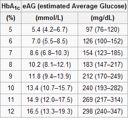
The table below, from Wikipedia, shows average blood glucose levels corresponding to various HbA1c values. As you can see, they are generally higher than the corresponding fasting blood glucose levels would normally be (the latter is what the values on the vertical axes of the graphs above from Yashin and colleagues’ study roughly measure). This is to be expected, because blood glucose levels vary a lot during the day, and are often transitorily high in response to food intake and fluctuations in various hormones. Growth hormone, cortisol and noradrenaline are examples of hormones that increase blood glucose. Only one hormone effectively decreases blood glucose levels, insulin, by stimulating glucose uptake and storage as glycogen and fat.
Nevertheless, one can reasonably expect fasting blood glucose levels to have been highly correlated with average blood glucose levels in the sample. So, in my opinion, the graphs above showing age-related blood glucose trajectories are still valid, in terms of their overall shape, but the values on the vertical axes should have been measured differently, perhaps using the formulas above.
Ironically, those who achieve low average blood glucose levels (measured based on HbA1c) by adopting a low carbohydrate diet (one of the most effective ways) frequently have somewhat high fasting blood glucose levels because of physiological (or benign) insulin resistance. Their body is primed to burn fat for energy, not glucose. Thus when growth hormone levels spike in the morning, so do blood glucose levels, as muscle cells are in glucose rejection mode. This is a benign version of the dawn effect (a.k.a. dawn phenomenon), which happens with quite a few low carbohydrate dieters, particularly with those who are deep in ketosis at dawn.
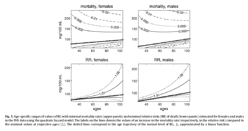
Yashin and colleagues also modeled relative risk of death based on blood glucose levels, using a fairly sophisticated mathematical model that takes into consideration U-curve relationships. What they found is intuitively appealing, and is illustrated by the two graphs at the bottom of the figure below. The graphs show how the relative risks (e.g., 1.05, on the topmost dashed line on the both graphs) associated with various ranges of blood glucose levels vary with age, for both females and males.
What the graphs above are telling us is that once you reach old age, controlling for blood sugar levels is not as effective as doing it earlier, because you are more likely to die from what the authors refer to as “other causes”. For example, at the age of 90, having a blood glucose of 150 mg/dl (corrected for the measurement problem noted earlier, this would be perhaps 165 mg/dl, from HbA1c values) is likely to increase your risk of death by only 5 percent. The graphs account for the facts that: (a) blood glucose levels naturally increase with age, and (b) fewer people survive as age progresses. So having that level of blood glucose at age 60 would significantly increase relative risk of death at that age; this is not shown on the graph, but can be inferred.
Here is a final rough edge of this study. From what I could gather from the underlying equations, the relative risks shown above do not account for the effect of high blood glucose levels earlier in life on relative risk of death later in life. This is a problem, even though it does not completely invalidate the conclusion above. As noted by several people (including Gary Taubes in his book Good Calories, Bad Calories), many of the diseases associated with high blood sugar levels (e.g., cancer) often take as much as 20 years of high blood sugar levels to develop. So the relative risks shown above underestimate the effect of high blood glucose levels earlier in life.
Do the long-lived participants have some natural protection against accelerated increases in blood sugar levels, or was it their diet and lifestyle that protected them? This question cannot be answered based on the study.
Assuming that their diet and lifestyle protected them, it is reasonable to argue that: (a) if you start controlling your average blood sugar levels well before you reach the age of 55, you may significantly increase your chances of living beyond the age of 90; (b) it is likely that your blood glucose levels will go up with age, but if you can manage to slow down that progression, you will increase your chances of living a longer and healthier life; (c) you should focus your control on reliable measures of average blood glucose levels, such as HbA1c, not fasting blood glucose levels (postprandial glucose levels are also a good option, because they contribute a lot to HbA1c increases); and (d) it is never too late to start controlling your blood glucose levels, but the more you wait, the bigger is the risk.
References:
Taubes, G. (2007). Good calories, bad calories: Challenging the conventional wisdom on diet, weight control, and disease. New York, NY: Alfred A. Knopf.
Yashin, A.I., Ukraintseva, S.V., Arbeev, K.G., Akushevich, I., Arbeeva, L.S., & Kulminski, A.M. (2009). Maintaining physiological state for exceptional survival: What is the normal level of blood glucose and does it change with age? Mechanisms of Ageing and Development, 130(9), 611-618.
The study uses data from the Framingham Heart Study (FHS). The FHS, which started in the late 1940s, recruited 5209 healthy participants (2336 males and 2873 females), aged 28 to 62, in the town of Framingham, Massachusetts. At the time of Yashin and colleagues’ article publication, there were 993 surviving participants.
I rearranged figure 2 from the Yashin and colleagues article so that the two graphs (for females and males) appeared one beside the other. The result is shown below (click on it to enlarge); the caption at the bottom-right corner refers to both graphs. The figure shows the age-related trajectory of blood glucose levels, grouped by lifespan (LS), starting at age 40.
As you can see from the figure above, blood glucose levels increase with age, even for long-lived individuals (LS > 90). The increases follow a U-curve (a.k.a. J-curve) pattern; the beginning of the right side of a U curve, to be more precise. The main difference in the trajectories of the blood glucose levels is that as lifespan increases, so does the width of the U curve. In other words, in long-lived people, blood glucose increases slowly with age; particularly up to 55 years of age, when it starts increasing more rapidly.
Now, here is one of the rough edges of this study. The authors do not provide standard deviations. You can ignore the error bars around the points on the graph; they are not standard deviations. They are standard errors, which are much lower than the corresponding standard deviations. Standard errors are calculated by dividing the standard deviations by the square root of the sample sizes for each trajectory point (which the authors do not provide either), so they go up with age since progressively smaller numbers of individuals reach advanced ages.
So, no need to worry if your blood glucose levels are higher than those shown on the vertical axes of the graphs. (I will comment more on those numbers below.) Not everybody who lived beyond 90 had a blood glucose of around 80 mg/dl at age 40. I wouldn't be surprised if about 2/3 of the long-lived participants had blood glucose levels in the range of 65 to 95 at that age.
Here is another rough edge. It is pretty clear that the authors’ main independent variable (i.e., health predictor) in this study is average blood glucose, which they refer to simply as “blood glucose”. However, the measure of blood glucose in the FHS is a very rough estimation of average blood glucose, because they measured blood glucose levels at random times during the day. These measurements, when averaged, are closer to fasting blood glucose levels than to average blood glucose levels.
A more reliable measure of average blood glucose levels is that of glycated hemoglobin (HbA1c). Blood glucose glycates (i.e., sticks to, like most sugary substances) hemoglobin, a protein found in red blood cells. Since red blood cells are relatively long-lived, with a turnover of about 3 months, HbA1c (given in percentages) is a good indicator of average blood glucose levels (if you don’t suffer from anemia or a few other blood abnormalities). Based on HbA1c, one can then estimate his or her average blood glucose level for the previous 3 months before the test, using one of the following equations, depending on whether the measurement is in mg/dl or mmol/l.
Average blood glucose (mg/dl) = 28.7 × HbA1c − 46.7
Average blood glucose (mmol/l) = 1.59 × HbA1c − 2.59
The table below, from Wikipedia, shows average blood glucose levels corresponding to various HbA1c values. As you can see, they are generally higher than the corresponding fasting blood glucose levels would normally be (the latter is what the values on the vertical axes of the graphs above from Yashin and colleagues’ study roughly measure). This is to be expected, because blood glucose levels vary a lot during the day, and are often transitorily high in response to food intake and fluctuations in various hormones. Growth hormone, cortisol and noradrenaline are examples of hormones that increase blood glucose. Only one hormone effectively decreases blood glucose levels, insulin, by stimulating glucose uptake and storage as glycogen and fat.
Nevertheless, one can reasonably expect fasting blood glucose levels to have been highly correlated with average blood glucose levels in the sample. So, in my opinion, the graphs above showing age-related blood glucose trajectories are still valid, in terms of their overall shape, but the values on the vertical axes should have been measured differently, perhaps using the formulas above.
Ironically, those who achieve low average blood glucose levels (measured based on HbA1c) by adopting a low carbohydrate diet (one of the most effective ways) frequently have somewhat high fasting blood glucose levels because of physiological (or benign) insulin resistance. Their body is primed to burn fat for energy, not glucose. Thus when growth hormone levels spike in the morning, so do blood glucose levels, as muscle cells are in glucose rejection mode. This is a benign version of the dawn effect (a.k.a. dawn phenomenon), which happens with quite a few low carbohydrate dieters, particularly with those who are deep in ketosis at dawn.
Yashin and colleagues also modeled relative risk of death based on blood glucose levels, using a fairly sophisticated mathematical model that takes into consideration U-curve relationships. What they found is intuitively appealing, and is illustrated by the two graphs at the bottom of the figure below. The graphs show how the relative risks (e.g., 1.05, on the topmost dashed line on the both graphs) associated with various ranges of blood glucose levels vary with age, for both females and males.
What the graphs above are telling us is that once you reach old age, controlling for blood sugar levels is not as effective as doing it earlier, because you are more likely to die from what the authors refer to as “other causes”. For example, at the age of 90, having a blood glucose of 150 mg/dl (corrected for the measurement problem noted earlier, this would be perhaps 165 mg/dl, from HbA1c values) is likely to increase your risk of death by only 5 percent. The graphs account for the facts that: (a) blood glucose levels naturally increase with age, and (b) fewer people survive as age progresses. So having that level of blood glucose at age 60 would significantly increase relative risk of death at that age; this is not shown on the graph, but can be inferred.
Here is a final rough edge of this study. From what I could gather from the underlying equations, the relative risks shown above do not account for the effect of high blood glucose levels earlier in life on relative risk of death later in life. This is a problem, even though it does not completely invalidate the conclusion above. As noted by several people (including Gary Taubes in his book Good Calories, Bad Calories), many of the diseases associated with high blood sugar levels (e.g., cancer) often take as much as 20 years of high blood sugar levels to develop. So the relative risks shown above underestimate the effect of high blood glucose levels earlier in life.
Do the long-lived participants have some natural protection against accelerated increases in blood sugar levels, or was it their diet and lifestyle that protected them? This question cannot be answered based on the study.
Assuming that their diet and lifestyle protected them, it is reasonable to argue that: (a) if you start controlling your average blood sugar levels well before you reach the age of 55, you may significantly increase your chances of living beyond the age of 90; (b) it is likely that your blood glucose levels will go up with age, but if you can manage to slow down that progression, you will increase your chances of living a longer and healthier life; (c) you should focus your control on reliable measures of average blood glucose levels, such as HbA1c, not fasting blood glucose levels (postprandial glucose levels are also a good option, because they contribute a lot to HbA1c increases); and (d) it is never too late to start controlling your blood glucose levels, but the more you wait, the bigger is the risk.
References:
Taubes, G. (2007). Good calories, bad calories: Challenging the conventional wisdom on diet, weight control, and disease. New York, NY: Alfred A. Knopf.
Yashin, A.I., Ukraintseva, S.V., Arbeev, K.G., Akushevich, I., Arbeeva, L.S., & Kulminski, A.M. (2009). Maintaining physiological state for exceptional survival: What is the normal level of blood glucose and does it change with age? Mechanisms of Ageing and Development, 130(9), 611-618.
Monday, February 11, 2013
The War of the End of the World: The health puzzle posed by its survivors
The War of Canudos took place in Brazil in 1896 and 1897. Canudos was a settlement of several thousand deeply religious Christians, led by a man known as Antonio Conselheiro. They opposed the recent establishment of the Republic of Brazil, particularly the institution of income taxes and civil marriage; the former was considered government-sponsored theft and the latter a sacrilege. The republic had been declared in 1889 following a military coup that deposed Dom Pedro II, an emperor beloved by the common people and under whose rule slavery had recently been abolished.
Canudos was located in the Brazilian sertão, an inhospitable semi-arid region in the northeastern part of the country. The inhabitants of Canudos were the sertanejos. The term jagunço was used to refer to the males, especially the outlaws. Many of the sertanejos lived in semi-starvation, in poor sanitary conditions, and with very limited (if any) access to healthcare. Infant mortality was very high at the time. Those who reached adulthood were typically of small stature, and very thin; not lean, thin – often described as “skin and bones”.
Below is what a typical young jagunço would look like at the time of the War of Canudos. (Some authors differentiate between jagunços and cangaceiros based on small differences in cultural and dress traditions; e.g., the hat in the photo is typical of cangaceiros.) The jagunços tended to be the best fed among the sertanejos. They were also known as cold-blooded killers. The photo is a cropped version of the original one; the grizzly original is at the top of a recent blog post by Juan Pablo Dabove (). The blog post discusses Vargas Llosa’s historical fiction book based on the War of Canudos, the masterpiece titled “The War of the End of the World” ().
Jorge Mario Pedro Vargas Llosa, a Peruvian-Spanish writer and politician, was the recipient of the 2010 Nobel Prize in Literature; “The War of the End of the World” is considered one of his greatest literary achievements. Euclides da Cunha wrote the most famous non-fictional account on the War of Canudos, another masterpiece that has been called “Brazil’s greatest book”, titled “Rebellion in the Backlands” (). The Portughese title is “Os Sertões”. Vargas Llosa’s book is based on da Cunha’s.
Sergio Rezende’s movie, “Guerra de Canudos” (), is a superb dramatization of the War of Canudos. I watched this movie after reading Vargas Llosa’s and da Cunha’s books, and was struck by two things: (a) the outstanding performances, especially by José Wilker, Cláudia Abreu, Marieta Severo, and Paulo Betti; and (b) the striking resemblance of the latter (Betti) to Royce Gracie (), a very nice man whom I interviewed () for my book on compensatory adaptation (), and who is no stranger to Ultimate Fighting Championship and mixed martial arts fans ().
In a nutshell, the War of Canudos went more or less like this. There were four military campaigns against the settlement. The third was a major one, led by one of Brazil’s most accomplished military leaders at the time, Colonel Antônio Moreira César. The jagunços, resorting to guerrilla warfare, fought off the government troops in the first three. The fourth, led by General Arthur Oscar de Andrade Guimarães, saw the jagunços defeated in a war of attrition primarily due to lack of access to food and water, after heavy losses among government troops. At the end, nearly all of the surviving jagunços were executed, by knife – to their absolute horror, and the perverse pleasure of the executioners bent on revenge, as the victims believed that they would not go to heaven if their lives were ended by knife, even against their will.
Ned, what is your point regarding health!?
After going through numerous sources, paper-based and online, academic and non-academic, I am convinced that a significant number of the survivors of the Canudos War lived to their 90s and beyond. This conclusion is based chiefly on comparisons of various dates, especially of interviews with survivors. No single source dedicated to this particular health-related aspect of the War of Canudos seems to exist. There is a video clip that shows some of the survivors (), speaking in Portuguese, with their ages shown in subtitles (“years”, in Portuguese, is “anos”). One of them, a man, is listed as being a supercentenarian.
In modern USA those who live to the age of 90 and beyond are outliers. Less than 2 percent of the population reach the age of 90 (). Most of them are women. My impression is that among the survivors of the War of Canudos, the 90+ percentage was at least 5 times higher; even with access to sanitation and healthcare in modern USA being much better at any age.
If my impression is correct, how can it be explained?
I think that some of the readers of this blog will be tempted to explain the high longevity based on calorie restriction. But the empirical evidence suggests that poor nutrition, in terms of micronutrients and macronutrients, is associated with increased mortality, not the other way around (, , ). Mortality due to poor nutrition is frequently from infectious diseases, in the young and the old. Degenerative diseases are widespread among the overnourished, not the well nourished, and kill mostly at later ages. It is not uncommon for infectious diseases to “mask” as degenerative diseases – e.g., viral diabetes ().
Often people point at hunter-gatherer populations and argue that they are healthy because of their low calorie intake. But mortality from infectious diseases among hunter-gatherers is very high, particularly in children. Others point to the absence of industrial foods engineered for overconsumption, which I think is definitely a factor in terms of degenerative diseases. Some say that a main factor is retention of lean body mass as one ages, referring mostly to muscle tissue, a hypothesis to which the case of the sertanejos poses a problem – what lean body mass!? And, on top of all of their problems, the sertanejos regularly faced long droughts, which may be why they typically had a “dry” look.
Yet others point to low stress. It is reasonable to think that stress is a mediating factor in the development of many modern diseases. Still, the sertanejos living in Canudos have had to endure quite a lot of stress, before and after the War of Canudos. In fact, the depictions of their lives at around the time of the War of Canudos suggest very stressful, miserable lives, prior to the conflict; which in part explains the early success of a religious settlement where life was marginally better.
By the way, the traditional Okinawans have also endured plenty of stress (), and they have had the highest longevity rates in recorded history. Food scarcity has frequently been combined with stress in their case, as with many other long-living groups. Causality is complex here, probably changing direction in different subsets of the data, but I have long suspected that the combination of stress and overnourishment is a particular unnatural one, to which humans are badly maladapted.
A main factor is almost always forgotten: the effective immune systems of those who have been subjected to starvation, poor sanitation, lack of healthcare, and other challenges – especially in childhood – and survived to adulthood. And here some counterintuitive things can happen. For example, someone may be very sickly early in life and barely survive childhood, and then become very resistant to infectious diseases later, thus appearing to be very healthy, to the surprise of relatives and friends who remember “that sickly child”. Immunocompetence is something that the body builds up in response to exposure.
As they say in northeastern Brazil, in characteristic drawl: “Ol’ sihtaneju ain’t die easy”.
Canudos was located in the Brazilian sertão, an inhospitable semi-arid region in the northeastern part of the country. The inhabitants of Canudos were the sertanejos. The term jagunço was used to refer to the males, especially the outlaws. Many of the sertanejos lived in semi-starvation, in poor sanitary conditions, and with very limited (if any) access to healthcare. Infant mortality was very high at the time. Those who reached adulthood were typically of small stature, and very thin; not lean, thin – often described as “skin and bones”.
Below is what a typical young jagunço would look like at the time of the War of Canudos. (Some authors differentiate between jagunços and cangaceiros based on small differences in cultural and dress traditions; e.g., the hat in the photo is typical of cangaceiros.) The jagunços tended to be the best fed among the sertanejos. They were also known as cold-blooded killers. The photo is a cropped version of the original one; the grizzly original is at the top of a recent blog post by Juan Pablo Dabove (). The blog post discusses Vargas Llosa’s historical fiction book based on the War of Canudos, the masterpiece titled “The War of the End of the World” ().
Jorge Mario Pedro Vargas Llosa, a Peruvian-Spanish writer and politician, was the recipient of the 2010 Nobel Prize in Literature; “The War of the End of the World” is considered one of his greatest literary achievements. Euclides da Cunha wrote the most famous non-fictional account on the War of Canudos, another masterpiece that has been called “Brazil’s greatest book”, titled “Rebellion in the Backlands” (). The Portughese title is “Os Sertões”. Vargas Llosa’s book is based on da Cunha’s.
Sergio Rezende’s movie, “Guerra de Canudos” (), is a superb dramatization of the War of Canudos. I watched this movie after reading Vargas Llosa’s and da Cunha’s books, and was struck by two things: (a) the outstanding performances, especially by José Wilker, Cláudia Abreu, Marieta Severo, and Paulo Betti; and (b) the striking resemblance of the latter (Betti) to Royce Gracie (), a very nice man whom I interviewed () for my book on compensatory adaptation (), and who is no stranger to Ultimate Fighting Championship and mixed martial arts fans ().
In a nutshell, the War of Canudos went more or less like this. There were four military campaigns against the settlement. The third was a major one, led by one of Brazil’s most accomplished military leaders at the time, Colonel Antônio Moreira César. The jagunços, resorting to guerrilla warfare, fought off the government troops in the first three. The fourth, led by General Arthur Oscar de Andrade Guimarães, saw the jagunços defeated in a war of attrition primarily due to lack of access to food and water, after heavy losses among government troops. At the end, nearly all of the surviving jagunços were executed, by knife – to their absolute horror, and the perverse pleasure of the executioners bent on revenge, as the victims believed that they would not go to heaven if their lives were ended by knife, even against their will.
Ned, what is your point regarding health!?
After going through numerous sources, paper-based and online, academic and non-academic, I am convinced that a significant number of the survivors of the Canudos War lived to their 90s and beyond. This conclusion is based chiefly on comparisons of various dates, especially of interviews with survivors. No single source dedicated to this particular health-related aspect of the War of Canudos seems to exist. There is a video clip that shows some of the survivors (), speaking in Portuguese, with their ages shown in subtitles (“years”, in Portuguese, is “anos”). One of them, a man, is listed as being a supercentenarian.
In modern USA those who live to the age of 90 and beyond are outliers. Less than 2 percent of the population reach the age of 90 (). Most of them are women. My impression is that among the survivors of the War of Canudos, the 90+ percentage was at least 5 times higher; even with access to sanitation and healthcare in modern USA being much better at any age.
If my impression is correct, how can it be explained?
I think that some of the readers of this blog will be tempted to explain the high longevity based on calorie restriction. But the empirical evidence suggests that poor nutrition, in terms of micronutrients and macronutrients, is associated with increased mortality, not the other way around (, , ). Mortality due to poor nutrition is frequently from infectious diseases, in the young and the old. Degenerative diseases are widespread among the overnourished, not the well nourished, and kill mostly at later ages. It is not uncommon for infectious diseases to “mask” as degenerative diseases – e.g., viral diabetes ().
Often people point at hunter-gatherer populations and argue that they are healthy because of their low calorie intake. But mortality from infectious diseases among hunter-gatherers is very high, particularly in children. Others point to the absence of industrial foods engineered for overconsumption, which I think is definitely a factor in terms of degenerative diseases. Some say that a main factor is retention of lean body mass as one ages, referring mostly to muscle tissue, a hypothesis to which the case of the sertanejos poses a problem – what lean body mass!? And, on top of all of their problems, the sertanejos regularly faced long droughts, which may be why they typically had a “dry” look.
Yet others point to low stress. It is reasonable to think that stress is a mediating factor in the development of many modern diseases. Still, the sertanejos living in Canudos have had to endure quite a lot of stress, before and after the War of Canudos. In fact, the depictions of their lives at around the time of the War of Canudos suggest very stressful, miserable lives, prior to the conflict; which in part explains the early success of a religious settlement where life was marginally better.
By the way, the traditional Okinawans have also endured plenty of stress (), and they have had the highest longevity rates in recorded history. Food scarcity has frequently been combined with stress in their case, as with many other long-living groups. Causality is complex here, probably changing direction in different subsets of the data, but I have long suspected that the combination of stress and overnourishment is a particular unnatural one, to which humans are badly maladapted.
A main factor is almost always forgotten: the effective immune systems of those who have been subjected to starvation, poor sanitation, lack of healthcare, and other challenges – especially in childhood – and survived to adulthood. And here some counterintuitive things can happen. For example, someone may be very sickly early in life and barely survive childhood, and then become very resistant to infectious diseases later, thus appearing to be very healthy, to the surprise of relatives and friends who remember “that sickly child”. Immunocompetence is something that the body builds up in response to exposure.
As they say in northeastern Brazil, in characteristic drawl: “Ol’ sihtaneju ain’t die easy”.
Monday, June 18, 2012
The lowest-mortality BMI: What is its relationship with fat-free mass?
Do overweight folks live longer? It is not uncommon to see graphs like the one below, from the Med Journal Watch blog (), suggesting that, at least as far as body mass index (BMI) is concerned (), overweight folks (25 < BMI < 30) seem to live longer. The graph shows BMI measured at a certain age, and risk of death within a certain time period (e.g., 20 years) following the measurement. The lowest-mortality BMI is about 26, which is in the overweight area of the BMI chart.
Note that relative age-adjusted mortality risk (i.e., relative to the mortality risk of people in the same age group), increases less steeply in response to weight variations as one becomes older. An older person increases the risk of dying to a lesser extent by weighing more or less than does a younger person. This seems to be particularly true for weight gain (as opposed to weight loss).
The table below is from a widely cited 2002 article by Allison and colleagues (), where they describe a study of 10,169 males aged 25-75. Almost all of the participants, ninety-eight percent, were followed up for many years after measurement; a total of 3,722 deaths were recorded.
Take a look at the two numbers circled in red. The one on the left is the lowest-mortality BMI not adjusting for fat mass or fat-free mass: a reasonably high 27.4. The one on the right is the lowest-mortality BMI adjusting for fat mass and fat-free mass: a much lower 21.6.
I know this may sound confusing, but due to possible statistical distortions this does not mean that you should try to bring your BMI to 21.6 if you want to reduce your risk of dying. What this means is that fat mass and fat-free mass matter. Moreover, all of the participants in this study were men. The authors concluded that: “…marked leanness (as opposed to thinness) has beneficial effects.”
Then we have an interesting 2003 article by Bigaard and colleagues () reporting on a study of 27,178 men and 29,875 women born in Denmark, 50 to 64 years of age. The table below summarizes deaths in this study, grouping them by BMI and waist circumference.
These are raw numbers; no complex statistics here. Circled in green is the area with samples that appear to be large enough to avoid “funny” results. Circled in red are the lowest-mortality percentages; I left out the 0.8 percentage because it is based on a very small sample.
As you can see, they refer to men and women with BMIs in the 25-29.9 range (overweight), but with waist circumferences in the lower-middle range: 90-96 cm for men and 74-82 cm for women; or approximately 35-38 inches for men and 29-32 inches for women.
Women with BMIs in the 18.5-24.9 range (normal) and the same or lower waists also died in small numbers. Underweight men and women had the highest mortality percentages.
A relatively small waist (not a wasp waist), together with a normal or high BMI, is an indication of more fat-free mass, which is retained together with some body fat. It is also an indication of less visceral body fat accumulation.
Note that relative age-adjusted mortality risk (i.e., relative to the mortality risk of people in the same age group), increases less steeply in response to weight variations as one becomes older. An older person increases the risk of dying to a lesser extent by weighing more or less than does a younger person. This seems to be particularly true for weight gain (as opposed to weight loss).
The table below is from a widely cited 2002 article by Allison and colleagues (), where they describe a study of 10,169 males aged 25-75. Almost all of the participants, ninety-eight percent, were followed up for many years after measurement; a total of 3,722 deaths were recorded.
Take a look at the two numbers circled in red. The one on the left is the lowest-mortality BMI not adjusting for fat mass or fat-free mass: a reasonably high 27.4. The one on the right is the lowest-mortality BMI adjusting for fat mass and fat-free mass: a much lower 21.6.
I know this may sound confusing, but due to possible statistical distortions this does not mean that you should try to bring your BMI to 21.6 if you want to reduce your risk of dying. What this means is that fat mass and fat-free mass matter. Moreover, all of the participants in this study were men. The authors concluded that: “…marked leanness (as opposed to thinness) has beneficial effects.”
Then we have an interesting 2003 article by Bigaard and colleagues () reporting on a study of 27,178 men and 29,875 women born in Denmark, 50 to 64 years of age. The table below summarizes deaths in this study, grouping them by BMI and waist circumference.
These are raw numbers; no complex statistics here. Circled in green is the area with samples that appear to be large enough to avoid “funny” results. Circled in red are the lowest-mortality percentages; I left out the 0.8 percentage because it is based on a very small sample.
As you can see, they refer to men and women with BMIs in the 25-29.9 range (overweight), but with waist circumferences in the lower-middle range: 90-96 cm for men and 74-82 cm for women; or approximately 35-38 inches for men and 29-32 inches for women.
Women with BMIs in the 18.5-24.9 range (normal) and the same or lower waists also died in small numbers. Underweight men and women had the highest mortality percentages.
A relatively small waist (not a wasp waist), together with a normal or high BMI, is an indication of more fat-free mass, which is retained together with some body fat. It is also an indication of less visceral body fat accumulation.
Labels:
BMI,
body fat,
body fat loss,
longevity,
mortality,
multivariate analysis,
muscle gain,
muscle loss
Monday, April 2, 2012
The 2012 Arch Intern Med red meat-mortality study: Eating 234 g/d of red meat could reduce mortality by 23 percent
As we have seen in an earlier post on the China Study data (), which explored relationships hinted at by Denise Minger’s previous and highly perceptive analysis (), one can use a multivariate analysis tool like WarpPLS () to explore relationships based on data reported by others. This is true even when the dataset available is fairly small.
So I entered the data reported in the most recent (published online in March 2012) study looking at the relationship between red meat consumption and mortality into WarpPLS to do some exploratory analyses. I discussed the study in my previous post; it was conducted by Pan et al. (Frank B. Hu is the senior author) and published in the prestigious Archives of Internal Medicine (). The data I used is from Table 1 of the article; it reports figures on several variables along 5 quintiles, based on separate analyses of two samples, called “Health Professionals” and “Nurses Health” samples. The Health Professionals sample comprised males; the Nurses Health sample, females.
Below is an interesting exploratory model, with results. It includes a number of hypotheses, represented by arrows, which seem to make sense. This is helpful, because a model incorporating hypotheses that make sense allows for easy identification of nonsense results, and thus rejection of the model or the data. (Refutability is one of the most important characteristics of good theoretical models.) Keep in mind that the sample size here is very small (N=10), as the authors of the study reported data along 5 quintiles for the Health Professionals sample, together with 5 quintiles for the Nurses Health sample. In a sense, this is somewhat helpful, because a small sample tends to be “unstable”, leading nonsense results and other signs of problems to show up easily – one example would be multivariate coefficients of association (the beta coefficients reported near the arrows) greater than 1 due to collinearity ().
So what does the model above tell us? It tells us that smoking (Smokng) is associated with reduced physical activity (PhysAct); beta = -0.92. It tells us that smoking (Smokng) is associated with reduced food intake (FoodInt); beta = -0.36. It tells us that physical activity (PhysAct) is associated with reduced incidence of diabetes (Diabetes); beta = -0.25. It tells us that increased food intake (FoodInt) is associated with increased incidence of diabetes (Diabetes); beta = 0.93. It tells us that increased food intake (FoodInt) is associated with increased red meat intake (RedMeat); beta = 0.60. It tells us that increased incidence of diabetes (Diabetes) is associated with increased mortality (Mort); beta = 0.61. It tells us that being female (SexM1F2) is associated with reduced mortality (Mort); beta = -0.67.
Some of these betas are a bit too high (e.g., 0.93), due to the level of collinearity caused by such a small sample. Due to being quite high, they are statistically significant even in a small sample. Betas greater than 0.20 tend to become statistically significant when the sample size is 100 or greater; so all of the coefficients above would be statistically significant with a larger sample size. What is the common denominator of all of the associations above? The common denominator is that all of them make sense, qualitatively speaking; there is not a single case where the sign is the opposite of what we would expect. There is one association that is shown on the graph and that is missing from my summary of associations above; and it also makes sense, at least to me. The model also tells us that increased red meat intake (RedMeat) is associated with reduced mortality (Mort); beta = -0.25. More technically, it tells us that, when we control for biological sex (SexM1F2) and incidence of diabetes (Diabetes), increased red meat intake (RedMeat) is associated with reduced mortality (Mort).
How do we roughly estimate this effect in terms of amounts of red meat consumed? The -0.25 means that, for each standard deviation in the amount of red meat consumed, there is a corresponding 0.25 standard deviation reduction of mortality. (This interpretation is possible because I used WarpPLS’ linear analysis algorithm; a nonlinear algorithm would lead to a more complex interpretation.) The standard deviation for red meat consumption is 0.897 servings. Each serving has about 84 g. And the highest number of servings in the dataset is 3.1 servings, or 260 g/d (calculated as: 3.1*84). To stay a bit shy of this extreme, let us consider a slightly lower intake amount, which is 3.1 standard deviations, or 234 g/d (calculated as: 3.1*0.897*84). Since the standard deviation for mortality is 0.3 percentage points, we can conclude that an extra 234 g of red meat per day is associated with a reduction in mortality of approximately 23 percent (calculated as: 3.1*0.25*0.3).
Let me repeat for emphasis: the data reported by the authors suggests that, when we control for biological sex and incidence of diabetes, an extra 234 g of red meat per day is associated with a reduction in mortality of approximately 23 percent. This is exactly the opposite, qualitatively speaking, of what was reported by the authors in the article. I should note that this is also a minute effect, like the effect reported by the authors. (The mortality rates in the article are expressed as percentages, with the lowest being around 1 percent. So this 23 percent is a percentage of a percentage.) If you were to compare a group of 100 people who ate little red meat with another group of the same size that ate 234 g more of red meat every day, over a period of more than 20 years, you would not find a single additional death in either group. If you were to compare matched groups of 1,000 individuals, you would find only 2 additional deaths among the folks who ate little red meat.
At the same time, we can also see that excessive food intake is associated with increased mortality via its effect on diabetes. The product beta coefficient for the mediated effect FoodInt --> Diabetes --> Mort is 0.57. This means that, for each standard deviation of food intake in grams, there is a corresponding 0.57 standard deviation increase in mortality, via an increase in the incidence of diabetes. This is very likely at levels of food consumption where significantly more calories are consumed than spent, ultimately leading to many people becoming obese. The standard deviation for food intake is 355 calories. The highest daily food intake quintile reported in the article is 2,396 calories, which happens to be associated with the highest mortality (and is probably an underestimation); the lowest is 1,202 (also probably underestimated).
So, in summary, the data suggests that, for the particular sample studied (made up of two subsamples): (a) red meat intake is protective in terms of overall mortality, through a direct effect; and (b) the deleterious effect of overeating on mortality is stronger than the protective effect of red meat intake. These conclusions are consistent with those of my previous post on the same study (). The difference is that the previous post suggested a possible moderating protective effect; this post suggests a possible direct protective effect. Both effects are small, as was the negative effect reported by the authors of the study. Neither is statistically significant, due to sample size limitations (secondary data from an article; N=10). And all of this is based on a study that categorized various types of processed meat as red meat, and that did not distinguish grass-fed from non-grass-fed meat.
By the way, in discussions of red meat intake’s effect on health, often iron overload is mentioned. What many people don’t seem to realize is that iron overload is caused primarily by hereditary haemochromatosis. Another cause is “blood doping” to improve athletic performance (). Hereditary haemochromatosis is a very rare genetic disorder; rare enough to be statistically “invisible” in any study that does not specifically target people with this disorder.
So I entered the data reported in the most recent (published online in March 2012) study looking at the relationship between red meat consumption and mortality into WarpPLS to do some exploratory analyses. I discussed the study in my previous post; it was conducted by Pan et al. (Frank B. Hu is the senior author) and published in the prestigious Archives of Internal Medicine (). The data I used is from Table 1 of the article; it reports figures on several variables along 5 quintiles, based on separate analyses of two samples, called “Health Professionals” and “Nurses Health” samples. The Health Professionals sample comprised males; the Nurses Health sample, females.
Below is an interesting exploratory model, with results. It includes a number of hypotheses, represented by arrows, which seem to make sense. This is helpful, because a model incorporating hypotheses that make sense allows for easy identification of nonsense results, and thus rejection of the model or the data. (Refutability is one of the most important characteristics of good theoretical models.) Keep in mind that the sample size here is very small (N=10), as the authors of the study reported data along 5 quintiles for the Health Professionals sample, together with 5 quintiles for the Nurses Health sample. In a sense, this is somewhat helpful, because a small sample tends to be “unstable”, leading nonsense results and other signs of problems to show up easily – one example would be multivariate coefficients of association (the beta coefficients reported near the arrows) greater than 1 due to collinearity ().
So what does the model above tell us? It tells us that smoking (Smokng) is associated with reduced physical activity (PhysAct); beta = -0.92. It tells us that smoking (Smokng) is associated with reduced food intake (FoodInt); beta = -0.36. It tells us that physical activity (PhysAct) is associated with reduced incidence of diabetes (Diabetes); beta = -0.25. It tells us that increased food intake (FoodInt) is associated with increased incidence of diabetes (Diabetes); beta = 0.93. It tells us that increased food intake (FoodInt) is associated with increased red meat intake (RedMeat); beta = 0.60. It tells us that increased incidence of diabetes (Diabetes) is associated with increased mortality (Mort); beta = 0.61. It tells us that being female (SexM1F2) is associated with reduced mortality (Mort); beta = -0.67.
Some of these betas are a bit too high (e.g., 0.93), due to the level of collinearity caused by such a small sample. Due to being quite high, they are statistically significant even in a small sample. Betas greater than 0.20 tend to become statistically significant when the sample size is 100 or greater; so all of the coefficients above would be statistically significant with a larger sample size. What is the common denominator of all of the associations above? The common denominator is that all of them make sense, qualitatively speaking; there is not a single case where the sign is the opposite of what we would expect. There is one association that is shown on the graph and that is missing from my summary of associations above; and it also makes sense, at least to me. The model also tells us that increased red meat intake (RedMeat) is associated with reduced mortality (Mort); beta = -0.25. More technically, it tells us that, when we control for biological sex (SexM1F2) and incidence of diabetes (Diabetes), increased red meat intake (RedMeat) is associated with reduced mortality (Mort).
How do we roughly estimate this effect in terms of amounts of red meat consumed? The -0.25 means that, for each standard deviation in the amount of red meat consumed, there is a corresponding 0.25 standard deviation reduction of mortality. (This interpretation is possible because I used WarpPLS’ linear analysis algorithm; a nonlinear algorithm would lead to a more complex interpretation.) The standard deviation for red meat consumption is 0.897 servings. Each serving has about 84 g. And the highest number of servings in the dataset is 3.1 servings, or 260 g/d (calculated as: 3.1*84). To stay a bit shy of this extreme, let us consider a slightly lower intake amount, which is 3.1 standard deviations, or 234 g/d (calculated as: 3.1*0.897*84). Since the standard deviation for mortality is 0.3 percentage points, we can conclude that an extra 234 g of red meat per day is associated with a reduction in mortality of approximately 23 percent (calculated as: 3.1*0.25*0.3).
Let me repeat for emphasis: the data reported by the authors suggests that, when we control for biological sex and incidence of diabetes, an extra 234 g of red meat per day is associated with a reduction in mortality of approximately 23 percent. This is exactly the opposite, qualitatively speaking, of what was reported by the authors in the article. I should note that this is also a minute effect, like the effect reported by the authors. (The mortality rates in the article are expressed as percentages, with the lowest being around 1 percent. So this 23 percent is a percentage of a percentage.) If you were to compare a group of 100 people who ate little red meat with another group of the same size that ate 234 g more of red meat every day, over a period of more than 20 years, you would not find a single additional death in either group. If you were to compare matched groups of 1,000 individuals, you would find only 2 additional deaths among the folks who ate little red meat.
At the same time, we can also see that excessive food intake is associated with increased mortality via its effect on diabetes. The product beta coefficient for the mediated effect FoodInt --> Diabetes --> Mort is 0.57. This means that, for each standard deviation of food intake in grams, there is a corresponding 0.57 standard deviation increase in mortality, via an increase in the incidence of diabetes. This is very likely at levels of food consumption where significantly more calories are consumed than spent, ultimately leading to many people becoming obese. The standard deviation for food intake is 355 calories. The highest daily food intake quintile reported in the article is 2,396 calories, which happens to be associated with the highest mortality (and is probably an underestimation); the lowest is 1,202 (also probably underestimated).
So, in summary, the data suggests that, for the particular sample studied (made up of two subsamples): (a) red meat intake is protective in terms of overall mortality, through a direct effect; and (b) the deleterious effect of overeating on mortality is stronger than the protective effect of red meat intake. These conclusions are consistent with those of my previous post on the same study (). The difference is that the previous post suggested a possible moderating protective effect; this post suggests a possible direct protective effect. Both effects are small, as was the negative effect reported by the authors of the study. Neither is statistically significant, due to sample size limitations (secondary data from an article; N=10). And all of this is based on a study that categorized various types of processed meat as red meat, and that did not distinguish grass-fed from non-grass-fed meat.
By the way, in discussions of red meat intake’s effect on health, often iron overload is mentioned. What many people don’t seem to realize is that iron overload is caused primarily by hereditary haemochromatosis. Another cause is “blood doping” to improve athletic performance (). Hereditary haemochromatosis is a very rare genetic disorder; rare enough to be statistically “invisible” in any study that does not specifically target people with this disorder.
Labels:
diabetes,
haemochromatosis,
iron overload,
longevity,
mortality,
red meat,
warppls
Monday, March 19, 2012
The 2012 red meat-mortality study (Arch Intern Med): The data suggests that red meat is protective
I am not a big fan of using arguments such as “food questionnaires are unreliable” and “observational studies are worthless” to completely dismiss a study. There are many reasons for this. One of them is that, when people misreport certain diet and lifestyle patterns, but do that consistently (i.e., everybody underreports food intake), the biasing effect on coefficients of association is minor. Measurement errors may remain for this or other reasons, but regression methods (linear and nonlinear) assume the existence of such errors, and are designed to yield robust coefficients in their presence. Besides, for me to use these types of arguments would be hypocritical, since I myself have done several analyses on the China Study data (), and built what I think are valid arguments based on those analyses.
My approach is: Let us look at the data, any data, carefully, using appropriate analysis tools, and see what it tells us; maybe we will find evidence of measurement errors distorting the results and leading to mistaken conclusions, or maybe not. With this in mind, let us take a look at the top part of Table 3 of the most recent (published online in March 2012) study looking at the relationship between red meat consumption and mortality, authored by Pan et al. (Frank B. Hu is the senior author) and published in the prestigious Archives of Internal Medicine (). This is a prominent journal, with an average of over 270 citations per article according to Google Scholar. The study has received much media attention recently.
Take a look at the area highlighted in red, focusing on data from the Health Professionals sample. That is the multivariate-adjusted cardiovascular mortality rate, listed as a normalized percentage, in the highest quintile (Q5) of red meat consumption from the Health Professionals sample. The non-adjusted percentages are 1.4 percent mortality in Q5 and 1.13 in Q1 (from Table 1 of the same article); so the multivariate adjustment-normalization changed the values of the percentages somewhat, but not much. The highlighted 1.35 number suggests that for each group of 100 people who consumed a lot of red meat (Q5), when compared with a group of 100 people who consumed little red meat (Q1), there were on average 0.35 more deaths over the same period of time (more than 20 years).
The heavy red meat eaters in Q5 consumed 972.37 percent more red meat than those in Q1. This is calculated with data from Table 1 of the same article, as: (2.36-0.22)/0.22. In Q5, the 2.36 number refers to the number of servings of red meat per day, with each serving being approximately 84 g. So the heavy red meat eaters ate approximately 198 g per day (a bit less than 0.5 lb), while the light red meat eaters ate about 18 g per day. In other words, the heavy red meat eaters ate 9.7237 times more, or 972.37 percent more, red meat.
So, just to be clear, even though the folks in Q5 consumed 972.37 percent more red meat than the folks in Q1, in each matched group of 100 you would not find a single additional death over the same time period. If you looked at matched groups of 1,000 individuals, you would find 3 more deaths among the heavy red meat eaters. The same general pattern, of a minute difference, repeats itself throughout Table 3. As you can see, all of the reported mortality ratios are 1-point-something. In fact, this same pattern repeats itself in all mortality tables (all-cause, cardiovascular, cancer). This is all based on a multivariate analysis that according to the authors controlled for a large number of variables, including baseline history of diabetes.
Interestingly, looking at data from the same sample (Health Professionals), the incidence of diabetes is 75 percent higher in Q5 than in Q1. The same is true for the second sample (Nurses Health), where the Q5-Q1 difference in incidence of diabetes is even greater - 81 percent. This caught my eye, being diabetes such a prototypical “disease of affluence”. So I entered the whole data reported in the article into HCE () and WarpPLS (), and conducted some analyses. The graphs below are from HCE. The data includes both samples – Health Professionals and Nurses Health.
HCE calculates bivariate correlations, and so does WarpPLS. But WarpPLS stores numbers with a higher level of precision, so I used WarpPLS for calculating coefficients of association, including correlations. I also double-checked the numbers with other software, just in case (e.g., SPSS and MATLAB). Here are the correlations calculated by WarpPLS, which refer to the graphs above: 0.030 for red meat intake and mortality; 0.607 for diabetes and mortality; and 0.910 for food intake and diabetes. Yes, you read it right, the correlation between red meat intake and mortality is a very low and non-significant 0.030 in this dataset. Not a big surprise when you look at the related HCE graph, with the line going up and down almost at random. Note that I included the quintiles data from both the Health Professionals and Nurses Health samples in one dataset.
Those folks in Q5 had a much higher incidence of diabetes, and yet the increase in mortality for them was significantly lower, in percentage terms. A key difference between Q5 and Q1 being what? The Q5 folks ate a lot more red meat. This looks suspiciously suggestive of a finding that I came across before, based on an analysis of the China Study II data (). The finding was that animal food consumption (and red meat is an animal food) was protective, actually reducing the negative effect of wheat flour consumption on mortality. That analysis actually suggested that wheat flour consumption may not be so bad if you eat 221 g or more of animal food daily.
So, I built the model below in WarpPLS, where red meat intake (RedMeat) is hypothesized to moderate the relationship between diabetes incidence (Diabetes) and mortality (Mort). Below I am also including the graphs for the direct and moderating effects; the data is standardized, which reduces estimation error, particularly in moderating effects estimation. I used a standard linear algorithm for the calculation of the path coefficients (betas next to the arrows) and jackknifing for the calculation of the P values (confidence = 1 – P value). Jackknifing is a resampling technique that does not require multivariate normality and that tends to work well with small samples; as is the case with nonparametric techniques in general.
The direct effect of diabetes on mortality is positive (0.68) and almost statistically significant at the P < 0.05 level (confidence of 94 percent), which is noteworthy because the sample size here is so small – only 10 data points, 5 quintiles from the Health Professionals sample and 5 from the Nurses Health sample. The moderating effect is negative (-0.11), but not statistically significant (confidence of 61 percent). In the moderating effect graphs (shown side-by-side), this negative moderation is indicated by a slightly less steep inclination of the regression line for the graph on the right, which refers to high red meat intake. A less steep inclination means a less strong relationship between diabetes and mortality – among the folks who ate the most red meat.
Not too surprisingly, at least to me, the results above suggest that red meat per se may well be protective. Although we should consider a least two other possibilities. One is that red meat intake is a marker for consumption of some other things, possibly present in animal foods, that are protective - e.g., choline and vitamin K2. The other possibility is that red meat is protective in part by displacing other less healthy foods. Perhaps what we are seeing here is a combination of these.
Whatever the reason may be, red meat consumption seems to actually lessen the effect of diabetes on mortality in this sample. That is, according to this data, the more red meat is consumed, the fewer people die from diabetes. The protective effect might have been stronger if the participants had eaten more red meat, or more animal foods containing the protective factors; recall that the threshold for protection in the China Study II data was consumption of 221 g or more of animal food daily (). Having said that, it is also important to note that, if you eat excess calories to the point of becoming obese, from red meat or any other sources, your risk of developing diabetes will go up – as the earlier HCE graph relating food intake and diabetes implies.
Please keep in mind that this post is the result of a quick analysis of secondary data reported in a journal article, and its conclusions may be wrong, even though I did my best not to make any mistake (e.g., mistyping data from the article). The authors likely spent months, if not more, in their study; and have the support of one of the premier research universities in the world. Still, this post raises serious questions. I say this respectfully, as the authors did seem to try their best to control for all possible confounders.
I should also say that the moderating effect I uncovered is admittedly a fairly weak effect on this small sample and not statistically significant. But its magnitude is apparently greater than the reported effects of red meat on mortality, which are not only minute but may well be statistical artifacts. The Cox proportional hazards analysis employed in the study, which is commonly used in epidemiology, is nothing more than a sophisticated ANCOVA; it is a semi-parametric version of a special case of the broader analysis method automated by WarpPLS.
Finally, I could not control for confounders because, given the small sample, inclusion of confounders (e.g., smoking) leads to massive collinearity. WarpPLS calculates collinearity estimates automatically, and is particularly thorough at doing that (calculating them at multiple levels), so there is no way to ignore them. Collinearity can severely distort results, as pointed out in a YouTube video on WarpPLS (). Collinearity can even lead to changes in the signs of coefficients of association, in the context of multivariate analyses - e.g., a positive association appears to be negative. The authors have the original data – a much, much larger sample - which makes it much easier to deal with collinearity.
Moderating effects analyses () – we need more of that in epidemiological research eh?
My approach is: Let us look at the data, any data, carefully, using appropriate analysis tools, and see what it tells us; maybe we will find evidence of measurement errors distorting the results and leading to mistaken conclusions, or maybe not. With this in mind, let us take a look at the top part of Table 3 of the most recent (published online in March 2012) study looking at the relationship between red meat consumption and mortality, authored by Pan et al. (Frank B. Hu is the senior author) and published in the prestigious Archives of Internal Medicine (). This is a prominent journal, with an average of over 270 citations per article according to Google Scholar. The study has received much media attention recently.
Take a look at the area highlighted in red, focusing on data from the Health Professionals sample. That is the multivariate-adjusted cardiovascular mortality rate, listed as a normalized percentage, in the highest quintile (Q5) of red meat consumption from the Health Professionals sample. The non-adjusted percentages are 1.4 percent mortality in Q5 and 1.13 in Q1 (from Table 1 of the same article); so the multivariate adjustment-normalization changed the values of the percentages somewhat, but not much. The highlighted 1.35 number suggests that for each group of 100 people who consumed a lot of red meat (Q5), when compared with a group of 100 people who consumed little red meat (Q1), there were on average 0.35 more deaths over the same period of time (more than 20 years).
The heavy red meat eaters in Q5 consumed 972.37 percent more red meat than those in Q1. This is calculated with data from Table 1 of the same article, as: (2.36-0.22)/0.22. In Q5, the 2.36 number refers to the number of servings of red meat per day, with each serving being approximately 84 g. So the heavy red meat eaters ate approximately 198 g per day (a bit less than 0.5 lb), while the light red meat eaters ate about 18 g per day. In other words, the heavy red meat eaters ate 9.7237 times more, or 972.37 percent more, red meat.
So, just to be clear, even though the folks in Q5 consumed 972.37 percent more red meat than the folks in Q1, in each matched group of 100 you would not find a single additional death over the same time period. If you looked at matched groups of 1,000 individuals, you would find 3 more deaths among the heavy red meat eaters. The same general pattern, of a minute difference, repeats itself throughout Table 3. As you can see, all of the reported mortality ratios are 1-point-something. In fact, this same pattern repeats itself in all mortality tables (all-cause, cardiovascular, cancer). This is all based on a multivariate analysis that according to the authors controlled for a large number of variables, including baseline history of diabetes.
Interestingly, looking at data from the same sample (Health Professionals), the incidence of diabetes is 75 percent higher in Q5 than in Q1. The same is true for the second sample (Nurses Health), where the Q5-Q1 difference in incidence of diabetes is even greater - 81 percent. This caught my eye, being diabetes such a prototypical “disease of affluence”. So I entered the whole data reported in the article into HCE () and WarpPLS (), and conducted some analyses. The graphs below are from HCE. The data includes both samples – Health Professionals and Nurses Health.
HCE calculates bivariate correlations, and so does WarpPLS. But WarpPLS stores numbers with a higher level of precision, so I used WarpPLS for calculating coefficients of association, including correlations. I also double-checked the numbers with other software, just in case (e.g., SPSS and MATLAB). Here are the correlations calculated by WarpPLS, which refer to the graphs above: 0.030 for red meat intake and mortality; 0.607 for diabetes and mortality; and 0.910 for food intake and diabetes. Yes, you read it right, the correlation between red meat intake and mortality is a very low and non-significant 0.030 in this dataset. Not a big surprise when you look at the related HCE graph, with the line going up and down almost at random. Note that I included the quintiles data from both the Health Professionals and Nurses Health samples in one dataset.
Those folks in Q5 had a much higher incidence of diabetes, and yet the increase in mortality for them was significantly lower, in percentage terms. A key difference between Q5 and Q1 being what? The Q5 folks ate a lot more red meat. This looks suspiciously suggestive of a finding that I came across before, based on an analysis of the China Study II data (). The finding was that animal food consumption (and red meat is an animal food) was protective, actually reducing the negative effect of wheat flour consumption on mortality. That analysis actually suggested that wheat flour consumption may not be so bad if you eat 221 g or more of animal food daily.
So, I built the model below in WarpPLS, where red meat intake (RedMeat) is hypothesized to moderate the relationship between diabetes incidence (Diabetes) and mortality (Mort). Below I am also including the graphs for the direct and moderating effects; the data is standardized, which reduces estimation error, particularly in moderating effects estimation. I used a standard linear algorithm for the calculation of the path coefficients (betas next to the arrows) and jackknifing for the calculation of the P values (confidence = 1 – P value). Jackknifing is a resampling technique that does not require multivariate normality and that tends to work well with small samples; as is the case with nonparametric techniques in general.
The direct effect of diabetes on mortality is positive (0.68) and almost statistically significant at the P < 0.05 level (confidence of 94 percent), which is noteworthy because the sample size here is so small – only 10 data points, 5 quintiles from the Health Professionals sample and 5 from the Nurses Health sample. The moderating effect is negative (-0.11), but not statistically significant (confidence of 61 percent). In the moderating effect graphs (shown side-by-side), this negative moderation is indicated by a slightly less steep inclination of the regression line for the graph on the right, which refers to high red meat intake. A less steep inclination means a less strong relationship between diabetes and mortality – among the folks who ate the most red meat.
Not too surprisingly, at least to me, the results above suggest that red meat per se may well be protective. Although we should consider a least two other possibilities. One is that red meat intake is a marker for consumption of some other things, possibly present in animal foods, that are protective - e.g., choline and vitamin K2. The other possibility is that red meat is protective in part by displacing other less healthy foods. Perhaps what we are seeing here is a combination of these.
Whatever the reason may be, red meat consumption seems to actually lessen the effect of diabetes on mortality in this sample. That is, according to this data, the more red meat is consumed, the fewer people die from diabetes. The protective effect might have been stronger if the participants had eaten more red meat, or more animal foods containing the protective factors; recall that the threshold for protection in the China Study II data was consumption of 221 g or more of animal food daily (). Having said that, it is also important to note that, if you eat excess calories to the point of becoming obese, from red meat or any other sources, your risk of developing diabetes will go up – as the earlier HCE graph relating food intake and diabetes implies.
Please keep in mind that this post is the result of a quick analysis of secondary data reported in a journal article, and its conclusions may be wrong, even though I did my best not to make any mistake (e.g., mistyping data from the article). The authors likely spent months, if not more, in their study; and have the support of one of the premier research universities in the world. Still, this post raises serious questions. I say this respectfully, as the authors did seem to try their best to control for all possible confounders.
I should also say that the moderating effect I uncovered is admittedly a fairly weak effect on this small sample and not statistically significant. But its magnitude is apparently greater than the reported effects of red meat on mortality, which are not only minute but may well be statistical artifacts. The Cox proportional hazards analysis employed in the study, which is commonly used in epidemiology, is nothing more than a sophisticated ANCOVA; it is a semi-parametric version of a special case of the broader analysis method automated by WarpPLS.
Finally, I could not control for confounders because, given the small sample, inclusion of confounders (e.g., smoking) leads to massive collinearity. WarpPLS calculates collinearity estimates automatically, and is particularly thorough at doing that (calculating them at multiple levels), so there is no way to ignore them. Collinearity can severely distort results, as pointed out in a YouTube video on WarpPLS (). Collinearity can even lead to changes in the signs of coefficients of association, in the context of multivariate analyses - e.g., a positive association appears to be negative. The authors have the original data – a much, much larger sample - which makes it much easier to deal with collinearity.
Moderating effects analyses () – we need more of that in epidemiological research eh?
Monday, February 20, 2012
The “pork paradox”? National pork consumption and obesity
In my previous post () I discussed some country data linking pork consumption and health, analyzed with WarpPLS (). One of the datasets used, the most complete, contained data from Nationmaster.com () for the following countries: Australia, Brazil, Canada, China, Denmark, France, Germany, Hong Kong, Hungary, Japan, Mexico, Poland, Russia, Singapore, Spain, Sweden, United Kingdom, and United States. That previous post also addressed a study by Bridges (), based on country-level data, suggesting that pork consumption may cause liver disease.
In this post we continue that analysis, but with a much more complex model containing the following country variables: wealth (PPP-adjusted GNP/person), pork consumption (lbs/person/year), alcohol consumption (liters/person/year), obesity (% of population), and life expectancy (years). The model and results, generated by WarpPLS, are shown on the figure below. (See notes at the end of this post.) These results are only for direct effects.
WarpPLS also calculates total effects, which are the effects of each variable on any other variable to which it is linked directly and/or indirectly. Two variables may be linked indirectly, through various paths, even if they are not linked directly (i.e., have an arrow directly connecting them). Another set of outputs generated by the software are effect sizes, which are calculated as Cohen’s f-squared coefficients. The figure below shows the total effects table. The values underlined in red are for total effects that are both statistically significant and also above the effect size threshold recommended by Cohen to be considered relevant (f-squared > 0.02).
As I predicted in my previous post, wealth is positively associated with pork consumption. So is alcohol consumption, and more strongly than wealth; which is consistent with a study by Jeanneret and colleagues showing a strong association between alcohol consumption and protein rich diets (). The inclusion of wealth in the model, compared with the model without wealth in the previous post, renders the direct and total effects of alcohol and pork consumption on life expectancy statistically indistinguishable from zero. (This often happens when a confounder is added to a model.)
Pork consumption is negatively associated with obesity, which is interesting. So is alcohol consumption, but much less strongly than pork consumption. This does not mean that if you eat 20 doughnuts every day, together with 1 lb of pork, you are not going to become obese. What this does suggest is that maybe countries where pork is consumed more heavily are somewhat more resistant to obesity. Here it should be noted that pork is very popular in Asian countries, which are becoming increasingly wealthy, but without the widespread obesity that we see in the USA.
But it is not the inclusion of Asian countries in the dataset that paints such a positive picture for pork consumption vis-à-vis obesity, and even weakens the association between wealth and obesity so much as to make it statistically non-significant. Denmark is a wealthy country that has very low levels of obesity. And it happens to have the highest level of pork consumption in the whole dataset: 142.6 lbs/person/year. So we are not talking about an “Asian paradox” here.
More like a “pork paradox”.
Finally, as far as life expectancy is concerned, the key factors seem to be wealth and obesity. Wealth has a major positive effect on life expectancy, while obesity has a much weaker negative effect. Well, access to sanitation, medical services, and other amenities of civilization, still trumps obesity in terms of prolonging life; however miserable life may turn out to be. The competing effects of these two variables (i.e., wealth and obesity) were taken into consideration, or controlled for, in the calculation of total effects and effect sizes.
The fact that pork consumption is negatively associated with obesity goes somewhat against the idea that pork is inherently unhealthy; even though pork certainly can cause disease if not properly prepared and/or cooked, which is true for many other plant and animal foods. The possible connection with liver problems, alluded to in the previous post, is particularly suspicious in light of these results. Liver diseases often impair that organ’s ability to make glycogen based on carbohydrates and protein; that is, liver diseases frequently lead to liver insulin resistance. And obesity frequently follows from liver insulin resistance.
Given that pork consumption appears to be negatively associated with obesity, it would be surprising if it was causing widespread liver disease, unless its relationship with liver disease was found to be nonlinear. (Alcohol consumption seems to be nonlinearly associated with liver disease.) Still, most studies that suggest the existence of a causal link between pork consumption and liver disease, like Bridges’s (), hint at a linear and dose-dependent relationship.
Notes
- Country-level data is inherently problematic, particularly when simple models are used (e.g., a model with only two variables). There are just too many possible confounders that may lead to the appearance of causal associations.
- More complex models ameliorate the above situation somewhat, but bump into another problem associated with country-level data – small sample sizes. We used data from 18 countries in this analysis, which is more than in the Bridges study. Still, the effective sample size here (N=18) is awfully small.
- There were some missing values in this dataset, which were handled by WarpPLS employing the most widely used approach in these cases – i.e., by replacing the missing values with the mean of each column. The percentages of missing values per variable (i.e., column) were: alcohol consumption: 27.78%; life expectancy: 5.56%; and obesity: 33.33%.
In this post we continue that analysis, but with a much more complex model containing the following country variables: wealth (PPP-adjusted GNP/person), pork consumption (lbs/person/year), alcohol consumption (liters/person/year), obesity (% of population), and life expectancy (years). The model and results, generated by WarpPLS, are shown on the figure below. (See notes at the end of this post.) These results are only for direct effects.
WarpPLS also calculates total effects, which are the effects of each variable on any other variable to which it is linked directly and/or indirectly. Two variables may be linked indirectly, through various paths, even if they are not linked directly (i.e., have an arrow directly connecting them). Another set of outputs generated by the software are effect sizes, which are calculated as Cohen’s f-squared coefficients. The figure below shows the total effects table. The values underlined in red are for total effects that are both statistically significant and also above the effect size threshold recommended by Cohen to be considered relevant (f-squared > 0.02).
As I predicted in my previous post, wealth is positively associated with pork consumption. So is alcohol consumption, and more strongly than wealth; which is consistent with a study by Jeanneret and colleagues showing a strong association between alcohol consumption and protein rich diets (). The inclusion of wealth in the model, compared with the model without wealth in the previous post, renders the direct and total effects of alcohol and pork consumption on life expectancy statistically indistinguishable from zero. (This often happens when a confounder is added to a model.)
Pork consumption is negatively associated with obesity, which is interesting. So is alcohol consumption, but much less strongly than pork consumption. This does not mean that if you eat 20 doughnuts every day, together with 1 lb of pork, you are not going to become obese. What this does suggest is that maybe countries where pork is consumed more heavily are somewhat more resistant to obesity. Here it should be noted that pork is very popular in Asian countries, which are becoming increasingly wealthy, but without the widespread obesity that we see in the USA.
But it is not the inclusion of Asian countries in the dataset that paints such a positive picture for pork consumption vis-à-vis obesity, and even weakens the association between wealth and obesity so much as to make it statistically non-significant. Denmark is a wealthy country that has very low levels of obesity. And it happens to have the highest level of pork consumption in the whole dataset: 142.6 lbs/person/year. So we are not talking about an “Asian paradox” here.
More like a “pork paradox”.
Finally, as far as life expectancy is concerned, the key factors seem to be wealth and obesity. Wealth has a major positive effect on life expectancy, while obesity has a much weaker negative effect. Well, access to sanitation, medical services, and other amenities of civilization, still trumps obesity in terms of prolonging life; however miserable life may turn out to be. The competing effects of these two variables (i.e., wealth and obesity) were taken into consideration, or controlled for, in the calculation of total effects and effect sizes.
The fact that pork consumption is negatively associated with obesity goes somewhat against the idea that pork is inherently unhealthy; even though pork certainly can cause disease if not properly prepared and/or cooked, which is true for many other plant and animal foods. The possible connection with liver problems, alluded to in the previous post, is particularly suspicious in light of these results. Liver diseases often impair that organ’s ability to make glycogen based on carbohydrates and protein; that is, liver diseases frequently lead to liver insulin resistance. And obesity frequently follows from liver insulin resistance.
Given that pork consumption appears to be negatively associated with obesity, it would be surprising if it was causing widespread liver disease, unless its relationship with liver disease was found to be nonlinear. (Alcohol consumption seems to be nonlinearly associated with liver disease.) Still, most studies that suggest the existence of a causal link between pork consumption and liver disease, like Bridges’s (), hint at a linear and dose-dependent relationship.
Notes
- Country-level data is inherently problematic, particularly when simple models are used (e.g., a model with only two variables). There are just too many possible confounders that may lead to the appearance of causal associations.
- More complex models ameliorate the above situation somewhat, but bump into another problem associated with country-level data – small sample sizes. We used data from 18 countries in this analysis, which is more than in the Bridges study. Still, the effective sample size here (N=18) is awfully small.
- There were some missing values in this dataset, which were handled by WarpPLS employing the most widely used approach in these cases – i.e., by replacing the missing values with the mean of each column. The percentages of missing values per variable (i.e., column) were: alcohol consumption: 27.78%; life expectancy: 5.56%; and obesity: 33.33%.
Subscribe to:
Posts (Atom)