Showing posts with label heart disease. Show all posts
Tuesday, April 21, 2026
Heavy physical activity may significantly reduce heart disease deaths, especially after age 45
The idea that heavy physical activity is a main trigger of heart attacks is widespread. Often endurance running and cardio-type activities are singled out. Some people refer to this as “death by running”. Others think that strength training has a higher lethal potential. We know based on the Oregon Sudden Unexpected Death Study that this is a myth ().
Here is some evidence that heavy physical activity in fact has a significant protective effect. The graph below shows the number of deaths from coronary heart disease, organized by age group, in longshoremen (dock workers). The shaded bars represent those whose level of activity at work was considered heavy. The unshaded bars represent those whose level of activity at work was considered moderate or light (essentially below the “heavy” level).
The data is based on an old and classic study of 6351 men, aged 35 to 74 years, who were followed either for 22 years, or to death, or to the age of 75. It shows a significant protective effect of heavy activity, especially after age 45 () . The numbers atop the unshaded bars reflect the relative risk of death from coronary heart disease in each age group. For example, in the age group 65-74, the risk among those not in the heavy activity group is 110 percent higher (2.1 times higher) than in the heavy activity group.
It should be noted that this is a cumulative effect, of years of heavy activity. Based on the description of the types of activities performed, and the calories spent, I estimate that the heavy activity group performed the equivalent of a few hours of strength training per week, plus a lot of walking and other light physical activities. The authors of the study concluded that “… repeated bursts of high energy output established a plateau of protection against coronary mortality.”
Heavy physical activity may not make you lose much weight, but has the potential to make you live longer.
Monday, August 26, 2019
How much alcohol is optimal? Maybe less than you think
I have been regularly recommending to users of the software HCE () to include a column in their health data reflecting their alcohol consumption. Why? Because I suspect that alcohol consumption is behind many of what we call the “diseases of affluence”.
A while ago I recall watching an interview with a centenarian, a very lucid woman. When asked about her “secret” to live a long life, she said that she added a little bit of whiskey to her coffee every morning. It was something like a tablespoon of whiskey, or about 15 g, which amounted to approximately 6 g of ethanol every single day.
Well, she might have been drinking very close to the optimal amount of alcohol per day for the average person, if the study reviewed in this post is correct.
Studies of the effect of alcohol consumption on health generally show results in terms of averages within fixed ranges of consumption. For example, they will show average mortality risks for people consuming 1, 2, 3 etc. drinks per day. These studies suggest that there is a J-curve relationship between alcohol consumption and health (). That is, drinking a little is better than not drinking; and drinking a lot is worse than drinking a little.
However, using “rough” ranges of 1, 2, 3 etc. drinks per day prevents those studies from getting to a more fine-grained picture of the beneficial effects of alcohol consumption.
Contrary to popular belief, the positive health effects of moderate alcohol consumption have little, if anything, to do with polyphenols such as resveratrol. Resveratrol, once believed to be the fountain of youth, is found in the skin of red grapes.
It is in fact the alcohol content that has positive effects, apparently reducing the incidence of coronary heart disease, diabetes, hypertension, congestive heart failure, stroke, dementia, Raynaud’s phenomenon, and all-cause mortality. Raynaud's phenomenon is associated with poor circulation in the extremities (e.g., toes, fingers), which in some cases can progress to gangrene.
In most studies of the effects of alcohol consumption on health, the J-curves emerge from visual inspection of the plots of averages across ranges of consumption. Rarely you find studies where nonlinear relationships are “discovered” by software tools such as WarpPLS (), with effects being adjusted accordingly.
You do find, however, some studies that fit reasonably justified functions to the data. Di Castelnuovo and colleagues’ study, published in JAMA Internal Medicine in 2006 (), is probably the most widely cited among these studies. This study is a meta-analysis; i.e., a study that builds on various other empirical studies.
I think that the journal in which this study appeared was formerly known as Archives of Internal Medicine, a fairly selective and prestigious journal, even though this did not seem to be reflected in its Wikipedia article at the time of this writing ().
What Di Castelnuovo and colleagues found is interesting. They fitted a bunch of nonlinear functions to the data, all with J-curve shapes. The results suggest a lot of variation in the maximum amount one can drink before mortality becomes higher than not drinking at all; that maximum amount ranges from about 4 to 6 drinks per day.
But there is little variation in one respect. The optimal amount of alcohol is somewhere around 5 and 7 g/d, which translates into about the following every day: half a can of beer, half a glass of wine, or half a “shot” of spirit. This is clearly a common trait of all of the nonlinear functions that they generated. This is illustrated in the figure below, from the article.
As you can seen from the curves above, a little bit of alcohol every day seems to have an acute effect on mortality reduction. And it seems that taking little doses every day is much better than taking the equivalent dose over a larger period of time; for instance, the equivalent per week, taken once a week. This is suggested by other studies as well ().
The curves above do not clearly reflect a couple of problems with alcohol consumption. One is that alcohol seems to be treated by the body as a toxin, which causes some harm and some good at the same time, the good being often ascribed to hormesis (). Someone who is more sensitive to alcohol’s harmful effects, on the liver for example, may not benefit as much from its positive effects.
The curves are averages that pass through points, after which the points are forgotten; even though they are real people.
The other problem with alcohol is that most people who are introduced to it in highly urbanized areas (where most people live) tend to drink it because of its mood-altering effects. This leads to a major danger of addiction and abuse. And drinking a lot of alcohol is much worse than not drinking at all.
Interestingly, in traditional Mediterranean Cultures where wine is consumed regularly, people tend to generally frown upon drunkenness ().
A while ago I recall watching an interview with a centenarian, a very lucid woman. When asked about her “secret” to live a long life, she said that she added a little bit of whiskey to her coffee every morning. It was something like a tablespoon of whiskey, or about 15 g, which amounted to approximately 6 g of ethanol every single day.
Well, she might have been drinking very close to the optimal amount of alcohol per day for the average person, if the study reviewed in this post is correct.
Studies of the effect of alcohol consumption on health generally show results in terms of averages within fixed ranges of consumption. For example, they will show average mortality risks for people consuming 1, 2, 3 etc. drinks per day. These studies suggest that there is a J-curve relationship between alcohol consumption and health (). That is, drinking a little is better than not drinking; and drinking a lot is worse than drinking a little.
However, using “rough” ranges of 1, 2, 3 etc. drinks per day prevents those studies from getting to a more fine-grained picture of the beneficial effects of alcohol consumption.
Contrary to popular belief, the positive health effects of moderate alcohol consumption have little, if anything, to do with polyphenols such as resveratrol. Resveratrol, once believed to be the fountain of youth, is found in the skin of red grapes.
It is in fact the alcohol content that has positive effects, apparently reducing the incidence of coronary heart disease, diabetes, hypertension, congestive heart failure, stroke, dementia, Raynaud’s phenomenon, and all-cause mortality. Raynaud's phenomenon is associated with poor circulation in the extremities (e.g., toes, fingers), which in some cases can progress to gangrene.
In most studies of the effects of alcohol consumption on health, the J-curves emerge from visual inspection of the plots of averages across ranges of consumption. Rarely you find studies where nonlinear relationships are “discovered” by software tools such as WarpPLS (), with effects being adjusted accordingly.
You do find, however, some studies that fit reasonably justified functions to the data. Di Castelnuovo and colleagues’ study, published in JAMA Internal Medicine in 2006 (), is probably the most widely cited among these studies. This study is a meta-analysis; i.e., a study that builds on various other empirical studies.
I think that the journal in which this study appeared was formerly known as Archives of Internal Medicine, a fairly selective and prestigious journal, even though this did not seem to be reflected in its Wikipedia article at the time of this writing ().
What Di Castelnuovo and colleagues found is interesting. They fitted a bunch of nonlinear functions to the data, all with J-curve shapes. The results suggest a lot of variation in the maximum amount one can drink before mortality becomes higher than not drinking at all; that maximum amount ranges from about 4 to 6 drinks per day.
But there is little variation in one respect. The optimal amount of alcohol is somewhere around 5 and 7 g/d, which translates into about the following every day: half a can of beer, half a glass of wine, or half a “shot” of spirit. This is clearly a common trait of all of the nonlinear functions that they generated. This is illustrated in the figure below, from the article.
As you can seen from the curves above, a little bit of alcohol every day seems to have an acute effect on mortality reduction. And it seems that taking little doses every day is much better than taking the equivalent dose over a larger period of time; for instance, the equivalent per week, taken once a week. This is suggested by other studies as well ().
The curves above do not clearly reflect a couple of problems with alcohol consumption. One is that alcohol seems to be treated by the body as a toxin, which causes some harm and some good at the same time, the good being often ascribed to hormesis (). Someone who is more sensitive to alcohol’s harmful effects, on the liver for example, may not benefit as much from its positive effects.
The curves are averages that pass through points, after which the points are forgotten; even though they are real people.
The other problem with alcohol is that most people who are introduced to it in highly urbanized areas (where most people live) tend to drink it because of its mood-altering effects. This leads to a major danger of addiction and abuse. And drinking a lot of alcohol is much worse than not drinking at all.
Interestingly, in traditional Mediterranean Cultures where wine is consumed regularly, people tend to generally frown upon drunkenness ().
Labels:
alcohol,
atherosclerosis,
diabetes,
heart disease,
J curve
Monday, May 28, 2018
Moderate alcohol consumption’s benefits: Blood flow or hormesis?
Moderate alcohol consumption has been found again and again to be beneficial to health (, , ). Even somewhat pessimistic studies linking alcohol consumption with health suggest that 6 drinks per week is optimal (). One drink is generally defined as: a 4-ounce glass of wine, a 12-ounce bottle or can of beer, or a 1.5-ounce shot of hard liquor. The amounts of ethanol vary, with more in hard liquor: 4 ounces of wine = 10.8 g of ethanol, 12 ounces of beer = 13.2 g of ethanol, and 1.5 ounces of spirits = 15.1 g of ethanol.
Contrary to popular belief, the positive health effects of moderate alcohol consumption have little, if anything, to do with polyphenols such as resveratrol. It is in fact the ethanol content that leads to the positive effects, apparently reducing the incidence of coronary heart disease, diabetes, hypertension, congestive heart failure, stroke, dementia, Raynaud’s phenomenon, and all-cause mortality. Raynaud's phenomenon is associated with poor circulation in the extremities (e.g., toes, fingers), which in some cases can progress to gangrene.
Two main explanations for the positive health effects of moderate alcohol consumption are: (a) that it improves blood flow; and (b) that it improves liver function via hormesis. These two explanations are not mutually exclusive and may both be right. The latter explanation is based on the assumption that often a favorable biological response results from low exposures to toxins and other stressors. This is fundamentally a compensatory adaptation response ().
It is not very easy to find evidence in favor of the first explanation above – that moderate alcohol consumption improves blood flow. An old study by Fewings and colleagues is a welcome exception. The study was published in 1966 in the British Journal of Pharmacology. It is titled: “The effects of ethyl alcohol on the blood vessels of the hand and forearm in man” ().
The figure below, from the study, shows average measures for 5 people who consumed 100 ml of brandy. This is equivalent to about 2 drinks. Each set of points reflects measurements taken at 30-minute intervals. The top graph shows the variation in blood alcohol content over time in mg / 100 ml. The middle graph shows the variation in hand blood flow over time in what the authors reported to be ml / 100 ml / min. The bottom graph shows the variation in forearm blood flow over time in the same scale as hand blood flow.
Many other measures are reported by the authors of the study, including measures in response to direct intra-arterial injection of ethanol. When injected, ethanol appears to have a nonlinear effect, opposite to that of oral consumption at first. Injected ethanol seems to impair blood flow at first, and then improve it significantly after a while.
Oral ethanol intake, through drinking alcoholic beverages, is the main focus of this post.
The authors also show evidence that the improvement in blood flow maintains itself for more than 2 h, and that flow becomes impaired at very high levels of blood alcohol.
So, as we can see, moderate alcohol consumption seems to improve blood flow. Why would this enhance one’s health?
One reason is that many important chemicals flow through the blood, which is about 90 percent water. Among these chemicals are free fatty acids, glucose, vitamins, minerals and oxygen. Without these chemicals, organs cannot operate properly, and in fact their tissues may die rather quickly. For example, for normal function the brain requires 3.3 ml / min of oxygen per 100 g of brain mass.
Another reason is that impaired blood flow seems to be significantly associated with accelerated atherosclerotic plaque growth, via a phenomenon known as endothelial cell apoptosis ().
Wednesday, April 25, 2018
Alcohol consumption, mortality, and cardiovascular disease
The graphs below summarize key results from a study published in April of 2018 by the highly influential journal The Lancet (). The study reported having included at least 599,912 drinkers in the analysis and having recorded 40,310 deaths and 39,018 cardiovascular disease events. The authors of the study concluded that “For all-cause mortality, we recorded a positive and curvilinear association with the level of alcohol consumption, with the minimum mortality risk around or below 100 g per week.”
The study was presented as being somewhat pessimistic: one cannot drink as much as previous data suggested. Let’s see. Two drinks of a spirit (e.g., whiskey) served “neat” (i.e., with nothing added to it) will typically add up to about 84 g; or 3 oz. If the alcohol content is 40 percent, such a double drink will contain about 33 g of alcohol. So, according to this study, you can still enjoy three double drinks of spirit per week, or six single drinks – which is almost one per day. That is not so little.
This study is consistent with most studies of the effect of alcohol consumption on health, which generally show results in terms of averages within fixed ranges of consumption. For example, they will show average mortality risks for people consuming 1, 2, 3 etc. drinks per day. These studies suggest that there is a J-curve relationship between alcohol consumption and health. That is, drinking a little is better than not drinking; and drinking a lot is worse than drinking a little.
Contrary to popular belief, the positive health effects of moderate alcohol consumption have little, if anything, to do with polyphenols such as resveratrol. Resveratrol, once believed to be the fountain of youth, is found in the skin of red grapes.
It is in fact the alcohol content that has positive effects, apparently reducing the incidence of coronary heart disease, diabetes, hypertension, congestive heart failure, stroke, dementia, Raynaud’s phenomenon, and all-cause mortality. Raynaud's phenomenon is associated with poor circulation in the extremities (e.g., toes, fingers), which in some cases can progress to gangrene.
In most studies of the effects of alcohol consumption on health, the J-curves emerge from visual inspection of the plots of averages across ranges of consumption. Rarely you find studies where nonlinear relationships are “discovered” by software tools such as WarpPLS (), with effects being adjusted accordingly.
Still, this study is indeed consistent with some past studies suggesting that the amount of alcohol intake that is optimal maybe less than most of us think ().
Labels:
alcohol,
atherosclerosis,
dementia,
diabetes,
heart disease,
hypertension,
J curve,
Raynaud’s phenomenon,
stroke
Monday, July 28, 2014
What is “relative risk” (RR)? The case of alcohol frequency and its impact on mortality from stroke
This post is in response to an inquiry by Ivor (sorry for the delayed response). It refers to a recent study by Rantakömi and colleagues on the effect of alcohol consumption frequency on mortality from stroke (). The study followed men who consumed alcohol to different degrees, including no consumption at all, over a period of a little more than 20 years.
The study purportedly controlled for systolic blood pressure, smoking, body mass index, diabetes, socioeconomic status, and total amount of alcohol consumption. That is, its results are presented as holding regardless of those factors.
The main results were reported in terms of “relative risk” (RR) ratios. Here they are, quoted from the abstract:
“0.71 (95% CI, 0.30–1.68; P = 0.437) for men with alcohol consumption <0.5 times per week and 1.16 (95% CI, 0.54–2.50; P = 0.704) among men who consumed alcohol 0.5–2.5 times per week. Among men who consumed alcohol >2.5 times per week compared with nondrinkers, RR was 3.03 (95% CI, 1.19–7.72; P = 0.020).”
Note the P values reported within parentheses. They are the probabilities that the results are due to chance and thus “not real”, or not due to actual effects. By convention, P values equal to or lower than 0.05 are considered statistically significant. In consequence, P values greater than 0.05 are seen as referring to effects that cannot be unequivocally considered real.
This means that, of the results reported, only one seems to be due to a real effect, and that is the one that: “Among men who consumed alcohol >2.5 times per week compared with nondrinkers, RR was 3.03 …”
Why the authors report the statistically non-significant results as if they were noteworthy is unclear to me.
Before we go any further, let us look at what “relative risk” (RR) means. RR is given by the following ratio:
(Probability of an event when exposed) / (Probability of an event when not exposed)
In the study by Rantakömi and colleagues, the event is death from stroke. The exposure refers to alcohol consumption at a certain level, compared to no alcohol consumption (no exposure).
Now, let us go back to the result regarding consumption of alcohol more than 2.5 times per week. That result sounds ominous. It is helpful to keep in mind that the study by Rantakömi and colleagues followed a total of 2609 men with no history of stroke, of whom only 66 died from stroke.
Consider the following scenario. Let us say that 1 person in a group of 1,000 people who consumed no alcohol died from stroke. Let us also say that 3 people in a group of 1,000 people who consumed alcohol more than 2.5 times per week died from stroke. Given this, the RR would be: (3/1,000) / (1/1,000) = 3.
One could say, based on this, that: “Consuming alcohol more than 2.5 times per week increases the risk of dying from stroke by 200%”. Based on the RR, this is technically correct. It is rather misleading nevertheless.
If you think that increasing sample size may help ameliorate the problem, think again. The RR would be the same if it was 3 people versus 1 person in 1,000,000 (one million). With these numbers, the RR would be even less credible, in my view.
This makes the findings by Rantakömi and colleagues look a lot less ominous, don’t you think? This post is not really about the study by Rantakömi and colleagues. It is about the following question, which is in the title of this post: What is “relative risk” (RR)?
Quite frankly, given what one sees in RR-based studies, the answer is arguably not far from this:
RR is a ratio used in statistical analysis that makes minute effects look enormous; the effects in question would not normally be noticed by anyone in real life, and may be due to chance after all.
The reason I say that the effects “may be due to chance after all” is that when effects are such that 1 event in 1,000 would make a big difference, a researcher would have to control for practically everything in order to rule out confounders.
If one single individual with a genetic predisposition toward death from stroke falls into the group that consumes more alcohol, falling in that group entirely by chance (or due to group allocation bias), the RR-based results would be seriously distorted.
This highlights one main problem with epidemiological studies in general, where RR is a favorite ratio to be reported. The problem is that epidemiological studies in general refer to effects that are tiny.
One way to put results in context and present them more “honestly” would be to provide more information to readers, such as graphs showing data points and unstandardized scales, like the one below. This graph is from a previous post on latitude and cancer rates in the USA (), and has been generated with the software WarpPLS ().
This graph clearly shows that, while there seems to be an association between latitude and cancer rates in the USA, the total variation in cancer rates in the sample is only of around 3 in 1,000. This graph also shows outliers (e.g., Alaska), which call for additional explanations.
As for the issue of alcohol consumption frequency and mortality, I leave you with the results of a 2008 study by Breslow and Graubard, with more citations and published in a more targeted journal ():
“Average volume obscured effects of quantity alone and frequency alone, particularly for cardiovascular disease in men where quantity and frequency trended in opposite directions.”
In other words, alcohol consumption in terms of volume (quantity multiplied by frequency) appears to matter much more than quantity or frequency alone. We can state this even more simply: drinking two bottles of whiskey in one sitting, but only once every two weeks, is not going to be good for you.
In the end, providing more information to readers so that they can place the results in context is a matter of scientific honesty.
Labels:
alcohol,
cardiovascular disease,
heart disease,
relative risk,
stroke
Monday, December 24, 2012
The 2012 Atherosclerosis egg study: More smoking is associated with more plaque, unless you eat more eggs
I blogged before about the study by David Spence and colleagues, published online in July 2012 in the journal Atherosclerosis (). This study attracted a lot of media attention (e.g., ). The article is titled: “Egg yolk consumption and carotid plaque”. The study argues that “regular consumption of egg yolk should be avoided by persons at risk of cardiovascular disease”. It hints at egg yolks being unhealthy in general, possibly even more so than cigarettes.
I used the numbers in Table 2 of the article (only 5 rows of data, one per quintile; i.e., N=5) to conduct a type of analysis that is rarely if ever conducted in health studies – a moderating effects analysis. A previous blog post summarizes the results of one such analysis using WarpPLS (). It looked into the effect of the number of eggs consumed per week on the association between blood LDL cholesterol and plaque (carotid plaque). The conclusion, which is admittedly tentative due to the small sample (N=5), was that plaque decreased as LDL cholesterol increased with consumption of 2.3 eggs per week or more ().
Recently I ran an analysis on the moderating effect of number of eggs consumed per week on the association between cumulative smoking (measured in “pack years”) and plaque. As it turns out, if you fit a 3D surface to the five data points that you get for these three variables from Table 2 of the article, you end up with a relatively smooth surface. Below is a 3D plot of the 5 data points, followed by a best-fitting 3D surface (developed using an experimental algorithm).
Based on this best-fitting surface you could then generate a contour graph, shown below. The “lines” are called “isolines”. Each isoline refers to plaque values that are constant for a set of eggs per week and cumulative smoking combinations. Next to the isolines are the corresponding plaque values. The first impression is indeed that both egg consumption and smoking are causing plaque buildup, as plaque clearly increases as one moves toward the top-right corner of the graph.
But focus your attention on each individual isoline, one at a time. It is clear that plaque remains constant for increases in cumulative smoking, as long as egg consumption increases. Take for example the isoline that refers to 120 mm2 of plaque area. An increase in cumulative smoking from about 14.5 to 16 pack years leads to no increase in plaque if egg consumption goes up from about 2 to 2.3 eggs per week.
These within-isoline trends, which are fairly stable across isolines (they are all slanted to the right), clearly contradict the idea that eggs cause plaque buildup. So, why does plaque buildup seem to clearly increase with egg consumption? Here is a good reason: egg consumption is very strongly correlated with age, and plaque increases with age. The correlation is a whopping 0.916. And I am not talking about cumulative egg consumption, which the authors also measure, through a variable called “egg-yolk years”. No, I am talking about eggs per week. In this dataset, older folks were eating more eggs, period.
The correlation between plaque and age is even higher: 0.977. Given this, it makes sense to look at individual isolines. This would be analogous to what biostatisticians often call “adjusting for age”, or analyzing the effect of egg consumption on plaque buildup “keeping age constant”. A different technique is to “control for age”; this technique would be preferable had the correlations been lower (say, lower than 0.7), as collinearity levels might have been below acceptable thresholds.
The underlying logic of the “keeping age constant” technique is fairly sound in the face of such a high correlation, which would make “controlling for age” very difficult due to collinearity. When we “keep age constant”, the results point at egg consumption being protective among smokers.
But diehard fans of the idea that eggs are unhealthy could explain the results differently. Maybe egg consumption causes plaque to go up, but smoking has a protective effect. Again taking the isoline that refers to 120 mm2 of plaque area, these diehard fans could say that an increase in egg consumption from 2 to 2.3 eggs per week leads to no increase in plaque if cumulative smoking goes up from about 14.5 to 16 pack years.
Not too long ago I also blogged about a medical case study of a man who ate approximately 25 eggs (20 to 30) per day for over 15 years (probably well over), was almost 90 years old (88) when the case was published in the prestigious The New England Journal of Medicine, and was in surprisingly good health (). This man was not a smoker.
Perhaps if this man smoked 25 cigarettes per day, and ate no eggs, he would be in even better health eh!?
I used the numbers in Table 2 of the article (only 5 rows of data, one per quintile; i.e., N=5) to conduct a type of analysis that is rarely if ever conducted in health studies – a moderating effects analysis. A previous blog post summarizes the results of one such analysis using WarpPLS (). It looked into the effect of the number of eggs consumed per week on the association between blood LDL cholesterol and plaque (carotid plaque). The conclusion, which is admittedly tentative due to the small sample (N=5), was that plaque decreased as LDL cholesterol increased with consumption of 2.3 eggs per week or more ().
Recently I ran an analysis on the moderating effect of number of eggs consumed per week on the association between cumulative smoking (measured in “pack years”) and plaque. As it turns out, if you fit a 3D surface to the five data points that you get for these three variables from Table 2 of the article, you end up with a relatively smooth surface. Below is a 3D plot of the 5 data points, followed by a best-fitting 3D surface (developed using an experimental algorithm).
Based on this best-fitting surface you could then generate a contour graph, shown below. The “lines” are called “isolines”. Each isoline refers to plaque values that are constant for a set of eggs per week and cumulative smoking combinations. Next to the isolines are the corresponding plaque values. The first impression is indeed that both egg consumption and smoking are causing plaque buildup, as plaque clearly increases as one moves toward the top-right corner of the graph.
But focus your attention on each individual isoline, one at a time. It is clear that plaque remains constant for increases in cumulative smoking, as long as egg consumption increases. Take for example the isoline that refers to 120 mm2 of plaque area. An increase in cumulative smoking from about 14.5 to 16 pack years leads to no increase in plaque if egg consumption goes up from about 2 to 2.3 eggs per week.
These within-isoline trends, which are fairly stable across isolines (they are all slanted to the right), clearly contradict the idea that eggs cause plaque buildup. So, why does plaque buildup seem to clearly increase with egg consumption? Here is a good reason: egg consumption is very strongly correlated with age, and plaque increases with age. The correlation is a whopping 0.916. And I am not talking about cumulative egg consumption, which the authors also measure, through a variable called “egg-yolk years”. No, I am talking about eggs per week. In this dataset, older folks were eating more eggs, period.
The correlation between plaque and age is even higher: 0.977. Given this, it makes sense to look at individual isolines. This would be analogous to what biostatisticians often call “adjusting for age”, or analyzing the effect of egg consumption on plaque buildup “keeping age constant”. A different technique is to “control for age”; this technique would be preferable had the correlations been lower (say, lower than 0.7), as collinearity levels might have been below acceptable thresholds.
The underlying logic of the “keeping age constant” technique is fairly sound in the face of such a high correlation, which would make “controlling for age” very difficult due to collinearity. When we “keep age constant”, the results point at egg consumption being protective among smokers.
But diehard fans of the idea that eggs are unhealthy could explain the results differently. Maybe egg consumption causes plaque to go up, but smoking has a protective effect. Again taking the isoline that refers to 120 mm2 of plaque area, these diehard fans could say that an increase in egg consumption from 2 to 2.3 eggs per week leads to no increase in plaque if cumulative smoking goes up from about 14.5 to 16 pack years.
Not too long ago I also blogged about a medical case study of a man who ate approximately 25 eggs (20 to 30) per day for over 15 years (probably well over), was almost 90 years old (88) when the case was published in the prestigious The New England Journal of Medicine, and was in surprisingly good health (). This man was not a smoker.
Perhaps if this man smoked 25 cigarettes per day, and ate no eggs, he would be in even better health eh!?
Labels:
cardiovascular disease,
cholesterol,
egg,
heart disease,
plaque
Monday, December 10, 2012
Does tallness cause heart disease? No, but sex does
Popular beliefs about medical issues are sometimes motivated by a statistical phenomenon known as “spurious relationship”, among other names. Two variables X and Y are influenced by a third variable C, which leads to X and Y being correlated and thus the impression that X and Y are causally associated.
Take a look at the table below, which I blogged about in a previous post (). This table shows that there is a strong unadjusted correlation between height and arterial stiffness, a marker of heart disease. The likelihood that the correlation is due to chance is lower than one tenth of a percentage point (P<.001).
0>
Interestingly, the authors of the study even use height as a control variable to narrow down the “true” causes of arterial stiffness (column with adjusted results), assuming that height did indeed influence arterial stiffness and what they found to be a key predictor of arterial stiffness, 2-hour postprandial glucose.
But there is no convincing evidence that height causes heart disease, with exception of pathological extremes – e.g., acromegaly. Extremes tend to influence statistical results somewhat, leading to conflicting conclusions that end up being disseminated by the popular media (). This is one of the sources of popular beliefs about medical issues.
Another, more important, source are real confounders. And this takes us back to the issue of height being associated with heart disease. In fact, height will typically be significantly associated with heart disease in almost any study that includes men and women and does not control for biological sex.
One of the reasons is that women overall tend to have a significantly lower incident of heart disease than men. The other is that height is significantly lower among women than men, on average, even though there are several women who are taller than the average man.
The table above was from a study including both sexes. Therefore, the strong association between height and arterial stiffness is a “reflection” of the strong association between being male and increased arterial stiffness. If one were to add a variable coded as 0 for male and 1 for female, and use it in a multivariate analysis of predictor of arterial stiffness, together with height, the effect of height would probably “disappear”.
Biological sex is the control variable, the “confounder”, that the authors should have used to narrow down the “true” causes of arterial stiffness (second column in the table). In the absence of biological sex, controlling for height accomplished something similar, but in a “wobbly” way, leaving many readers scratching their heads in confusion.
Take a look at the table below, which I blogged about in a previous post (). This table shows that there is a strong unadjusted correlation between height and arterial stiffness, a marker of heart disease. The likelihood that the correlation is due to chance is lower than one tenth of a percentage point (P<.001).
0>
Interestingly, the authors of the study even use height as a control variable to narrow down the “true” causes of arterial stiffness (column with adjusted results), assuming that height did indeed influence arterial stiffness and what they found to be a key predictor of arterial stiffness, 2-hour postprandial glucose.
But there is no convincing evidence that height causes heart disease, with exception of pathological extremes – e.g., acromegaly. Extremes tend to influence statistical results somewhat, leading to conflicting conclusions that end up being disseminated by the popular media (). This is one of the sources of popular beliefs about medical issues.
Another, more important, source are real confounders. And this takes us back to the issue of height being associated with heart disease. In fact, height will typically be significantly associated with heart disease in almost any study that includes men and women and does not control for biological sex.
One of the reasons is that women overall tend to have a significantly lower incident of heart disease than men. The other is that height is significantly lower among women than men, on average, even though there are several women who are taller than the average man.
The table above was from a study including both sexes. Therefore, the strong association between height and arterial stiffness is a “reflection” of the strong association between being male and increased arterial stiffness. If one were to add a variable coded as 0 for male and 1 for female, and use it in a multivariate analysis of predictor of arterial stiffness, together with height, the effect of height would probably “disappear”.
Biological sex is the control variable, the “confounder”, that the authors should have used to narrow down the “true” causes of arterial stiffness (second column in the table). In the absence of biological sex, controlling for height accomplished something similar, but in a “wobbly” way, leaving many readers scratching their heads in confusion.
Labels:
arterial stiffness,
diabetes,
gender,
glucose,
heart disease
Monday, September 12, 2011
Fasting blood glucose of 83 mg/dl and heart disease: Fact and fiction
If you are interested in the connection between blood glucose control and heart disease, you have probably done your homework. This is a scary connection, and sometimes the information on the Internetz make people even more scared. You have probably seen something to this effect mentioned:
So I decided to take a look at the Brunner and colleagues study. It covers, among other things, the relationship between cardiovascular disease (they use the acronym CHD for this), and 2-hour blood glucose levels after a 50-g oral glucose tolerance test (OGTT). They tested thousands of men at one point in time, and then followed them for over 30 years, which is really impressive. The graph below shows the relationship between CHD and blood glucose in mmol/l. Here is a calculator to convert the values to mg/dl.
The authors note in the limitations section that: “Fasting glucose was not measured.” So these results have nothing to do with fasting glucose, as we are led to believe when we see this study cited on the web. Also, on the abstract, the authors say that there is “no evidence of nonlinearity”, but in the results section they say that the data provides “evidence of a nonlinear relationship”. The relationship sure looks nonlinear to me. I tried to approximate it manually below.
Note that CHD mortality really goes up more clearly after a glucose level of 5.5 mmol/l (100 mg/dl). But it also varies significantly more widely after that level; the magnitudes of the error bars reflect that. Also, you can see that at around 6.7 mmol/l (121 mg/dl), CHD mortality is on average about the same as at 5.5 mmol/l (100 mg/dl) and 3.5 mmol/l (63 mg/dl). This last level suggests an abnormally high insulin response, bringing blood glucose levels down too much at the 2-hour mark – i.e., reactive hypoglycemia, which the study completely ignores.
These findings are consistent with the somewhat chaotic nature of blood glucose variations in normoglycemic individuals, and also with evidence suggesting that average blood glucose levels go up with age in a J-curve fashion even in long-lived individuals.
We also know that traits vary along a bell curve for any population of individuals. Research results are often reported as averages, but the average individual does not exist. The average individual is an abstraction, and you are not it. Glucose metabolism is a complex trait, which is influenced by many factors. This is why there is so much variation in mortality for different glucose levels, as indicated by the magnitudes of the error bars.
In any event, these findings are clearly inconsistent with the statement that "heart disease risk increases in a linear fashion as fasting blood glucose rises beyond 83 mg/dl". The authors even state early in the article that another study based on the same dataset, to which theirs was a follow-up, suggested that:
Many of the complications from diabetes, including heart disease, stem from poor glucose control. But it seems increasingly clear that blood glucose control does not have to be perfect to keep those complications at bay. For most people, blood glucose levels can be maintained within a certain range with the proper diet and lifestyle. You may be looking at a long life if you catch the problem early, even if your blood glucose is not always at 83 mg/dl (4.6 mmol/l). More on this on my next post.
Heart disease risk increases in a linear fashion as fasting blood glucose rises beyond 83 mg/dl.In fact, I have seen this many times, including on some very respectable blogs. I suspect it started with one blogger, and then got repeated over and over again by others; sometimes things become “true” through repetition. Frequently the reference cited is a study by Brunner and colleagues, published in Diabetes Care in 2006. I doubt very much the bloggers in question actually read this article. Sometimes a study by Coutinho and colleagues is also cited, but this latter study is actually a meta-analysis.
So I decided to take a look at the Brunner and colleagues study. It covers, among other things, the relationship between cardiovascular disease (they use the acronym CHD for this), and 2-hour blood glucose levels after a 50-g oral glucose tolerance test (OGTT). They tested thousands of men at one point in time, and then followed them for over 30 years, which is really impressive. The graph below shows the relationship between CHD and blood glucose in mmol/l. Here is a calculator to convert the values to mg/dl.
The authors note in the limitations section that: “Fasting glucose was not measured.” So these results have nothing to do with fasting glucose, as we are led to believe when we see this study cited on the web. Also, on the abstract, the authors say that there is “no evidence of nonlinearity”, but in the results section they say that the data provides “evidence of a nonlinear relationship”. The relationship sure looks nonlinear to me. I tried to approximate it manually below.
Note that CHD mortality really goes up more clearly after a glucose level of 5.5 mmol/l (100 mg/dl). But it also varies significantly more widely after that level; the magnitudes of the error bars reflect that. Also, you can see that at around 6.7 mmol/l (121 mg/dl), CHD mortality is on average about the same as at 5.5 mmol/l (100 mg/dl) and 3.5 mmol/l (63 mg/dl). This last level suggests an abnormally high insulin response, bringing blood glucose levels down too much at the 2-hour mark – i.e., reactive hypoglycemia, which the study completely ignores.
These findings are consistent with the somewhat chaotic nature of blood glucose variations in normoglycemic individuals, and also with evidence suggesting that average blood glucose levels go up with age in a J-curve fashion even in long-lived individuals.
We also know that traits vary along a bell curve for any population of individuals. Research results are often reported as averages, but the average individual does not exist. The average individual is an abstraction, and you are not it. Glucose metabolism is a complex trait, which is influenced by many factors. This is why there is so much variation in mortality for different glucose levels, as indicated by the magnitudes of the error bars.
In any event, these findings are clearly inconsistent with the statement that "heart disease risk increases in a linear fashion as fasting blood glucose rises beyond 83 mg/dl". The authors even state early in the article that another study based on the same dataset, to which theirs was a follow-up, suggested that:
…. [CHD was associated with levels above] a postload glucose of 5.3 mmol/l [95 mg/dl], but below this level the degree of glycemia was not associated with coronary risk.Now, exaggerating the facts, to the point of creating fictitious results, may have a positive effect. It may scare people enough that they will actually check their blood glucose levels. Perhaps people will remove certain foods like doughnuts and jelly beans from their diets, or at least reduce their consumption dramatically. However, many people may find themselves with higher fasting blood glucose levels, even after removing those foods from their diets, as their bodies try to adapt to lower circulating insulin levels. Some may see higher levels for doing other things that are likely to improve their health in the long term. Others may see higher levels as they get older.
Many of the complications from diabetes, including heart disease, stem from poor glucose control. But it seems increasingly clear that blood glucose control does not have to be perfect to keep those complications at bay. For most people, blood glucose levels can be maintained within a certain range with the proper diet and lifestyle. You may be looking at a long life if you catch the problem early, even if your blood glucose is not always at 83 mg/dl (4.6 mmol/l). More on this on my next post.
Labels:
cardiovascular disease,
diabetes,
glucose,
heart disease,
J curve,
research
Tuesday, September 28, 2010
Income, obesity, and heart disease in US states
The figure below combines data on median income by state (bottom-left and top-right), as well as a plot of heart disease death rates against percentage of population with body mass index (BMI) greater than 30 percent. The data are recent, and have been provided by CNN.com and creativeclass.com, respectively.
Heart disease deaths and obesity are strongly associated with each other, and both are inversely associated with median income. US states with lower median income tend to have generally higher rates of obesity and heart disease deaths.
The reasons are probably many, complex, and closely interconnected. Low income is usually associated with high rates of stress, depression, smoking, alcoholism, and poor nutrition. Compounding the problem, these are normally associated with consumption of cheap, addictive, highly refined foods.
Interestingly, this is primarily an urban phenomenon. If you were to use hunter-gatherers as your data sources, you would probably see the opposite relationship. For example, non-westernized hunter-gatherers have no income (at least not in the “normal” sense), but typically have a lower incidence of obesity and heart disease than mildly westernized ones. The latter have some income.
Tragically, the first few generations of fully westernized hunter-gatherers usually find themselves in the worst possible spot.
Heart disease deaths and obesity are strongly associated with each other, and both are inversely associated with median income. US states with lower median income tend to have generally higher rates of obesity and heart disease deaths.
The reasons are probably many, complex, and closely interconnected. Low income is usually associated with high rates of stress, depression, smoking, alcoholism, and poor nutrition. Compounding the problem, these are normally associated with consumption of cheap, addictive, highly refined foods.
Interestingly, this is primarily an urban phenomenon. If you were to use hunter-gatherers as your data sources, you would probably see the opposite relationship. For example, non-westernized hunter-gatherers have no income (at least not in the “normal” sense), but typically have a lower incidence of obesity and heart disease than mildly westernized ones. The latter have some income.
Tragically, the first few generations of fully westernized hunter-gatherers usually find themselves in the worst possible spot.
Labels:
cardiovascular disease,
heart disease,
income,
obesity,
research
Sunday, August 29, 2010
Sunday, May 9, 2010
Long distance running causes heart disease, unless it doesn’t
Regardless of type of exercise, disease markers are generally associated with intensity of exertion over time. This association follows a J-curve pattern. Do too little of it, and you have more disease; do too much, and incidence of disease goes up. There is always an optimal point, for each type of exercise and marker. A J curve is actually a U curve, with a shortened left end. The reason for the shortened left end is that, when measurements are taken, usually more measures fall on the right side of the curve than on the left.
The figure below (click to enlarge) shows a schematic representation that illustrates this type of relationship. (I am not very good at drawing.) Different individuals have different curves. If the vertical axis was a measure of health, as opposed to disease, then the curve would have the shape of an inverted J.
The idea that long distance running causes heart disease has been around for a while. Is it correct?
If it is, then one would expect to see certain things. For example, let’s say you take a group of long distance runners who have been doing that for a while, ideally runners above age 50. That is when heart disease becomes more frequent. This would also capture more experienced runners, with enough running experience to cause some serious damage. Let us say you measured markers of heart disease before and after a grueling long distance race. What would you see?
If long distance running causes heart disease, you would see a significant proportion with elevated makers of heart disease among the runners at baseline (i.e., before the race). After all, running is causing a cumulative problem. The levels of those markers would be correlated with practice, or participation in previous races, since the races are causing the damage. Also, you would see a uniformly bad increase in the markers after the race, as the running is messing up everybody more or less equally.
Sahlén and colleagues (2009), a group of Swedish researchers, studied males and females aged 55 or older who participated in a 30-km (about 19-mile) cross-country race. The full reference to the article is at the end of this post. The researchers included only runners who had no diagnosed medical disorders in their study. They collected data on the patterns of exercise prior to the race, and participation in previous races. Blood was taken before and after the race, and several measurements were obtained, including measurements of two possible heart disease markers: N-terminal pro-brain natriuretic peptide (NT-proBNP), and troponin T (TnT). The table below (click to enlarge) shows several of those measurements before and after the race.
We can see that NT-proBNP and TnT increased significantly after the race. So did creatinine, a byproduct of breakdown in muscle tissue of creatine phosphate; something that you would expect after such a grueling race. Yep, long distance running increases NT-proBNP and TnT, so it leads to heart disease, right?
Wait, not so fast!
NT-proBNP and TnT levels usually increase after endurance exercise, something that is noted by the authors in their literature review. But those levels do not stay elevated for too long after the race. Being permanently elevated, that is a sign of a problem. Also, excessive elevation during the race is also a sign of a potential problem.
Now, here is something interesting. Look at the table below, showing the variations grouped by past participation in races.
The increases in NT-proBNP and TnT are generally lower in those individuals that participated in 3 to 13 races in the past. They are higher for the inexperienced runners, and, in the case of NT-proBNP, particularly for those with 14 or more races under their belt (the last group on the right). The baseline NT-proBNP is also significantly higher for that group. They were older too, but not by much.
Can you see a possible J-curve pattern?
Now look at this table below, which shows the results of a multiple regression analysis on its right side. Look at the last column on the right, the beta coefficients. They are all significant, but the first is .81, which is quite high for a standardized partial regression coefficient. It refers to an almost perfect relationship between the log of NT-proBNP increase and the log of baseline NT-proBNP. (The log transformations reflect the nonlinear relationships between NT-proBNP, a fairly sensitive health marker, and the other variables.)
In a multiple regression analysis, the effect of each independent variable (i.e., each predictor) on the dependent variable (the log of NT-proBNP increase) is calculated controlling for the effects of all the other independent variables on the dependent variable. Thus, what the table above is telling us is that baseline NT-proBNP predicts NT-proBNP increase almost perfectly, even when we control for age, creatinine increase, and race duration (i.e., amount of time a person takes to complete the race).
Again, even when we control for: AGE, creatinine increase, and RACE DURATION.
In order words, baseline NT-proBNP is what really matters; not even age makes that much of a difference. But baseline NT-proBNP is NEGATIVELY correlated with number of previous races. The only exception is the group that participated in 14 or more previous races. Maybe that was too much for them.
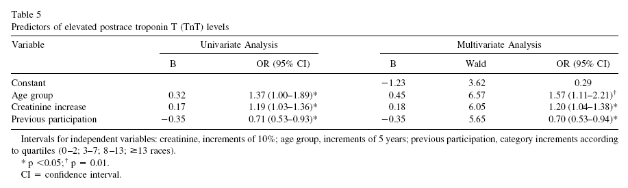
Okay, one more table. This one, included below, shows regression analyses between a few predictors and the main dependent variable, which in this case is TnT elevation. No surprises here based on the discussion so far. Look at the left part, the column labeled as “B”. Those are correlation coefficients, varying from -1 to 1. Which is the predictor with the highest absolute correlation with TnT elevation? It is number of previous races, but the correlation is, again, NEGATIVE.
In follow-up tests after the race, 9 out of the 185 participants (4.9 percent) showed more decisive evidence of heart disease. One of those died while training a few months after the race. An autopsy was conducted showing abnormal left ventricular hypertrophy with myocardial fibrosis, coronary artery narrowing, and an old myocardial scar.
Who were the 9 lucky ones? You guessed it. Those were the ones who had the largest increases in NT-proBNP during the race. And large increases in NT-proBNP were more common among the runners who were too inexperienced or too experienced. The ones at the extremes.
So, here is a summary of what this study is telling us:
- The 30-km cross-country race studied is no doubt a strenuous activity. So if you have not exercised in years, perhaps you should not start with this kind of race.
- By and large, individuals who had elevated markers of heart disease prior to the race also had the highest elevations of those markers after the race.
- Participation in past races was generally protective, likely due to compensatory body adaptations, with the exception of those who did too much of that.
- Prevalence of heart disease among the runners was measured at 4.9 percent. This does not beat even the mildly westernized Inuit, but certainly does not look so bad considering that the general prevalence of ischemic heart disease in the US and Sweden is about 6.8 percent.
It seems reasonable to conclude that long distance running may be healthy, unless one does too much of it. The ubiquitous J-curve pattern again.
How much is too much? It certainly depends on each person’s particular health condition, but the bar seems to be somewhat high on average: participation in 14 or more previous 30-km races.
As for the 4.9 percent prevalence of heart disease among runners, maybe it is caused by something else, and endurance running may actually be protective, as long as it is not taken to extremes. Maybe that something else is a diet rich in refined carbohydrates and sugars, or psychological stress caused by modern life, or a combination of both.
Just for the record, I don’t do endurance running. I like walking, sprinting, moderate resistance training, and also a variety of light aerobic activities that involve some play. This is just a personal choice; nothing against endurance running.
Mark Sisson was an accomplished endurance runner; now he does not like it very much. (Click here to check his excellent book The Primal Blueprint). Arthur De Vany is not a big fan of endurance running either.
Still, maybe the Tarahumara and hunter-gatherer groups who practice persistence hunting are not such huge exceptions among humans after all.
Reference:
Sahlén, A., Gustafsson, T.P., Svensson, J.E., Marklund, T., Winter, R., Linde, C., & Braunschweig, F. (2009). Predisposing Factors and Consequences of Elevated Biomarker Levels in Long-Distance Runners Aged >55 Years. The American Journal of Cardiology, 104(10), 1434–1440.
The figure below (click to enlarge) shows a schematic representation that illustrates this type of relationship. (I am not very good at drawing.) Different individuals have different curves. If the vertical axis was a measure of health, as opposed to disease, then the curve would have the shape of an inverted J.
The idea that long distance running causes heart disease has been around for a while. Is it correct?
If it is, then one would expect to see certain things. For example, let’s say you take a group of long distance runners who have been doing that for a while, ideally runners above age 50. That is when heart disease becomes more frequent. This would also capture more experienced runners, with enough running experience to cause some serious damage. Let us say you measured markers of heart disease before and after a grueling long distance race. What would you see?
If long distance running causes heart disease, you would see a significant proportion with elevated makers of heart disease among the runners at baseline (i.e., before the race). After all, running is causing a cumulative problem. The levels of those markers would be correlated with practice, or participation in previous races, since the races are causing the damage. Also, you would see a uniformly bad increase in the markers after the race, as the running is messing up everybody more or less equally.
Sahlén and colleagues (2009), a group of Swedish researchers, studied males and females aged 55 or older who participated in a 30-km (about 19-mile) cross-country race. The full reference to the article is at the end of this post. The researchers included only runners who had no diagnosed medical disorders in their study. They collected data on the patterns of exercise prior to the race, and participation in previous races. Blood was taken before and after the race, and several measurements were obtained, including measurements of two possible heart disease markers: N-terminal pro-brain natriuretic peptide (NT-proBNP), and troponin T (TnT). The table below (click to enlarge) shows several of those measurements before and after the race.
We can see that NT-proBNP and TnT increased significantly after the race. So did creatinine, a byproduct of breakdown in muscle tissue of creatine phosphate; something that you would expect after such a grueling race. Yep, long distance running increases NT-proBNP and TnT, so it leads to heart disease, right?
Wait, not so fast!
NT-proBNP and TnT levels usually increase after endurance exercise, something that is noted by the authors in their literature review. But those levels do not stay elevated for too long after the race. Being permanently elevated, that is a sign of a problem. Also, excessive elevation during the race is also a sign of a potential problem.
Now, here is something interesting. Look at the table below, showing the variations grouped by past participation in races.
The increases in NT-proBNP and TnT are generally lower in those individuals that participated in 3 to 13 races in the past. They are higher for the inexperienced runners, and, in the case of NT-proBNP, particularly for those with 14 or more races under their belt (the last group on the right). The baseline NT-proBNP is also significantly higher for that group. They were older too, but not by much.
Can you see a possible J-curve pattern?
Now look at this table below, which shows the results of a multiple regression analysis on its right side. Look at the last column on the right, the beta coefficients. They are all significant, but the first is .81, which is quite high for a standardized partial regression coefficient. It refers to an almost perfect relationship between the log of NT-proBNP increase and the log of baseline NT-proBNP. (The log transformations reflect the nonlinear relationships between NT-proBNP, a fairly sensitive health marker, and the other variables.)
In a multiple regression analysis, the effect of each independent variable (i.e., each predictor) on the dependent variable (the log of NT-proBNP increase) is calculated controlling for the effects of all the other independent variables on the dependent variable. Thus, what the table above is telling us is that baseline NT-proBNP predicts NT-proBNP increase almost perfectly, even when we control for age, creatinine increase, and race duration (i.e., amount of time a person takes to complete the race).
Again, even when we control for: AGE, creatinine increase, and RACE DURATION.
In order words, baseline NT-proBNP is what really matters; not even age makes that much of a difference. But baseline NT-proBNP is NEGATIVELY correlated with number of previous races. The only exception is the group that participated in 14 or more previous races. Maybe that was too much for them.
Okay, one more table. This one, included below, shows regression analyses between a few predictors and the main dependent variable, which in this case is TnT elevation. No surprises here based on the discussion so far. Look at the left part, the column labeled as “B”. Those are correlation coefficients, varying from -1 to 1. Which is the predictor with the highest absolute correlation with TnT elevation? It is number of previous races, but the correlation is, again, NEGATIVE.
In follow-up tests after the race, 9 out of the 185 participants (4.9 percent) showed more decisive evidence of heart disease. One of those died while training a few months after the race. An autopsy was conducted showing abnormal left ventricular hypertrophy with myocardial fibrosis, coronary artery narrowing, and an old myocardial scar.
Who were the 9 lucky ones? You guessed it. Those were the ones who had the largest increases in NT-proBNP during the race. And large increases in NT-proBNP were more common among the runners who were too inexperienced or too experienced. The ones at the extremes.
So, here is a summary of what this study is telling us:
- The 30-km cross-country race studied is no doubt a strenuous activity. So if you have not exercised in years, perhaps you should not start with this kind of race.
- By and large, individuals who had elevated markers of heart disease prior to the race also had the highest elevations of those markers after the race.
- Participation in past races was generally protective, likely due to compensatory body adaptations, with the exception of those who did too much of that.
- Prevalence of heart disease among the runners was measured at 4.9 percent. This does not beat even the mildly westernized Inuit, but certainly does not look so bad considering that the general prevalence of ischemic heart disease in the US and Sweden is about 6.8 percent.
It seems reasonable to conclude that long distance running may be healthy, unless one does too much of it. The ubiquitous J-curve pattern again.
How much is too much? It certainly depends on each person’s particular health condition, but the bar seems to be somewhat high on average: participation in 14 or more previous 30-km races.
As for the 4.9 percent prevalence of heart disease among runners, maybe it is caused by something else, and endurance running may actually be protective, as long as it is not taken to extremes. Maybe that something else is a diet rich in refined carbohydrates and sugars, or psychological stress caused by modern life, or a combination of both.
Just for the record, I don’t do endurance running. I like walking, sprinting, moderate resistance training, and also a variety of light aerobic activities that involve some play. This is just a personal choice; nothing against endurance running.
Mark Sisson was an accomplished endurance runner; now he does not like it very much. (Click here to check his excellent book The Primal Blueprint). Arthur De Vany is not a big fan of endurance running either.
Still, maybe the Tarahumara and hunter-gatherer groups who practice persistence hunting are not such huge exceptions among humans after all.
Reference:
Sahlén, A., Gustafsson, T.P., Svensson, J.E., Marklund, T., Winter, R., Linde, C., & Braunschweig, F. (2009). Predisposing Factors and Consequences of Elevated Biomarker Levels in Long-Distance Runners Aged >55 Years. The American Journal of Cardiology, 104(10), 1434–1440.
Subscribe to:
Posts (Atom)