Regardless of type of exercise, disease markers are generally associated with intensity of exertion over time. This association follows a J-curve pattern. Do too little of it, and you have more disease; do too much, and incidence of disease goes up. There is always an optimal point, for each type of exercise and marker. A J curve is actually a U curve, with a shortened left end. The reason for the shortened left end is that, when measurements are taken, usually more measures fall on the right side of the curve than on the left.
The figure below (click to enlarge) shows a schematic representation that illustrates this type of relationship. (I am not very good at drawing.) Different individuals have different curves. If the vertical axis was a measure of health, as opposed to disease, then the curve would have the shape of an inverted J.
The idea that long distance running causes heart disease has been around for a while. Is it correct?
If it is, then one would expect to see certain things. For example, let’s say you take a group of long distance runners who have been doing that for a while, ideally runners above age 50. That is when heart disease becomes more frequent. This would also capture more experienced runners, with enough running experience to cause some serious damage. Let us say you measured markers of heart disease before and after a grueling long distance race. What would you see?
If long distance running causes heart disease, you would see a significant proportion with elevated makers of heart disease among the runners at baseline (i.e., before the race). After all, running is causing a cumulative problem. The levels of those markers would be correlated with practice, or participation in previous races, since the races are causing the damage. Also, you would see a uniformly bad increase in the markers after the race, as the running is messing up everybody more or less equally.
Sahlén and colleagues (2009), a group of Swedish researchers, studied males and females aged 55 or older who participated in a 30-km (about 19-mile) cross-country race. The full reference to the article is at the end of this post. The researchers included only runners who had no diagnosed medical disorders in their study. They collected data on the patterns of exercise prior to the race, and participation in previous races. Blood was taken before and after the race, and several measurements were obtained, including measurements of two possible heart disease markers: N-terminal pro-brain natriuretic peptide (NT-proBNP), and troponin T (TnT). The table below (click to enlarge) shows several of those measurements before and after the race.

We can see that NT-proBNP and TnT increased significantly after the race. So did creatinine, a byproduct of breakdown in muscle tissue of creatine phosphate; something that you would expect after such a grueling race. Yep, long distance running increases NT-proBNP and TnT, so it leads to heart disease, right?
Wait, not so fast!
NT-proBNP and TnT levels usually increase after endurance exercise, something that is noted by the authors in their literature review. But those levels do not stay elevated for too long after the race. Being permanently elevated, that is a sign of a problem. Also, excessive elevation during the race is also a sign of a potential problem.
Now, here is something interesting. Look at the table below, showing the variations grouped by past participation in races.
The increases in NT-proBNP and TnT are generally lower in those individuals that participated in 3 to 13 races in the past. They are higher for the inexperienced runners, and, in the case of NT-proBNP, particularly for those with 14 or more races under their belt (the last group on the right). The baseline NT-proBNP is also significantly higher for that group. They were older too, but not by much.
Can you see a possible J-curve pattern?
Now look at this table below, which shows the results of a multiple regression analysis on its right side. Look at the last column on the right, the beta coefficients. They are all significant, but the first is .81, which is quite high for a standardized partial regression coefficient. It refers to an almost perfect relationship between the log of NT-proBNP increase and the log of baseline NT-proBNP. (The log transformations reflect the nonlinear relationships between NT-proBNP, a fairly sensitive health marker, and the other variables.)

In a multiple regression analysis, the effect of each independent variable (i.e., each predictor) on the dependent variable (the log of NT-proBNP increase) is calculated controlling for the effects of all the other independent variables on the dependent variable. Thus, what the table above is telling us is that baseline NT-proBNP predicts NT-proBNP increase almost perfectly, even when we control for age, creatinine increase, and race duration (i.e., amount of time a person takes to complete the race).
Again, even when we control for: AGE, creatinine increase, and RACE DURATION.
In order words, baseline NT-proBNP is what really matters; not even age makes that much of a difference. But baseline NT-proBNP is NEGATIVELY correlated with number of previous races. The only exception is the group that participated in 14 or more previous races. Maybe that was too much for them.
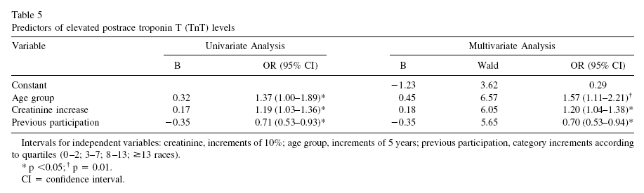
Okay, one more table. This one, included below, shows regression analyses between a few predictors and the main dependent variable, which in this case is TnT elevation. No surprises here based on the discussion so far. Look at the left part, the column labeled as “B”. Those are correlation coefficients, varying from -1 to 1. Which is the predictor with the highest absolute correlation with TnT elevation? It is number of previous races, but the correlation is, again, NEGATIVE.
In follow-up tests after the race, 9 out of the 185 participants (4.9 percent) showed more decisive evidence of heart disease. One of those died while training a few months after the race. An autopsy was conducted showing abnormal left ventricular hypertrophy with myocardial fibrosis, coronary artery narrowing, and an old myocardial scar.
Who were the 9 lucky ones? You guessed it. Those were the ones who had the largest increases in NT-proBNP during the race. And large increases in NT-proBNP were more common among the runners who were too inexperienced or too experienced. The ones at the extremes.
So, here is a summary of what this study is telling us:
- The 30-km cross-country race studied is no doubt a strenuous activity. So if you have not exercised in years, perhaps you should not start with this kind of race.
- By and large, individuals who had elevated markers of heart disease prior to the race also had the highest elevations of those markers after the race.
- Participation in past races was generally protective, likely due to compensatory body adaptations, with the exception of those who did too much of that.
- Prevalence of heart disease among the runners was measured at 4.9 percent. This does not beat even the
mildly westernized Inuit, but certainly does not look so bad considering that the general prevalence of ischemic heart disease
in the US and Sweden is about 6.8 percent.
It seems reasonable to conclude that long distance running may be healthy, unless one does too much of it. The ubiquitous J-curve pattern again.
How much is too much? It certainly depends on each person’s particular health condition, but the bar seems to be somewhat high on average: participation in 14 or more previous 30-km races.
As for the 4.9 percent prevalence of heart disease among runners, maybe it is caused by something else, and endurance running may actually be protective, as long as it is not taken to extremes. Maybe that something else is a diet rich in refined carbohydrates and sugars, or psychological stress caused by modern life, or a combination of both.
Just for the record, I don’t do endurance running. I like walking, sprinting, moderate resistance training, and also a variety of light aerobic activities that involve some play. This is just a personal choice; nothing against endurance running.
Mark Sisson was an accomplished endurance runner; now he does not like it very much. (Click
here to check his excellent book
The Primal Blueprint).
Arthur De Vany is not a big fan of endurance running either.
Still, maybe the
Tarahumara and hunter-gatherer groups who practice
persistence hunting are not such huge exceptions among humans after all.
Reference:
Sahlén, A., Gustafsson, T.P., Svensson, J.E., Marklund, T., Winter, R., Linde, C., & Braunschweig, F. (2009).
Predisposing Factors and Consequences of Elevated Biomarker Levels in Long-Distance Runners Aged >55 Years.
The American Journal of Cardiology, 104(10), 1434–1440.