Saturday, May 21, 2022

Vitamin D production from UV radiation: The effects of total cholesterol and skin pigmentation

Our body naturally produces as much as 10,000 IU of vitamin D based on a few minutes of sun exposure when the sun is high. Getting that much vitamin D from dietary sources is very difficult, even after “fortification”.

The above refers to pre-sunburn exposure. Sunburn is not associated with increased vitamin D production; it is associated with skin damage and cancer.

Solar ultraviolet (UV) radiation is generally divided into two main types: UVB (wavelength: 280–320 nm) and UVA (320–400 nm). Vitamin D is produced primarily based on UVB radiation. Nevertheless, UVA is much more abundant, amounting to about 90 percent of the sun’s UV radiation.

UVA seems to cause the most skin damage, although there is some debate on this. If this is correct, one would expect skin pigmentation to be our body’s defense primarily against UVA radiation, not UVB radiation. If so, one’s ability to produce vitamin D based on UVB should not go down significantly as one’s skin becomes darker.

Also, vitamin D and cholesterol seem to be closely linked. Some argue that one is produced based on the other; others that they have the same precursor substance(s). Whatever the case may be, if vitamin D and cholesterol are indeed closely linked, one would expect low cholesterol levels to be associated with low vitamin D production based on sunlight.

Bogh et al. (2010) published a very interesting study; one of those studies that remain relevant as time goes by. The link to the study was provided by Ted Hutchinson in the comments sections of a another post on vitamin D. The study was published in a refereed journal with a solid reputation, the Journal of Investigative Dermatology.

The study by Bogh et al. (2010) is particularly interesting because it investigates a few issues on which there is a lot of speculation. Among the issues investigated are the effects of total cholesterol and skin pigmentation on the production of vitamin D from UVB radiation.

The figure below depicts the relationship between total cholesterol and vitamin D production based on UVB radiation. Vitamin D production is referred to as “delta 25(OH)D”. The univariate correlation is a fairly high and significant 0.51.


25(OH)D is the abbreviation for calcidiol, a prehormone that is produced in the liver based on vitamin D3 (cholecalciferol), and then converted in the kidneys into calcitriol, which is usually abbreviated as 1,25-(OH)2D3. The latter is the active form of vitamin D.

The table below shows 9 columns; the most relevant ones are the last pair at the right. They are the delta 25(OH)D levels for individuals with dark and fair skin after exposure to the same amount of UVB radiation. The difference in vitamin D production between the two groups is statistically indistinguishable from zero.


So there you have it. According to this study, low total cholesterol seems to be associated with impaired ability to produce vitamin D from UVB radiation. And skin pigmentation appears to have little effect on the amount of vitamin D produced.

The study has a few weaknesses, as do almost all studies. For example, if you take a look at the second pair of columns from the right on the table above, you’ll notice that the baseline 25(OH)D is lower for individuals with dark skin. The difference was just short of being significant at the 0.05 level.

What is the problem with that? Well, one of the findings of the study was that lower baseline 25(OH)D levels were significantly associated with higher delta 25(OH)D levels. Still, the baseline difference does not seem to be large enough to fully explain the lack of difference in delta 25(OH)D levels for individuals with dark and fair skin.

A widely cited dermatology researcher, Antony Young, published an invited commentary on this study in the same journal issue (Young, 2010). The commentary points out some weaknesses in the study, but is generally favorable. The weaknesses include the use of small sub-samples.

References

Bogh, M.K.B., Schmedes, A.V., Philipsen, P.A., Thieden, E., & Wulf, H.C. (2010). Vitamin D production after UVB exposure depends on baseline vitamin D and total cholesterol but not on skin pigmentation. Journal of Investigative Dermatology, 130(2), 546–553.

Young, A.R. (2010). Some light on the photobiology of vitamin D. Journal of Investigative Dermatology, 130(2), 346–348.

Saturday, January 22, 2022

Insulin responses to foods rich in carbohydrates and protein

Insulin is often presented as a hormone that is at the core of the diseases of civilization, particularly because of the insulin response elicited by foods rich in refined carbohydrates and sugars. What is often not mentioned is that protein also elicits an insulin response and so do foods where carbohydrates are mixed with fat. Sometimes the insulin responses are way more than one would expect based on the macronutrient compositions of the foods.

Holt et al. (1997; full reference at the end of this post) conducted a classic study of insulin responses. This study has been widely cited, and paints an interesting picture of differences in insulin responses to various foods. But you have to be careful where you look. There has been some confusion about the results because of the way they are often reported in places like Wikipedia and on various Internet sites that refer to the study.

The key thing to bear in mind when reviewing this study is that the amounts of food used were designed to have the same calorie content: 1000 kJ or 240 kcal (i.e., 240 calories). This led to wild variations in the size of the portions that are compared and their weight in grams. Also, some of the food portions are probably not what people usually eat in one sitting.

In Holt et al.’s (1997) study the participants were 41 lean and healthy university students. They were fed 1000 kJ (240 kcal) portions of the test foods on separate mornings after a 10-hour fast overnight. Blood insulin levels were measured at different times within a 120-minute period after each meal. An insulin score was then calculated from the area under the insulin response curve for each food; white bread was used as the reference food.

Part of Table 2 on page 1267 is shown below (the full text version of the paper is linked at the end of this post), just to illustrate the types and amounts of food served, and the macronutrient breakdown for each food. I hope you can see what I meant when I said that some of the food portions are probably not what people usually eat in one sitting. I don’t think it would be hard to find someone who would eat 158 g of beef steak in one sitting, but 333 g of fish is a little more difficult. Fish has a higher proportion of protein than beef steak, and thus is more satiating. The same goes for 625 g of orange, about 6 oranges. Foods that have more fat have more calories per gram; hence the smaller portions served for high-fat foods.


Table 4 of the article is a bit long, so I am providing it in two parts below. AUC stands for “area under the curve”. As you can see, for isocaloric portions of different foods (i.e., with the same amount of calories), there is a huge variation in insulin response. The insulin AUCs are shown on the second numeric column from the left. Also note that the insulin responses (AUC) for white bread varied in different meals. This complicates things a bit, but at least provides a more realistic view of the responses since each participant served as his or her own control.


Look at the third column from the right, which shows the insulin responses per gram of each food, compared with the response to white bread, always shown at the top for each group of related foods (e.g., protein-rich foods). The gram-adjusted response for whole-meal bread is rather high, and so is the glucose response. The gram-adjusted insulin response to potatoes is less than one-third of the response to white bread, even though the non-gram-adjusted glucose response is higher. The insulin response to beef is also less than one-third of the response to white bread, gram-for-gram. Even cheese leads to a gram-adjusted response that is about half the one for white bread, and I don’t think many people will eat the same amount of cheese in one sitting as they would do with white bread.

In summary, insulin responses to protein-rich foods are often 50 to 70 percent lower than responses to equivalent amounts of refined carbohydrate-rich foods. Also, insulin responses to unrefined carbohydrate-rich foods (e.g., potato, fruits) are often 70 to 90 percent lower than responses to equivalent amounts of refined carbohydrate-rich foods.

Why do insulin levels go up in response to dietary protein?

One of the reasons is that insulin is needed for tissue protein synthesis. That is, increased circulating protein (as amino acids) and insulin have a net anabolic effect, promoting muscle growth and inhibiting muscle breakdown. (Muscle protein synthesis and breakdown happen all the time; the net effect defines whether muscle grows or shrinks.) In this respect, insulin acts in conjunction with other hormones, such as growth hormone and insulin-like growth factor 1.

Reference:

Holt, S.H., Miller, J.C., & Petocz, P. (1997). An insulin index of foods: The insulin demand generated by 1000-kJ portions of common foods. American Journal of Clinical Nutrition, 66, 1264-1276.

Sunday, December 26, 2021

Age-related trends in health markers may indicate survival advantages: The case of platelet counts


Platelets () are particles that circulate in the blood of mammals. They react to blood vessel injuries by forming clots. Platelet counts are provided in standard blood panels, and are used by medical doctors to diagnose possible health problems. At the time of this writing, the refence range for platelet counts is 150,000 to 450,000 per cubic millimeter.

The figure below has two graphs, and is based on an article by Balduini and Noris, published in 2014 in the prestigious journal Haematologica (). The graph on the left shows the distribution of platelet counts by age and sex. The one on the right shows the reference ranges for platelet counts by age and sex.


The reference ranges within the bars include all individuals in the same age-sex group, whereas the ones outside the bars are based on groups of individuals in specific areas (i.e., geographic regions) where the age-sex reference ranges are wider. A reference range is essentially an interval, derived from statistical analyses, in which one would expect individuals who are disease-free to fall into.

A clear pattern that emerges from these graphs is that platelet counts go down with age, in both men and women. A tendency to form clots is generally associated with health problems at more advanced ages, even though blood clotting is necessary for good health. Given this, one could interpret the graphs as indicating that older individuals have lower blood clot counts because those lower counts are associated with a survival advantage.

This interpretation is not guaranteed to be correct, of course. Nevertheless, one of the key conclusions by the authors of the study seems quite correct: “[…] using 150–400×10^9/L as the normal range for platelet count, a number of old people of some areas could be at risk of receiving a wrong diagnosis of thrombocytopenia, while young inhabitants of other areas could be at risk of an undue diagnosis of thrombocytosis.”

If you get a platelet count in a standard blood panel that is out of the reference range, your doctor may tell you that this could be an indication of a frightening underlying health problem. If this happens, you may want to discuss this blog post, and the article on which it is based, with your doctor. There are follow-up tests that can rule out serious underlying problems. Having said that, a low count may in fact be a good sign.

Sunday, October 24, 2021

You can eat a lot during the Holiday Season and gain no body fat, as long as you also eat little


The evolutionary pressures placed by periods of famine shaped the physiology of most animals, including humans, toward a design that favors asymmetric food consumption. That is, most animals are “designed” to alternate between eating little and then a lot.

Often when people hear this argument they point out the obvious. There is no evidence that our ancestors were constantly starving. This is correct, but what these folks seem to forget is that evolution responds to events that alter reproductive success rates (), even if those events are rare.

If an event causes a significant amount of death but occurs only once every year, a population will still evolve traits in response to the event. Food scarcity is one such type of event.

Since evolution is blind to complexity, adaptations to food scarcity can take all shapes and forms, including counterintuitive ones. Complicating this picture is the fact that food does not only provide us with fuel, but also with the sources of important structural components, signaling elements (e.g., hormones), and process catalysts (e.g., enzymes).

In other words, we may have traits that are health-promoting under conditions of food scarcity, but those traits are only likely to benefit our health as long as food scarcity is relatively short-term. Not eating anything for 40 days would be lethal for most people.

By "eating little" I don’t mean necessarily fasting. Given the amounts of mucus and dead cells (from normal cell turnover) passing through the digestive tract, it is very likely that we’ll be always digesting something. So eating very little within a period of 10 hours sends the body a message that is similar to the message sent by eating nothing within the same period of 10 hours.

Most of the empirical research that I've reviewed suggests that eating very little within a period of, say, 10-20 hours and then eating to satisfaction in one single meal will elicit the following responses. Protein phosphorylation underlies many of them.

- Your body will hold on to its most important nutrient reserves when you eat little, using selective autophagy to generate energy (, ). This may have powerful health-promoting properties, including the effect of triggering anti-cancer mechanisms.

- Food will taste fantastic when you feast, to such an extent that this effect will be much stronger than that associated with any spice ().

- Nutrients will be allocated more effectively when you feast, leading to a lower net gain of body fat ().

- The caloric value of food will be decreased, with a 14 percent decrease being commonly found in the literature ().

- The feast will prevent your body from down-regulating your metabolism via subclinical hypothyroidism (), which often happens when the period in which one eats little extends beyond a certain threshold (e.g., more than one week).

- Your mood will be very cheerful when you feast, potentially improving social relationships. That is, if you don’t become too grouchy during the period in which you eat little.

I recall once participating in a meeting that went from early morning to late afternoon. We had the option of taking a lunch break, or working through lunch and ending the meeting earlier. Not only was I the only person to even consider the second option, some people thought that the idea of skipping lunch was outrageous, with a few implying that they would have headaches and other problems.

When I said that I had had nothing for breakfast, a few thought that I was pushing my luck. One of my colleagues warned me that I might be damaging my health irreparably by doing those things. Well, maybe they were right on both grounds, who knows?

It is my belief that the vast majority of humans will do quite fine if they eat little or nothing for a period of 20 hours. The problem is that they need to be convinced first that they have nothing to worry about. Otherwise they may end up with a headache or worse, entirely due to psychological mechanisms ().

There is no need to eat beyond satiety when you feast. I’d recommend that you just eat to satiety, and don’t force yourself to eat more than that. If you avoid industrialized foods when you feast, that will be even better, because satiety will be achieved faster. One of the main characteristics of industrialized foods is that they promote unnatural overeating; congrats food engineers on a job well done!

If you are relatively lean, satiety will normally be achieved with less food than if you are not. Hunger intensity and duration tends to be generally associated with body weight. Except for dedicated bodybuilders and a few other athletes, body weight gain is much more strongly influenced by body fat gain than by muscle gain.

Sunday, September 19, 2021

Dietary protein does not become body fat if you are on a low carbohydrate diet

By definition LC is about dietary carbohydrate restriction. If you are reducing carbohydrates, your proportional intake of protein or fat, or both, will go up. While I don’t think there is anything wrong with a high fat diet, it seems to me that the true advantage of LC may be in how protein is allocated, which appears to contribute to a better body composition.

LC with more animal protein and less fat makes particularly good sense to me. Eating a variety of unprocessed animal foods, as opposed to only muscle meat from grain-fed cattle, will get you that. In simple terms, LC with more protein, achieved in a natural way with unprocessed foods, means more of the following in one's diet: lean meats, seafood and vegetables. Possibly with lean meats and seafood making up more than half of one’s protein intake. Generally speaking, large predatory fish species (e.g., various shark species, including dogfish) are better avoided to reduce exposure to toxic metals.

Organ meats such as beef liver are also high in protein and low in fat, but should be consumed in moderation due to the risk of hypervitaminosis; particularly hypervitaminosis A. Our ancestors ate the animal whole, and organ mass makes up about 10-20 percent of total mass in ruminants. Eating organ meats once a week places you approximately within that range.

In LC liver glycogen is regularly depleted, so the amino acids resulting from the digestion of protein will be primarily used to replenish liver glycogen, to replenish the albumin pool, for oxidation, and various other processes (e.g., tissue repair, hormone production). If you do some moderate weight training, some of those amino acids will be used for muscle repair and potentially growth.

In this sense, the true “metabolic advantage” of LC, so to speak, comes from protein and not fat. “Calories in” still counts, but you get better allocation of nutrients. Moreover, in LC, the calorie value of protein goes down a bit, because your body is using it as a “jack of all trades”, and thus in a less efficient way. This renders protein the least calorie-dense macronutrient, yielding fewer calories per gram than carbohydrates; and significantly fewer calories per gram when compared with dietary fat and alcohol.

Dietary fat is easily stored as body fat after digestion. In LC, it is difficult for the body to store amino acids as body fat. The only path would be conversion to glucose and uptake by body fat cells, but in LC the liver will typically be starving and want all the extra glucose for itself, so that it can feed its ultimate master – the brain. The liver glycogen depletion induced by LC creates a hormonal mix that places the body in fat release mode, making it difficult for fat cells to take up glucose via the GLUT4 transporter protein.

Excess amino acids are oxidized for energy. This may be why many people feel a slight surge of energy after a high-protein meal. (A related effect is associated with alcohol consumption, which is often masked by the relaxing effect also associated with alcohol consumption.) Amino acid oxidation is not associated with cancer. Neither is fat oxidation. But glucose oxidation is; this is known as the Warburg effect.

A high-protein LC approach will not work very well for athletes who deplete major amounts of muscle glycogen as part of their daily training regimens. These folks will invariably need more carbohydrates to keep their performance levels up. Ultimately this is a numbers game. The protein-to-glucose conversion rate is about 2-to-1. If an athlete depletes 300 g of muscle glycogen per day, he or she will need about 600 g of protein to replenish that based only on protein. This is too high an intake of protein by any standard.

A recreational exerciser who depletes 60 g of glycogen 3 times per week can easily replenish that muscle glycogen with dietary protein. Someone who exercises with weights for 40 minutes 3 times per week will deplete about that much glycogen each time. Contrary to popular belief, muscle glycogen is only minimally replenished postprandially (i.e., after meals) based on dietary sources. Liver glycogen replenishment is prioritized postprandially. Muscle glycogen is replenished over several days, primarily based on liver glycogen. It is one fast-filling tank replenishing another slow-filling one.

Recreational exercisers who are normoglycemic and who do LC intermittently tend to increase the size of their liver glycogen tank over time, via compensatory adaptation, and also use more fat (and ketones, which are byproducts of fat metabolism) as sources of energy. Somewhat paradoxically, these folks benefit from regular high carbohydrate intake days (e.g., once a week, or on exercise days), since their liver glycogen tanks will typically store more glycogen. If they keep their liver and muscle glycogen tanks half empty all the time, compensatory adaptation suggests that both their liver and muscle glycogen tanks will over time become smaller, and that their muscles will store more fat.

One way or another, with the exception of those with major liver insulin resistance, dietary protein does not become body fat if you are on a LC diet.

Sunday, August 15, 2021

The China Study one more time: Are raw plant foods giving people cancer?

In this previous post I analyzed some data from the China Study that included counties where there were cases of schistosomiasis infection. Following one of Denise Minger’s suggestions, I removed all those counties from the data. I was left with 29 counties, a much smaller sample size. I then ran a multivariate analysis using WarpPLS (warppls.com), like in the previous post, but this time I used an algorithm that identifies nonlinear relationships between variables.

Below is the model with the results. (Click on it to enlarge. Use the "CRTL" and "+" keys to zoom in, and CRTL" and "-" to zoom out.) As in the previous post, the arrows explore associations between variables. The variables are shown within ovals. The meaning of each variable is the following: aprotein = animal protein consumption; pprotein = plant protein consumption; cholest = total cholesterol; crcancer = colorectal cancer.


What is total cholesterol doing at the right part of the graph? It is there because I am analyzing the associations between animal protein and plant protein consumption with colorectal cancer, controlling for the possible confounding effect of total cholesterol.

I am not hypothesizing anything regarding total cholesterol, even though this variable is shown as pointing at colorectal cancer. I am just controlling for it. This is the type of thing one can do in multivariate analyzes. This is how you “control for the effect of a variable” in an analysis like this.

ins Since the sample is fairly small, we end up with nonsignificant beta coefficients that would normally be statistically significant with a larger sample. But it helps that we are using nonparametric statistics, because they are still robust in the presence of small samples, and deviations from normality. Also the nonlinear algorithm is more sensitive to relationships that do not fit a classic linear pattern. We can summarize the findings as follows:

- As animal protein consumption increases, plant protein consumption decreases significantly (beta=-0.36; P<0.01). This is to be expected and helpful in the analysis, as it differentiates somewhat animal from plant protein consumers. Those folks who got more of their protein from animal foods tended to get significantly less protein from plant foods.

- As animal protein consumption increases, colorectal cancer decreases, but not in a statistically significant way (beta=-0.31; P=0.10). The beta here is certainly high, and the likelihood that the relationship is real is 90 percent, even with such a small sample.

- As plant protein consumption increases, colorectal cancer increases significantly (beta=0.47; P<0.01). The small sample size was not enough to make this association nonsignificant. The reason is that the distribution pattern of the data here is very indicative of a real association, which is reflected in the low P value.

Remember, these results are not confounded by schistosomiasis infection, because we are only looking at counties where there were no cases of schistosomiasis infection. These results are not confounded by total cholesterol either, because we controlled for that possible confounding effect. Now, control variable or not, you would be correct to point out that the association between total cholesterol and colorectal cancer is high (beta=0.58; P=0.01). So let us take a look at the shape of that association:


Does this graph remind you of the one on this post; the one with several U curves? Yes. And why is that? Maybe it reflects a tendency among the folks who had low cholesterol to have more cancer because the body needs cholesterol to fight disease, and cancer is a disease. And maybe it reflects a tendency among the folks who have high total cholesterol to do so because total cholesterol (and particularly its main component, LDL cholesterol) is in part a marker of disease, and cancer is often a culmination of various metabolic disorders (e.g., the metabolic syndrome) that are nothing but one disease after another.

To believe that total cholesterol causes colorectal cancer is nonsensical because total cholesterol is generally increased by consumption of animal products, of which animal protein consumption is a proxy. (In this reduced dataset, the linear univariate correlation between animal protein consumption and total cholesterol is a significant and positive 0.36.) And animal protein consumption seems to be protective again colorectal cancer in this dataset (negative association on the model graph).

Now comes the part that I find the most ironic about this whole discussion in the blogosphere that has been going on recently about the China Study; and the answer to the question posed in the title of this post: Are raw plant foods giving people cancer? If you think that the answer is “yes”, think again. The variable that is strongly associated with colorectal cancer is plant protein consumption.

Do fruits, veggies, and other plant foods that can be consumed raw have a lot of protein?

With a few exceptions, like nuts, they do not. Most raw plant foods have trace amounts of protein, especially when compared with foods made from refined grains and seeds (e.g., wheat grains, soybean seeds). So the contribution of raw fruits and veggies in general could not have influenced much the variable plant protein consumption. To put this in perspective, the average plant protein consumption per day in this dataset was 63 g; even if they were eating 30 bananas a day, the study participants would not get half that much protein from bananas.

Refined foods made from grains and seeds are made from those plant parts that the plants absolutely do not “want” animals to eat. They are the plants’ “children” or “children’s nutritional reserves”, so to speak. This is why they are packed with nutrients, including protein and carbohydrates, but also often toxic and/or unpalatable to animals (including humans) when eaten raw.

But humans are so smart; they learned how to industrially refine grains and seeds for consumption. The resulting human-engineered products (usually engineered to sell as many units as possible, not to make you healthy) normally taste delicious, so you tend to eat a lot of them. They also tend to raise blood sugar to abnormally high levels, because industrial refining makes their high carbohydrate content easily digestible. Refined foods made from grains and seeds also tend to cause leaky gut problems, and autoimmune disorders like celiac disease. Yep, we humans are really smart.

Thanks again to Dr. Campbell and his colleagues for collecting and compiling the China Study data, and to Ms. Minger for making the data available in easily downloadable format and for doing some superb analyses herself.

Tuesday, June 22, 2021

Blood glucose control before age 55 may increase your chances of living beyond 90

This post refers to an interesting study by Yashin and colleagues (2009) at Duke University’s Center for Population Health and Aging. (The full reference to the article, and a link, are at the end of this post.) This study is a gem with some rough edges, and some interesting implications.

The study uses data from the Framingham Heart Study (FHS). The FHS, which started in the late 1940s, recruited 5209 healthy participants (2336 males and 2873 females), aged 28 to 62, in the town of Framingham, Massachusetts. At the time of Yashin and colleagues’ article publication, there were 993 surviving participants.

I rearranged figure 2 from the Yashin and colleagues article so that the two graphs (for females and males) appeared one beside the other. The result is shown below (click on it to enlarge); the caption at the bottom-right corner refers to both graphs. The figure shows the age-related trajectory of blood glucose levels, grouped by lifespan (LS), starting at age 40.


As you can see from the figure above, blood glucose levels increase with age, even for long-lived individuals (LS > 90). The increases follow a U-curve (a.k.a. J-curve) pattern; the beginning of the right side of a U curve, to be more precise. The main difference in the trajectories of the blood glucose levels is that as lifespan increases, so does the width of the U curve. In other words, in long-lived people, blood glucose increases slowly with age; particularly up to 55 years of age, when it starts increasing more rapidly.

Now, here is one of the rough edges of this study. The authors do not provide standard deviations. You can ignore the error bars around the points on the graph; they are not standard deviations. They are standard errors, which are much lower than the corresponding standard deviations. Standard errors are calculated by dividing the standard deviations by the square root of the sample sizes for each trajectory point (which the authors do not provide either), so they go up with age since progressively smaller numbers of individuals reach advanced ages.

So, no need to worry if your blood glucose levels are higher than those shown on the vertical axes of the graphs. (I will comment more on those numbers below.) Not everybody who lived beyond 90 had a blood glucose of around 80 mg/dl at age 40. I wouldn't be surprised if about 2/3 of the long-lived participants had blood glucose levels in the range of 65 to 95 at that age.

Here is another rough edge. It is pretty clear that the authors’ main independent variable (i.e., health predictor) in this study is average blood glucose, which they refer to simply as “blood glucose”. However, the measure of blood glucose in the FHS is a very rough estimation of average blood glucose, because they measured blood glucose levels at random times during the day. These measurements, when averaged, are closer to fasting blood glucose levels than to average blood glucose levels.

A more reliable measure of average blood glucose levels is that of glycated hemoglobin (HbA1c). Blood glucose glycates (i.e., sticks to, like most sugary substances) hemoglobin, a protein found in red blood cells. Since red blood cells are relatively long-lived, with a turnover of about 3 months, HbA1c (given in percentages) is a good indicator of average blood glucose levels (if you don’t suffer from anemia or a few other blood abnormalities). Based on HbA1c, one can then estimate his or her average blood glucose level for the previous 3 months before the test, using one of the following equations, depending on whether the measurement is in mg/dl or mmol/l.

    Average blood glucose (mg/dl) = 28.7 × HbA1c − 46.7

    Average blood glucose (mmol/l) = 1.59 × HbA1c − 2.59

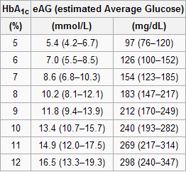
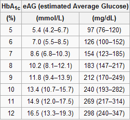
The table below, from Wikipedia, shows average blood glucose levels corresponding to various HbA1c values. As you can see, they are generally higher than the corresponding fasting blood glucose levels would normally be (the latter is what the values on the vertical axes of the graphs above from Yashin and colleagues’ study roughly measure). This is to be expected, because blood glucose levels vary a lot during the day, and are often transitorily high in response to food intake and fluctuations in various hormones. Growth hormone, cortisol and noradrenaline are examples of hormones that increase blood glucose. Only one hormone effectively decreases blood glucose levels, insulin, by stimulating glucose uptake and storage as glycogen and fat.

Nevertheless, one can reasonably expect fasting blood glucose levels to have been highly correlated with average blood glucose levels in the sample. So, in my opinion, the graphs above showing age-related blood glucose trajectories are still valid, in terms of their overall shape, but the values on the vertical axes should have been measured differently, perhaps using the formulas above.

Ironically, those who achieve low average blood glucose levels (measured based on HbA1c) by adopting a low carbohydrate diet (one of the most effective ways) frequently have somewhat high fasting blood glucose levels because of physiological (or benign) insulin resistance. Their body is primed to burn fat for energy, not glucose. Thus when growth hormone levels spike in the morning, so do blood glucose levels, as muscle cells are in glucose rejection mode. This is a benign version of the dawn effect (a.k.a. dawn phenomenon), which happens with quite a few low carbohydrate dieters, particularly with those who are deep in ketosis at dawn.

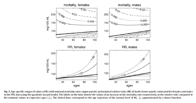
Yashin and colleagues also modeled relative risk of death based on blood glucose levels, using a fairly sophisticated mathematical model that takes into consideration U-curve relationships. What they found is intuitively appealing, and is illustrated by the two graphs at the bottom of the figure below. The graphs show how the relative risks (e.g., 1.05, on the topmost dashed line on the both graphs) associated with various ranges of blood glucose levels vary with age, for both females and males.
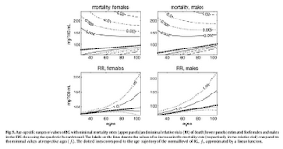

What the graphs above are telling us is that once you reach old age, controlling for blood sugar levels is not as effective as doing it earlier, because you are more likely to die from what the authors refer to as “other causes”. For example, at the age of 90, having a blood glucose of 150 mg/dl (corrected for the measurement problem noted earlier, this would be perhaps 165 mg/dl, from HbA1c values) is likely to increase your risk of death by only 5 percent. The graphs account for the facts that: (a) blood glucose levels naturally increase with age, and (b) fewer people survive as age progresses. So having that level of blood glucose at age 60 would significantly increase relative risk of death at that age; this is not shown on the graph, but can be inferred.

Here is a final rough edge of this study. From what I could gather from the underlying equations, the relative risks shown above do not account for the effect of high blood glucose levels earlier in life on relative risk of death later in life. This is a problem, even though it does not completely invalidate the conclusion above. As noted by several people (including Gary Taubes in his book Good Calories, Bad Calories), many of the diseases associated with high blood sugar levels (e.g., cancer) often take as much as 20 years of high blood sugar levels to develop. So the relative risks shown above underestimate the effect of high blood glucose levels earlier in life.

Do the long-lived participants have some natural protection against accelerated increases in blood sugar levels, or was it their diet and lifestyle that protected them? This question cannot be answered based on the study.

Assuming that their diet and lifestyle protected them, it is reasonable to argue that: (a) if you start controlling your average blood sugar levels well before you reach the age of 55, you may significantly increase your chances of living beyond the age of 90; (b) it is likely that your blood glucose levels will go up with age, but if you can manage to slow down that progression, you will increase your chances of living a longer and healthier life; (c) you should focus your control on reliable measures of average blood glucose levels, such as HbA1c, not fasting blood glucose levels (postprandial glucose levels are also a good option, because they contribute a lot to HbA1c increases); and (d) it is never too late to start controlling your blood glucose levels, but the more you wait, the bigger is the risk.

References:

Taubes, G. (2007). Good calories, bad calories: Challenging the conventional wisdom on diet, weight control, and disease. New York, NY: Alfred A. Knopf.

Yashin, A.I., Ukraintseva, S.V., Arbeev, K.G., Akushevich, I., Arbeeva, L.S., & Kulminski, A.M. (2009). Maintaining physiological state for exceptional survival: What is the normal level of blood glucose and does it change with age? Mechanisms of Ageing and Development, 130(9), 611-618.